

Coastal Wall Art: Seascapes With Restraint
Forget the distressed BEACH sign. Muted seascapes, shorelines and harbours can calm a room anywhere, even a hundred miles from the sea.
Key Takeaways
- Apply the inland test: a coastal piece should still work in a house that has never seen the sea, because a true seascape is landscape painting whose land happens to be water, while a piece that depends on announcing beach house will date the room.
- Build the palette from the coast's quiet colours — fog grey, pearl, sand, sea-glass green and grey-blue — and use navy only as an accent inside the image, not as a room-wide uniform.
- Check the horizon first: a high horizon gives the sea weight and presence for rooms where art is the main event, a low horizon is lighter and more contemplative, and a dead-centre horizon splits the image into two competing halves.
- Match the weather to the room's job, not your holiday memories: calm horizons above beds and in rooms for unwinding, moving water where a room benefits from motion, and storm or fog when a single large piece must anchor a room.
- Surround it with texture, not theme: linen, pale wood, woven grass and unglazed ceramic flatter the subject, while nautical props do not — though a genuinely old piece of maritime salvage or a framed antique chart earns its place.
Coastal art has an image problem, and the problem is a sign that says BEACH in distressed lettering, flanked by a rope-wrapped anchor. That version of the seaside — literal, labeled, and obliged to announce itself — is why many people who genuinely love the coast hesitate to hang it. They should not. Coastal wall art done with restraint is some of the most livable art there is: horizons, weather, and water in muted colors that calm a room without turning it into a souvenir shop. The whole craft is knowing where the line sits.
What coastal wall art actually covers
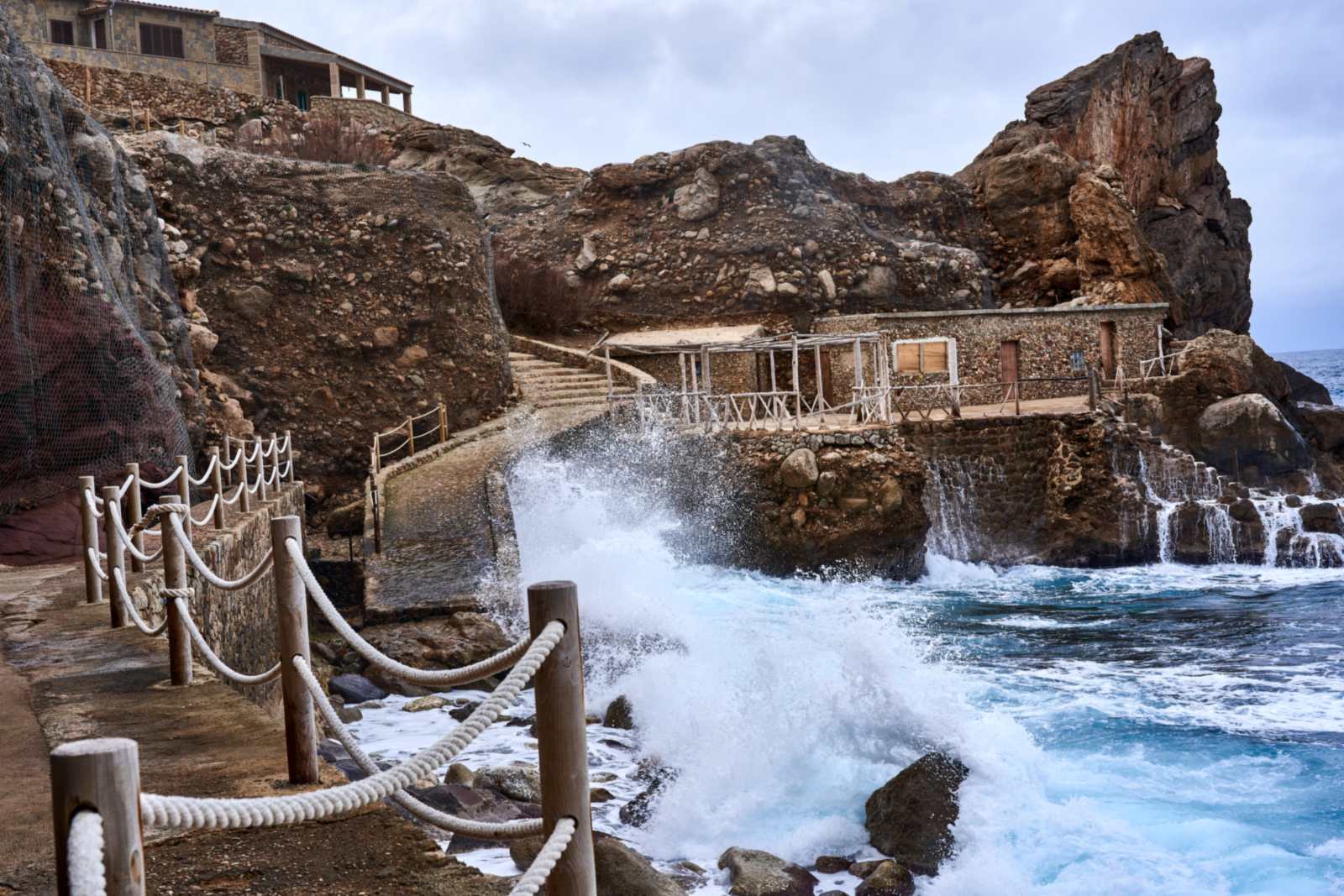
Strip away the gift-shop layer and the coastal shelf is deep. Seascapes proper: open water and sky, the oldest subject in landscape painting. Shorelines: the wet-sand margin where the tide writes and erases, foam edges, reflections. Dunes and beach grass, all wind and pale gold. Harbors and working boats, with their rigging, hulls, and weathered paint. Lighthouses, which survive their cliché status when treated as architecture in a landscape rather than as a symbol. And the wild cards: storm seas and fog, which trade prettiness for mood and suit grown-up rooms better than any sunny postcard.
Notice what is absent from that list: words, shells arranged into shapes, and navy-and-white stripes used as a substitute for a subject. A useful test for any coastal piece is to ask whether it would still work in a house that had never seen the sea. A true seascape passes — it is landscape painting whose land happens to be water. A piece that depends on announcing “beach house” fails, and it will date the room around it. Everything on that list stays above the waterline; what lives below it — whales, turtles, reef and coral — belongs to marine life art, the ocean below the surface.
Palette discipline: the muted coast
The coast’s real colors are mostly quiet ones. Fog grey and pearl. Sand, in shades from wet taupe to dry bone. Sea-glass green and the grey-blue of water under a clouded sky. Driftwood silver-brown. A restrained coastal palette pulls from that register, and it matters because these tones behave like neutrals in a room — they lower the heart rate of a space without emptying it. Navy has a place, but as an accent inside an image, the way deep water darkens at the horizon, not as a room-wide uniform.
This is also where coastal art earns its keep far from the coast. A muted seascape in a landlocked bedroom is not pretending the ocean is nearby; it is borrowing the horizon’s calm, the same way a mountain print borrows altitude. What dates a room is not the distance to the sea but the literalness of the reference. Choose the painting over the postcard and the question never arises. Coastal is one of the landscape-adjacent families in the subject overview this series opens with, where its calm is weighed against mountains, forests, and the rest.
The horizon line does quiet work
Within any seascape, the most consequential inch is the horizon. A high horizon — mostly water, a strip of sky — gives the image weight and presence; the sea becomes a field of texture you stand over, and the piece suits rooms where the art is the main event. A low horizon — mostly sky, a band of water — is air and weather, lighter and more contemplative, and it is the right choice when the wall needs calm more than it needs a focal point. A horizon placed dead center splits the image into two competing halves, which is why the strongest seascapes rarely do it. When a piece feels restful without your knowing why, check the horizon first; it is usually the reason.
The shoreline variant of the same idea is the waterline running diagonally — wet sand in the foreground, surf arriving at an angle — which leads the eye into the picture instead of letting it rest. Diagonal shorelines are the energetic end of an otherwise calm subject, and they are a good answer in rooms that found the straight horizon too still: a hallway, a family room, anywhere people move.
The working coast: harbors and boats
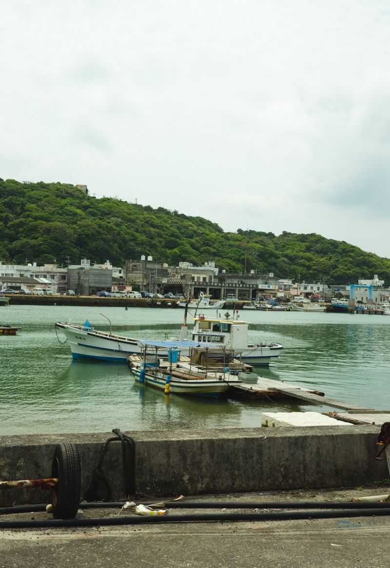
The coast’s second tradition is not scenery but livelihood, and it rescues the subject from prettiness altogether. Harbor scenes — masts massed against a waterfront, hulls at rest, rigging drawn against the sky — are studies in verticals and reflections, nearly abstract at a glance and full of incident up close. A single boat, weathered and particular, makes a portrait as characterful as any face. Working-coast art suits rooms that would find an empty horizon too bare: kitchens, studies, dens, the places where life is actually conducted. It is also the register in which lighthouses redeem themselves — as one structure among docks, rocks, and weather, doing a job, rather than posing alone as an emblem.
Choosing the weather in coastal wall art
Every coastal image has weather, and the weather sets the room’s register. Calm horizons — still water, level light, a horizon line running clean across the piece — are the minimalists of the subject: restful, architectural, ideal above beds and in rooms meant for unwinding. Moving water — surf, tide races, boats under sail — adds energy and suits living spaces and hallways, anywhere a room benefits from motion. Storm and fog are the dramatic register: greyer, deeper, and more contemplative, and a single large storm piece can anchor a room the way a portrait does, with weather instead of a face.
Match the weather to the room’s job rather than to your holiday memories. The bedroom that must help you sleep wants the calm horizon even if your favorite beach is a surf beach; save the breakers for the room where you entertain. It sounds obvious, and it is the single most common coastal mistake: choosing the image of the coast you love over the mood the room actually needs.
Rooms that take the coast well
The bathroom is the classic placement and a good one — water imagery in the room of water, in a palette that flatters tile and white porcelain — so long as the piece itself stays refined; a quiet shoreline study reads as a spa, a slogan reads as a joke. Which formats actually survive that room’s steam is a separate question, answered in bathroom art that handles humidity. Bedrooms take the horizon pieces. Hallways and stairwells, which are seen in passing and in sequence, suit shoreline studies hung as a pair or a three-part series: the tide at different hours, the same beach in different weather, a walk along the coast told in frames.
Around the art, the decorative scheme that flatters this subject is textural rather than thematic: linen, pale wood, woven grass, unglazed ceramic — materials the coast itself is made of — instead of nautical props. One exception proves the rule gracefully: a genuinely old object, a piece of real maritime salvage or a framed antique chart, has the authenticity that imitation props reach for and miss. If it is real, it belongs; if it is pretending, the painting will expose it.
The vintage shelf: paintings and posters
Coastal art also has a long memory worth borrowing. The nineteenth century made the seascape one of its grand subjects — marine painting with tall ships, harbor weather, and light studied like a science — and those images, reproduced as art, bring a gravity that photography rarely matches: the sea as it was imagined when it was still dangerous and essential. The railway-age seaside poster is the shelf’s lighter end: bold, bright, flat-color invitations to the coast, charming in kitchens and hallways where their cheer is a feature. Both registers share the subject’s core virtue — they are about the sea itself, not about announcing a lifestyle — which is why a century has not dated them.
Coastal art in modern rooms
A persistent worry is that coastal art belongs to a particular house — whitewashed, wickered, somewhere with sand in the drive. The muted seascape disproves it daily. In a modern room, a large fog-grey horizon piece is functionally a tonal painting: all field, atmosphere, and one clean line. It pairs with black frames, pale oak, concrete, and steel as happily as with linen and driftwood, because what the modern room asks of art is restraint, and restraint is this subject’s whole discipline. If your home is contemporary and the coast keeps calling, answer with the horizon, not the theme.
A last check before you choose
Run three questions over any candidate piece. Could it hang in a house a hundred miles inland without apology? Is its palette built from the coast’s quiet colors rather than its souvenir colors? And is the image doing the work — light, water, weather — instead of a caption doing it? Three yeses and you have real coastal wall art: seaside calm that never has to say the word beach, and a room that feels like the tide just went out and left it clean.
More in Subject Guides




Continue exploring: Subject Guides guides · All guides