

Photography Wall Art: Prints Like Windows
A good photo print works like a window, so judge it from where you'll actually sit — and match its size and surface to the detail it can honestly carry.
Key Takeaways
- Choose the job first: landscape photography deepens a room, street and architectural work wakes it up, and portrait photography keeps it company and changes its social weather
- Treat black-and-white versus color as structural: monochrome refuses to compete with a settled palette and unifies mixed sources, while color must sit inside the room's palette or become its voice
- Match size to the file honestly: bold shapes enlarge gracefully, but fine detail needs a high-resolution source or a more modest size, judged from the real viewing distance
- Match the surface to what the image is proud of: acrylic and metal serve clarity and graphic bite, while matte canvas or paper softens atmospheric images into something more painterly
A photograph on a wall makes a different promise than a painting does. It says: this place existed, this light really fell, this moment actually happened. That claim on reality is why photography wall art reads like a window — the viewer looks through the surface into a scene rather than at a surface that depicts one. It is also why photographs are unforgiving prints. The same literalness that creates the window exposes every flaw in the file, the printing, and the format choice. This guide walks through the photography subject on its own terms: the kinds of photographs that hold a wall, the black-and-white versus color decision, and the surfaces that serve a photographic image instead of fighting it.
Nothing here requires you to be a photographer. It requires only that you judge a photograph the way you would judge a window: by how clearly it shows you something worth seeing, and how little the glass gets in the way.
The three temperaments of photography wall art
Most photographs chosen for walls fall into three temperaments, and each asks something different of the room. Landscape photography is the window in its purest form: horizons, weather, and distance, printed large enough that your eye can travel into the scene. It suits rooms where people sit and stay — the picture gives the gaze somewhere to go while the mind rests. Street and architectural photography — the photographic core of cityscape wall art — is restless by comparison: geometry, signage, crowds, and the accidental compositions of built places. It brings energy and edge, and it holds up in hallways, offices, and kitchens where a serene vista would go unnoticed. Portrait photography is the most intimate of the three — a face on a wall changes the social weather of a room, which is why successful portrait prints are usually either family photographs with real meaning for the household or striking anonymous portraits treated as characters in the room’s story.
The temperament matters more than the specific image because it decides the print’s job. A landscape is asked to deepen a room; a street scene is asked to wake it up; a portrait is asked to keep it company. Choose the job first, and the right photographs announce themselves. It is the same job-first logic that organizes wall art subjects as a whole.
Black and white versus color is a structural choice
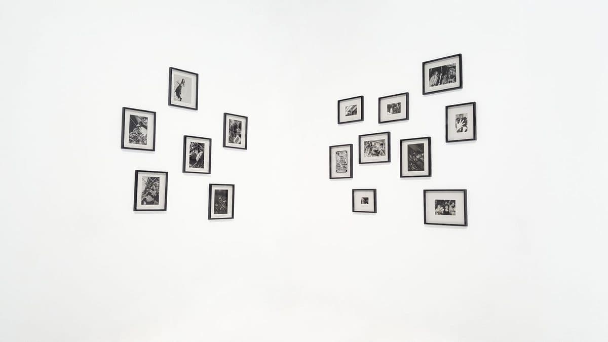
Stripping color from a photograph does not make it simpler; it makes it more architectural. Without color, the eye reads tone, shape, and texture — the bones of the image. Black-and-white prints therefore pair beautifully with rooms that already carry strong color in furniture and textiles, because the print refuses to compete. They also forgive mixed sources: photographs from different decades, cameras, and places hang together coherently once color stops insisting on their differences, which makes monochrome the natural choice for a collected wall.
Color photography makes the opposite wager. A color print lives or dies by its palette — the exact green of a field, the sodium orange of a night street. When it works, the photograph becomes the room’s color source, the thing cushions and rugs quietly answer to. When it fails, it fails by clashing in a way a monochrome print never can. The practical rule: if the room’s palette is settled and loved, lean monochrome or choose color photographs already inside that palette. If the room is neutral and waiting for a voice, a confident color photograph can be that voice.
Sharpness, grain, and the size question
Every photograph has a size beyond which it stops looking like a window and starts looking like an enlargement. Detail that reads as crisp at arm’s length dissolves at three feet across if the original file did not carry enough information — edges go soft, fine texture turns to mush, and digital noise, invisible on a screen, prints as grit in smooth skies and shadows. This is not a reason to fear large photographic prints; it is a reason to match the image to the size honestly. A photograph with bold shapes and simple tones enlarges gracefully. A photograph whose pleasure is fine detail — foliage, crowds, distant windows — needs either a genuinely high-resolution source or a more modest size.
Grain deserves a kind word. Film photographs and high-sensitivity digital shots carry a texture that is part of their character, and printed at a sympathetic size it reads as atmosphere rather than error. The distinction is intention: grain that belongs to the image feels like weather; blur that comes from enlargement feels like a mistake. Stand at the distance the wall will actually be viewed from — across the room for a large print, not with your nose to it — and judge there.
Surfaces that serve photography wall art
A photograph’s window effect depends on the surface staying out of the way, which is why smooth, glossy formats flatter it. An acrylic print mounts the image behind a polished sheet, and the depth of that layer gives photographs a luminous, backlit quality — skies glow, water deepens, and the scene feels lit from within. It is the closest a print comes to a screen’s brightness while remaining a physical object. The cost of the polish is reflection: acrylic mirrors the room’s windows and lamps back at the viewer, so its best walls are lit evenly rather than facing a bright window head-on.
A metal print takes the same smooth logic in a tougher direction. The image sits in the surface of an aluminum panel, producing saturated color and crisp edges with no glazing at all. Photographs with strong graphic content — architecture, night scenes, hard shadows — keep their bite on metal, and the panel shrugs off the humidity and handling that kitchens, bathrooms, and busy hallways dish out. Softer photographs can feel hardened by it; a misty, low-contrast landscape may prefer a matte surface that matches its mood.
Matte surfaces — canvas and fine art paper — are not wrong for photography, but they change the contract. Texture softens the window into something more like a memory: gentler, more painterly, less literal. For atmospheric photographs that trade in mood rather than detail, that softening is a feature. For a photograph whose whole point is crystalline clarity, it is a tax. Match the surface to what the image is proud of.
Choosing photographs you did not take
Most photographic wall art is someone else’s seeing, and choosing it well means borrowing their eye deliberately. Look first for a point of view: a photograph taken from the obvious overlook is a souvenir, while one taken from a considered position — low against the water, inside the crowd, through the weather — is an interpretation. Interpretations age better on a wall because they give you something to keep discovering. Look, too, for photographs that leave space in the frame: an area of sky, water, or shadow where the eye can rest. Wall-sized images are lived with at close range and long duration, and relentless detail at that scale tires like a loud room.
A word on honesty in sources. A photograph offered as a print should be the photographer’s to sell — licensed through a gallery, a stock library, or the maker directly — and its resolution should be the file the photographer actually captured, not an upscaled copy of a small image found online. The window effect depends on that integrity: detail that was never in the file cannot be printed into it, and a print made from a scavenged thumbnail will look exactly like what it is the moment it reaches wall size. Your own photographs travel the opposite route, and the photo to canvas guide walks it from file to wall.
Hanging photographs so they read as windows
Because photography wall art claims to be a view, its framing and placement work best when they support the illusion. Thin borders or frameless formats keep the scene’s edge from feeling like a picture frame around a picture. A generous white border, borrowed from gallery practice, does the opposite job deliberately — it announces the photograph as a considered object, which suits smaller prints and collected walls. Either can be right; mixing the two treatments randomly in one room rarely is.
Light deserves the last word. A photograph printed from a luminous scene wants even, moderate light — enough to open its shadows, not so much direct sun that its tones fade unevenly over the years. Hang the window where you would enjoy a real one: opposite a seat, at the end of a sight line, where the eye lands when it looks up from a book or a desk. A photograph given that wall will do what no other kind of picture quite does — it will make the room feel larger than its own four walls.
More in Subject Guides

Continue exploring: Subject Guides guides · All guides