

Map Wall Art: Places That Mean Something
Pick the place with a story over the prettier coastline, then print it large enough to actually read — a map too small to follow has stopped being a map.
Key Takeaways
- Choose by biography first: hometown, a great year, a family origin, or an aspirational place you are planning toward will hold attention longer than a beautiful map of somewhere meaningless to you
- Commit to a scale: go large enough for street names and features to be findable without squinting, or embrace a large world map as pattern at distance and document up close — avoid the in-between size
- Read coverage, date, and lettering before buying: check that your place is not at an edge or under the title block, that the date fits your story, and that the source scan is full quality
- Resist pins and dots: marking travels on the map turns it into a scoreboard and leaves permanent holes — keep the record in a journal or in separate place prints instead
A map is the only picture that is also a document. Hang one, and the wall holds two pleasures at once: the graphic beauty of coasts, contours, and street grids, and the standing invitation to lean in and find somewhere. Map wall art is chosen by the heart more than by the eye — the place is the point — which makes it the most personal of subjects and, handled well, the most rewarding to live with. This guide covers the map subject in its own right: the families of maps worth framing, how scale and presentation change what a map does in a room, and how to build a wall of places that mean something.
The families of map wall art
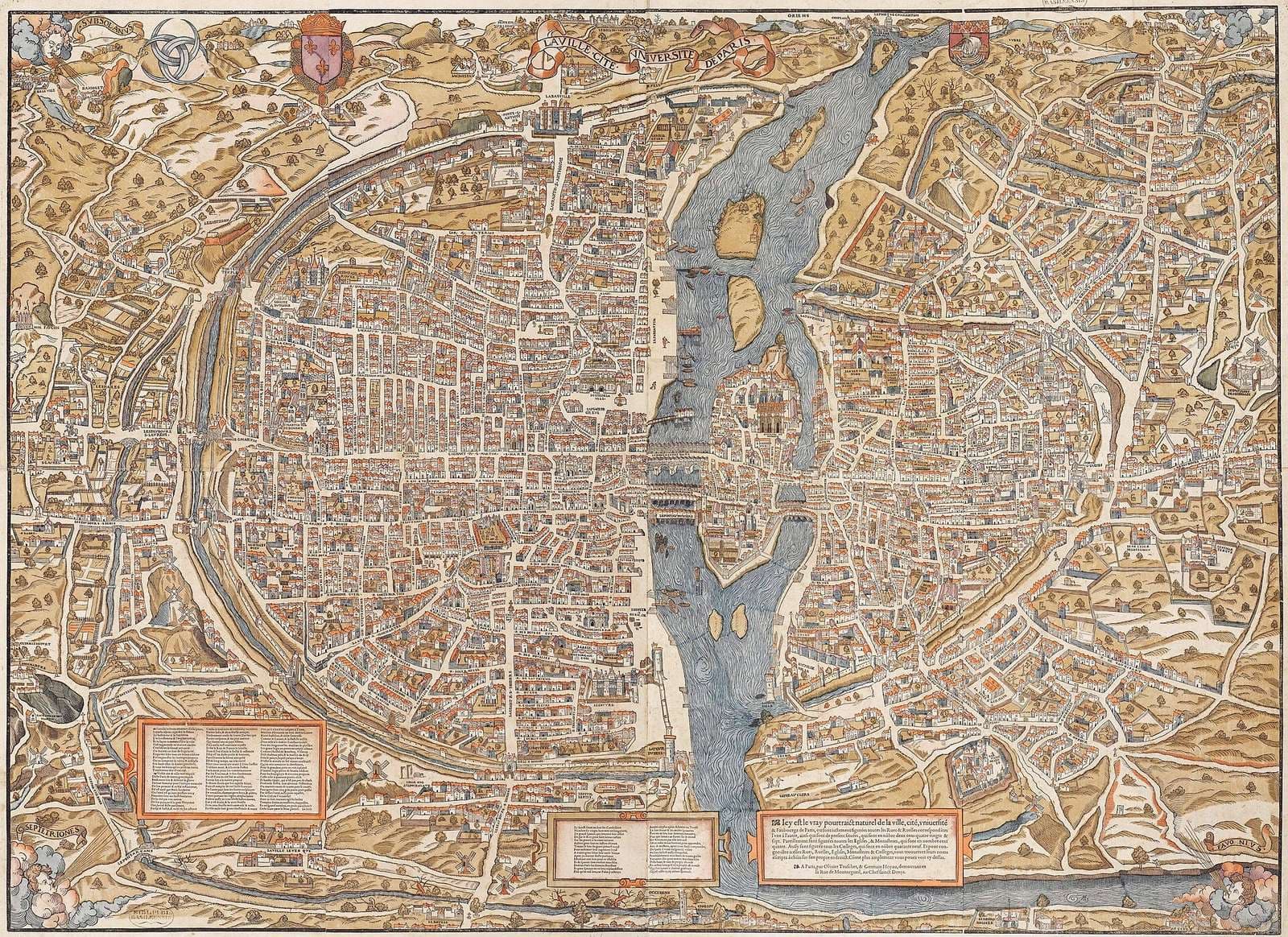
Vintage charts and antique maps are the romantics of the family: hand-colored coasts, ornate cartouches, sea monsters in the empty water, and the confident wrongness of old geography. Their palettes — parchment, sage, faded rose, ink blue — sit comfortably in traditional and eclectic rooms, and their slight inaccuracies are part of their charm: they show a place as an earlier age imagined it. City plans are the graphic moderns: a street grid read from above becomes pattern, and a familiar city becomes an abstraction you can still navigate. World and regional maps are the surveyors — political, physical, or antique in style — and they bring scale and overview, the wall as atlas page. Specialist maps complete the family: nautical charts with their soundings and rhumb lines, topographic sheets whose contour lines ripple like fingerprints, transit diagrams, and star charts for the sky-minded.
Each family rewards a different kind of looking. Vintage maps reward the wanderer’s gaze, drifting across detail. City plans reward the detective, hunting a street, a park, a first apartment. Charts and topographic sheets reward the practitioner — the sailor and hiker read them as instruments still. Choose the family whose kind of looking you want to do daily. It is the same choose-by-kind method the series applies to subjects for a wall of every kind.
The place is the point
Maps are bought by biography. The strongest map walls are indexes of a life: the hometown, the city of a great year, the coastline of every summer, the country a family came from. This is why a map of a place you have never been can feel oddly inert despite its beauty — the graphic pleasure is real but the second pleasure, recognition, never fires. When in doubt, choose the place with the story over the place with the prettier coastline; you will look at the story for years.
There is a courteous exception: the aspirational map. A place you are saving for, studying toward, or dreaming into a plan works on a wall because the recognition is prospective — the map is a promise you get to look at. Aspirational maps hang best where plans are made: the desk wall, the kitchen’s planning corner, places where a promise is fuel rather than decoration.
Scale: a map must be readable to be art
Maps live on detail, and detail sets their size floor. A city plan printed too small becomes wallpaper pattern — attractive, but the map has stopped being a map. Judge a candidate by standing at the wall’s real viewing distance: street names and features you care about should be findable without squinting. That usually argues for going larger than instinct suggests, or for choosing a map drawn at a bolder scale — a harbor chart of one bay rather than a whole coast, one district rather than a whole city.
Alternatively, embrace pattern honestly. A world map large enough to dominate a wall is pattern at room distance and document at close distance — both pleasures, sequenced. It is the small, in-between map that fails: too detailed to read as pattern, too small to read as a map. Commit to a scale, in either direction, and the piece works.
Reading a map before you buy it
A few minutes of close reading separates a map you will study for years from one you will stop seeing. Check the coverage: does the sheet center on the ground you care about, or does your neighborhood fall at a crease, an edge, or under the title block? Old survey sheets were drawn for their makers’ purposes, and the place you love may be literally marginal in the original. Check the date against the story: a hometown map from before the highway, or a city plan from the year of a great trip, carries a time layer as personal as the geography. And check the lettering and ornament: hand-lettered legends, compass roses, and border work are where the draughtsman’s art lives, and they are what you will be admiring at close range.
Provenance deserves one honest paragraph. Genuine antique maps are wonderful and priced like antiques; high-quality reproductions of public-domain originals are how most map walls get built, and there is no shame in them — the geography is identical and the artistry survives printing. What matters is honesty about which you are buying and a reproduction printed from a full-quality scan, because map detail, of all subjects, exposes a poor source file the moment it is enlarged. A blurry map is a broken promise: the whole point was that you could lean in.
Presentation: paper, pins, and restraint
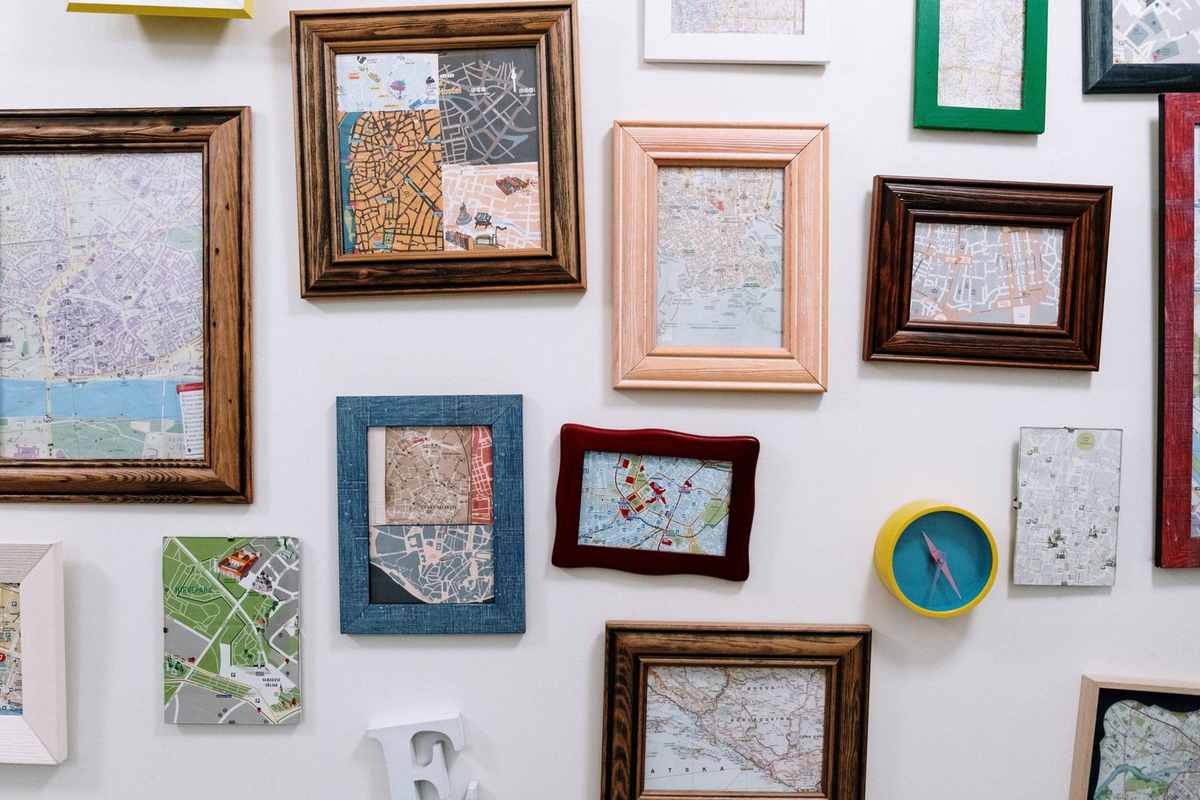
Maps were made on paper, and paper remains their most sympathetic surface. A fine art paper print under a mat, in a simple frame, presents a map the way archives and map rooms do — as a document of value — and the mat’s border separates the map’s busy edge from the wall. Dark wood or black frames suit the antique palette; pale wood and white suit modern city plans. The long tradition of hanging charts unframed, on battens or dowels, gives a room a workshop ease that suits studios and kids’ rooms, where the map is a tool as much as a picture.
One discipline: resist the pins. Marking traveled places with pins or dots is satisfying for a month and then the map becomes a scoreboard, its geography upstaged by the tally — and the holes are forever. If the record matters, keep it in a journal, or let a growing collection of separate place prints do the recording. The map itself stays timeless, the way places are.
Map wall art for children, travelers, and the rooted
Different owners ask maps for different work. For a traveler, the map wall is a planning instrument and a trophy case in one — expect it to migrate toward the desk and the door, and to grow. For a rooted household, one deep map does the work: the county, the watershed, the city, studied the way you study a family photograph, its pleasure in exhaustive familiarity. For children, the map is the rare wall art that teaches while it decorates; choose one drawn clearly and hung low, and let questions about it become a household habit. None of these uses is the decorative default of filling a bare wall prettily — though a good map does that too, it is the least of what it does.
Where maps earn their wall
The home office is the map’s headquarters: reference, inspiration, and a background that tells callers exactly who they are talking to. Hallways are the map’s gallery — a passage gives a sequence of places the time and closeness they reward — and kids’ rooms gain a quiet geography education from a good world map hung at their height, treated as furniture for curiosity rather than decor to be kept pristine. The office’s full treatment — focus on the wall, calm on the call — is the home office wall art guide’s whole brief.
Build a collection the way you built the biography: one place at a time, in a consistent presentation, with sizes varied by importance rather than by accident. A wall of map wall art assembled that way is the rarest kind of decoration — one that could belong to no one else on earth.
More in Subject Guides


Continue exploring: Subject Guides guides · All guides