

Sports Wall Art That Grows Up
The test is simple: a guest who ignores the sport should still admire the picture — stadium light, vintage design, or a peak moment, framed like any other art.
Key Takeaways
- Choose images first, allegiance second: stadium and arena photography, vintage posters and programs, and near-abstract action studies pass the test that novelty merchandise fails
- Curate rather than display merchandise: edit to a few strong pieces linked by one thread — a team's history, a stadium, an athlete, or a family's seasons — in identical, simple frames
- Hold shared rooms to normal art standards: one major piece or a disciplined gallery series at eye level with breathing room, and keep the home office to a single restrained piece
- Pick each sport's home-ground strength: baseball for architecture and geometry, golf for landscape, basketball for vertical grace in black and white, and individual sports for portrait-like images
Sports loyalty is one of the most durable attachments a person owns — it outlasts furniture, paint colors, and most hobbies — so it deserves wall art that can keep up. The trouble is the subject’s reputation: sports decor is filed in most minds under dorm rooms and basement caves, all foam fingers and novelty signs. That reputation is undeserved. Handled with the same seriousness as any other subject, sports wall art can be photography, design, and history of real quality. This guide makes the case inside the sports subject alone: the forms that grow up gracefully, and how to style them for rooms adults actually live in. It is one case of the general decision — choosing the subject of your wall art— taken up across every subject in this series.
Sports wall art: the three forms that grow up
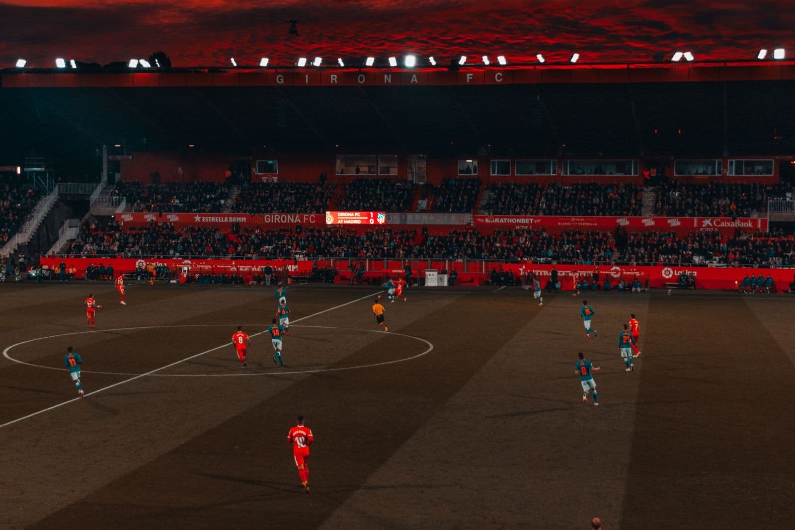
Stadium and arena photography leads the grown-up forms because its real subject is architecture and light. A great ballpark or arena photograph — the bowl at dusk, the field geometry from high up, an empty stadium in morning quiet — is a landscape wearing a team’s colors. It carries loyalty for the fan and pure composition for everyone else, which is exactly the double life a shared room needs. Vintage posters and programs are the second form: event posters, program covers, and ticket-era graphics from earlier decades, drawn in the bold flat styles of their day. Age converts advertising into folk art, and a framed vintage piece reads as design history that happens to be about your team or your game.
Action studies complete the set: the athlete at the peak of a motion, shot or drawn with a photographer’s patience. The best action images are nearly abstract — a diver’s line, a sprinter’s extension, a boxer’s geometry — and they reward large printing and plain presentation. What all three forms share is that they are images first and allegiance second. A guest who cares nothing for the sport can still admire the picture; that is the whole test, and novelty merchandise fails it. Music wall art is held to the same test, and passes it the same way.
Allegiance without the gift shop
The line between a collection and a merchandise display is curation. A merchandise display shows everything the team store sells; a collection shows what the fan chose, and choice is visible in editing: a few strong pieces, each earning its space, related by a real thread — one team’s history across decades, one stadium’s evolution, one athlete’s career, one family’s seasons. Frames do half the dignifying work. Identical, simple frames turn mixed pieces — a poster, a photograph, a program cover — into a considered series, while leaving each piece in whatever frame it arrived in advertises that no decision was ever made.
Color offers a quieter route to loyalty. A room dressed in a team’s palette — deep green and gold, navy and white — with art that is merely great sports imagery reads as fandom to those who know and as good decorating to those who don’t. It is the difference between wearing the jersey and commissioning the portrait: both are loyalty, at different volumes, and a home usually wants the portrait’s volume in its shared rooms.
Rooms that listen to the game
The den and the living room remain the subject’s headquarters — the rooms where the game is watched are where its art belongs — but the styling there should follow the room’s other art rules, not the cave’s. One major piece over the main seat, or a disciplined gallery series on the side wall, sized and spaced like any fine group. Sports art fails in living rooms only when it is excused from the standards every other subject meets — the eye-level heights, the breathing room, the single clear focal point that any painting would be granted without a word of argument.
The kids’ room is the subject’s most joyful territory. A young fan’s wall can carry the poster bright and literal — this is the one room where allegiance-first is correct — and sports imagery there doubles as aspiration: the player they study, the stadium they mean to see. Choose pieces that can graduate: a strong stadium photograph or a fine action study bought for a ten-year-old will still be right at eighteen, long after novelty pieces have been outgrown twice. The general subject — art that can grow up with its owner — is the whole brief of the kids’ room wall art guide in this series.
The home office takes the subject’s most restrained cut: one vintage program or a single architectural stadium print, framed like the art it is, says everything a professional room should say about the fan who works there. It is also a reliable pleasure on a video call — a piece with a story that takes ten seconds to tell. Keep the office to one piece; fandom there is seasoning, and the work is the meal.
Sports wall art, sport by sport: what photographs best
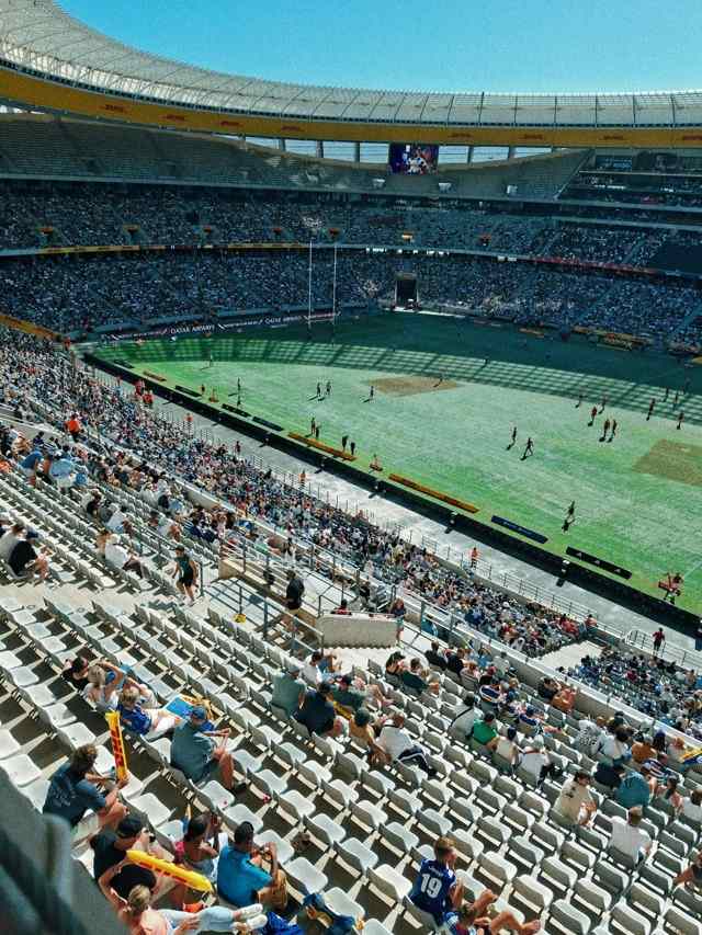
Each game offers the wall something different, and picking a sport’s home-ground imagery beats generic action. Baseball gives architecture and geometry — the diamond’s perfect diagram, outfield walls, evening light across grass — and it is the most decorative of the major sports on a wall. Football and rugby give mass and collision, better in drawn or vintage treatments than in glossy modern photography. Basketball gives verticality and grace, the game of the extended body, superb in black and white. Golf gives landscape outright — its courses are scenery with flags in it — and its imagery slides into any room that takes landscape art. Racing gives speed lines and machine beauty; boxing and the individual sports give the loneliest and most portrait-like images of all, one figure against the whole contest. Choosing within your sport’s strength keeps the wall from looking like a highlights reel and makes it look, instead, like a student of the game lives there.
Sizing follows the image’s nature. Architectural and landscape sports images enlarge like the scenery they are; action studies enlarge until their grain or blur shows, and no further — a frozen moment printed past its file looks like a paused screen, the one effect guaranteed to cheapen it. The vintage pieces print at their natural poster sizes and look wrong enlarged past them, as if the paper itself objects.
A note on memorabilia honesty
Sports wall art and memorabilia are cousins, not twins. A signed or game-used object is a relic whose value is history; a print is an image whose value is looking. Trouble starts when prints pretend to be relics — facsimile signatures, manufactured “limited” claims, imagery lifted from broadcasts. Choose prints that are honest about being prints: real photography, real poster art, openly reproduced. Your own ticket stubs and photographs, framed plainly beside them, supply all the authenticity the wall could want, because they are yours.
One more setting earns a mention: the hallway and the stairwell, the house’s parade route. A sequence of program covers or season posters climbing the stairs turns the daily walk into a review of years — the household’s history told in fixtures. Keep the frames light, the spacing metronomic, and let chronology do the arranging; it is the one gallery order every visitor can read without a word of explanation.
Fandom, stated with that much care, stops being a phase a room goes through and becomes what it actually is: one of the oldest stories a household tells about itself. Hang it like you mean to keep it — because you will.
More in Subject Guides



Continue exploring: Subject Guides guides · All guides