

National Parks Wall Art: Poster or Photo
Build it at the speed of your travels, one park at a time, and let the empty spaces stay — they're part of the record, not a set to complete.
Key Takeaways
- Pick a lead tradition early: poster-style prints read as a designed, nostalgic wall, while photographs read as an immersive window wall — let one dominate and use the other only as an accent
- Resist completing the set: one print per park that matters, starting with the strongest memory at the largest size, reads as autobiography rather than merchandise
- Use geography as layout if you group prints: hang parks roughly where they sit on the land, keep frames consistent and spacing even, and keep groups to about four to seven prints per wall
- Frame posters to the sheet, not the scene, so printed borders and title blocks keep their intended proportions, and use clean, simple frames for both traditions
Some wall art is decoration, and some is testimony. A piece of national parks wall art says I stood there — or I mean to stand there — and that double meaning is what makes the subject endure. The parks themselves are grand, varnished subjects: granite valleys, carved canyons, geysers, dunes, and forests that photograph and illustrate beautifully at almost any scale — the high parks shade into mountain wall art outright. This guide covers the national parks subject in depth: the two great visual traditions it offers, how to build a collection that grows with your travels, and how to hang parks together without turning a wall into a gift shop.
National parks wall art: the poster and the photograph
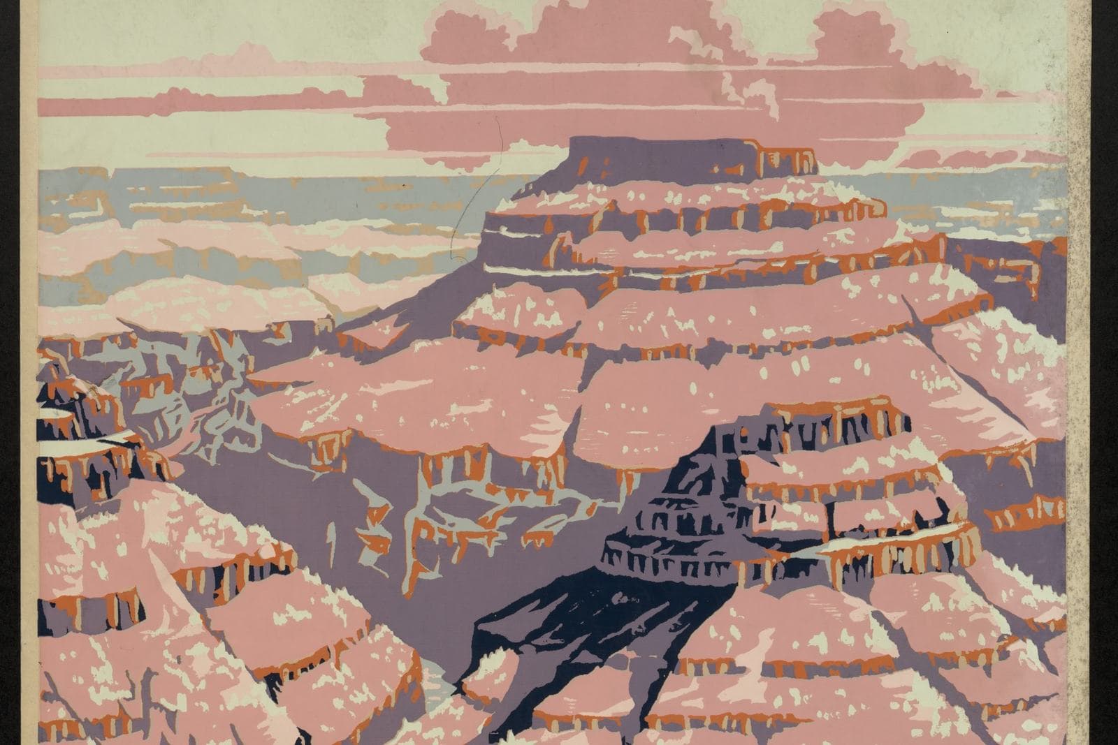
The older tradition is the illustrated poster. In the 1930s and early 1940s, government arts programs commissioned artists to render the parks in bold, flat color — silkscreened scenes with a limited palette, strong shapes, and lettering built into the design. Those images have outlived their original purpose because their style is honest about being art: a poster of a canyon is a composition first and a record second. Originals from the era are public-domain works, and modern artists continue the idiom with new parks and fresh compositions in the same spirit. Poster-style prints bring graphic punch, retro warmth, and a palette that behaves well in rooms — flat color fields do not fight furniture the way a busy photograph can.
The younger tradition is the photograph: the parks shot at dawn, in storm light, under stars. Photography trades the poster’s design discipline for presence — you are looking at the actual place, with weather in it. The two traditions suit different rooms and different owners. A poster collection reads as a designed wall: coherent, cheerful, a little nostalgic. A photographic collection reads as a window wall: immersive, quieter, more about the places than the pictures. Choosing a lead tradition early is the single best decision in building a parks wall, because each park you add afterward joins an existing visual argument instead of starting a new one.
Mixing is allowed — with one rule. Let one tradition dominate in count and size, and treat the other as an accent: a single photographic print among posters, or one bold poster anchoring a photographic group. Parity is what looks accidental; hierarchy is what looks collected.
Building the national parks wall art collection over time
The natural way to collect parks art is the honest way: one print per park that matters to you, acquired as the connection forms. A wall that grows at the speed of your actual travel carries its meaning in its gaps — the empty space where a future park will go is part of the story. Start with the park that owns your strongest memory and give it the largest, best-placed print. Let it set the tradition, the palette, and the framing treatment that later arrivals will follow.
Resist completing the set. A wall showing every park in identical frames reads as merchandise; a wall showing the six parks woven into your life reads as autobiography. The exception is a deliberate map logic — parks chosen to trace a route you drove, a region you call home, or a coast-to-desert transect — where completeness is the concept rather than a shopping list. Even then, vary the image choice within the frame system: repeated identical compositions flatten the wall, while varied scenes keep each park’s character in view.
The gallery wall that works like an atlas
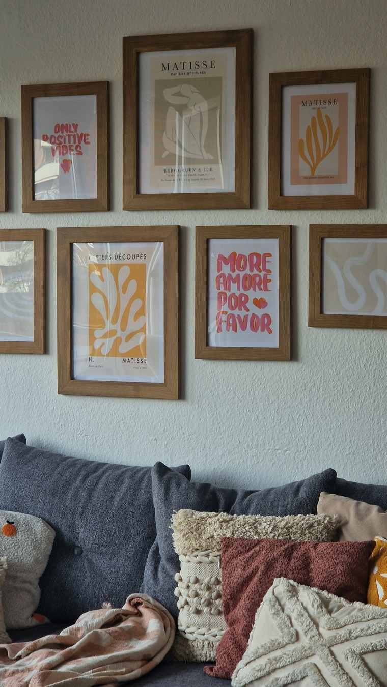
Parks art invites one arrangement other subjects do not: geography as layout. Hang the prints in roughly the positions the parks occupy on the land — western parks to the left, eastern to the right, north high and south low — and the wall becomes a loose atlas a viewer can read. The scheme needs no precision to work; it rewards the people who know the map with a quiet second layer of order, and everyone else simply sees a balanced group.
A literal map can hold the arrangement together. One map print of the country or a region, placed at the group’s center or edge, gives the parks a reference point and turns the wall into a travel ledger guests will study. Keep the frames consistent, spacing even, and let the images vary — that contrast between a tidy system and wild contents is exactly the pleasure of the genre.
Scale the group to the wall with restraint. Parks images are scenery, and scenery connects to the wider landscape tradition — each print is already a view. Four to seven prints in a group usually saturate a domestic wall; beyond that, split the collection by region or era and give each its own wall rather than crowding one. Taken one park at a time, each print is also a landscape, and the landscape wall art guide covers that wider subject — the outdoors at eye level, park boundary or none.
One big park, or many small ones
Not every parks wall is a collection. A single large print of one beloved park makes a different and equally valid statement: this is the place. Given a statement wall, a photograph usually serves better than a poster — its scale and realism turn the room toward the view — while a large poster works as graphic design, its flat color and lettering holding a wall the way a sign does, cheerful and bold. Whichever you choose, a single print earns a cleaner field around it than other subjects do: parks scenery is visually rich, and neighboring art tends to read as competition.
Poster-style prints carry one extra consideration: lettering. The park’s name is part of the design, in period type that does half the nostalgic work. That is a pleasure in a hall, den, or office, and a commitment in a quiet bedroom — text on a wall is read every time it is seen, so be sure the word it keeps saying is one you want said daily. Photographs make no such demand, which is why they suit the rooms where you unwind and posters suit the rooms where you arrive, plan, and pass through.
Seasons offer a final axis of choice. The same park in snow, in wildflower season, and under autumn color is effectively three subjects. A collection can honor that by showing one park across its year instead of many parks in their postcard summer — a narrower, deeper kind of park pride that frequent visitors recognize immediately.
Where parks art hangs best
National parks wall art thrives in rooms with a journey in them: hallways and stairwells, where the wall unrolls as you walk; dens and studies, where the prints feed the next plan; kids’ rooms, where a park over the bed is an ambition as much as a picture. They also carry a public, shared quality that suits entryways — the parks belong to everyone, and guests read them as an open invitation to trade travel stories, which is the best work an entryway picture can do.
One practical note on framing poster-style pieces: the poster idiom often includes a printed border or a title block inside the image itself. Mat and frame choices should respect that built-in margin rather than crop or cover it — frame to the sheet, not to the scene, and the print keeps the proportions its designer intended. Clean, simple frames suit both traditions; ornate ones argue with scenery and almost always lose.
Judge any candidate print by a simple test: does it make you want to go, or go back? A parks picture that passes that test will keep passing it daily, which is more than most decoration can promise. Build slowly, frame consistently, and let the wall keep the record of where you have been — and leave it room for where you haven’t. The wall will fill at exactly the right speed: the speed of the life it is recording, one trail, one road, one return trip at a time. Underneath the parks themselves sits the first choice any wall asks for — choosing wall art by subject, which this series treats as a subject in its own right.
More in Subject Guides


Continue exploring: Subject Guides guides · All guides