

Landscape Wall Art: Outdoors at Eye Level
A good landscape works like a window the room never had. Learn to judge its horizon, its layered depth and its light before you fall for the view itself.
Key Takeaways
- Start with the horizon: a low horizon gives the image to the sky and feels airy and restful, while a high horizon fills the frame with land and feels grounded and abundant.
- Check for three depth layers — a foreground the eye can step into, a middle ground where the main event lives, and a background that pales into distance; a missing foreground is why pretty scenes read flat.
- Match the picture's light to the room's: a bright meadow can lend light to a dim, north-facing room, while a misty, low-contrast scene can calm a room that already glares.
- Treat the season in the frame as a thermostat: snow cools a room, spring greens lighten a heavy one, and autumn's golds and russets act almost like accent colours that can argue with reds and oranges already present.
- Decide whether the room needs a mood or a place: painted landscapes usually deliver the stronger mood, photographed ones the stronger, more literal sense of place.
Landscape wall art is the oldest subject there is, for a simple reason: it does the one thing a wall cannot do for itself — it opens a view. Every other subject sits on the wall; a landscape reads as a space beyond it, a window the room did not come with. That illusion is not magic. It is built from a handful of learnable parts — a horizon, layers of depth, a quality of light — and once you can see those parts, choosing a landscape that suits your room stops being guesswork and becomes a short series of decisions.
This guide stays with the subject itself: what makes one landscape feel deep and another flat, why the shape of the image matters as much as the scene, and how the light in the picture should answer the light in the room. Sizing ratios and hanging heights belong to other guides in this series; here we are learning to see the picture. And if you are still deciding which subject family the room wants at all, start with choosing a subject for your walls, which maps the families before you narrow to one.
Landscape wall art: the horizon does the heavy lifting
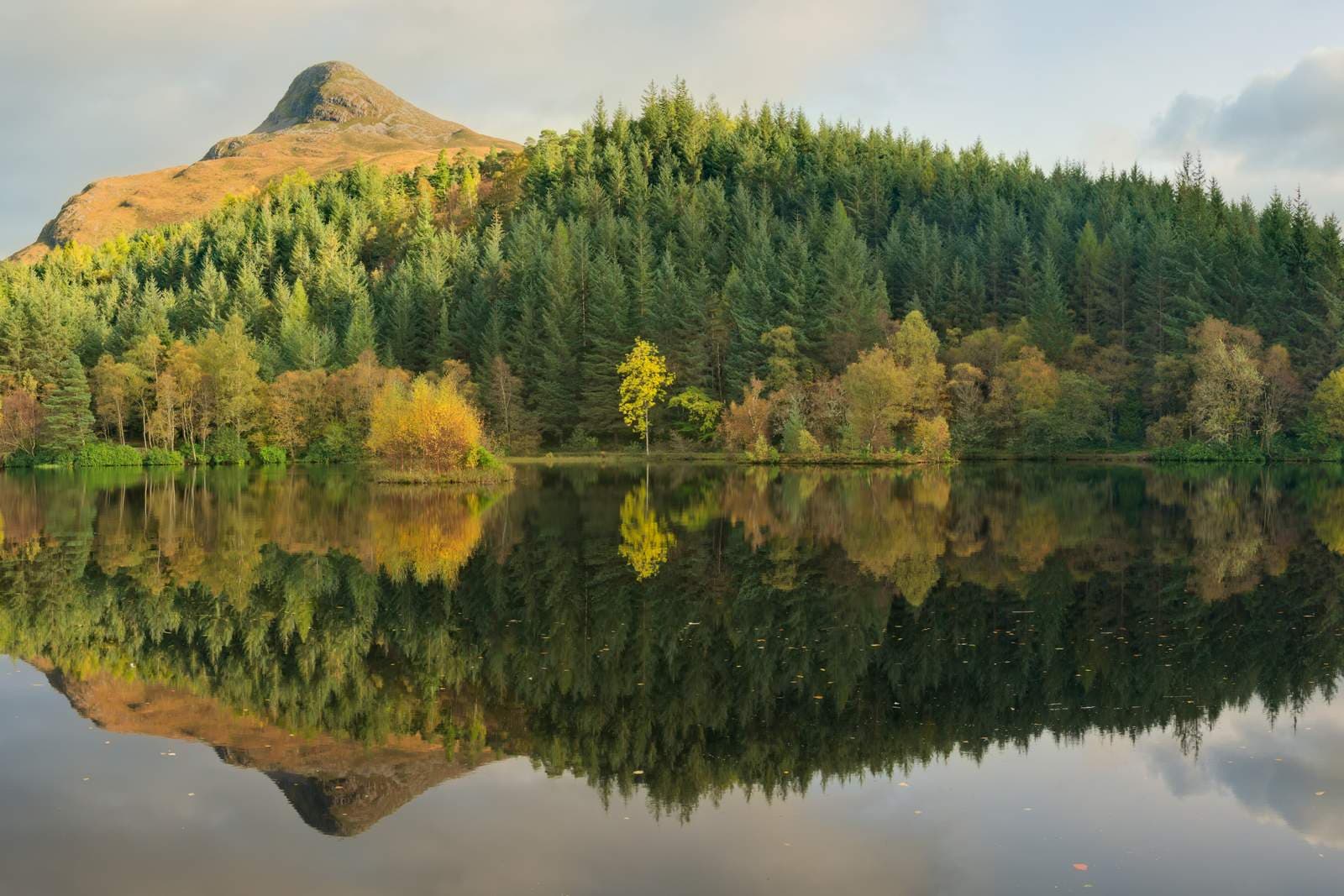
Nearly every landscape is organized by its horizon line, and where the painter or photographer places that line decides what the picture is mostly about. A low horizon gives the image to the sky: big weather, drifting cloud, the pale gradients of dawn and dusk. Low-horizon landscapes feel airy and restful, and they give a room the sense of headroom — a useful gift in a space with a low ceiling or heavy furniture. A high horizon does the opposite: the land fills the frame, and you look into fields, water, or streets rather than up at the heavens. High-horizon pictures feel grounded and abundant; they carry more detail and reward a longer look.
Neither is better — they are different postures. A simple test when you are choosing: ask whether your room needs to breathe (choose the sky) or to settle (choose the land). And watch for images where the horizon sits awkwardly halfway with nothing happening on either side; the composed landscapes keep a clear two-thirds-to-one-third argument between earth and sky.
Depth is built in layers
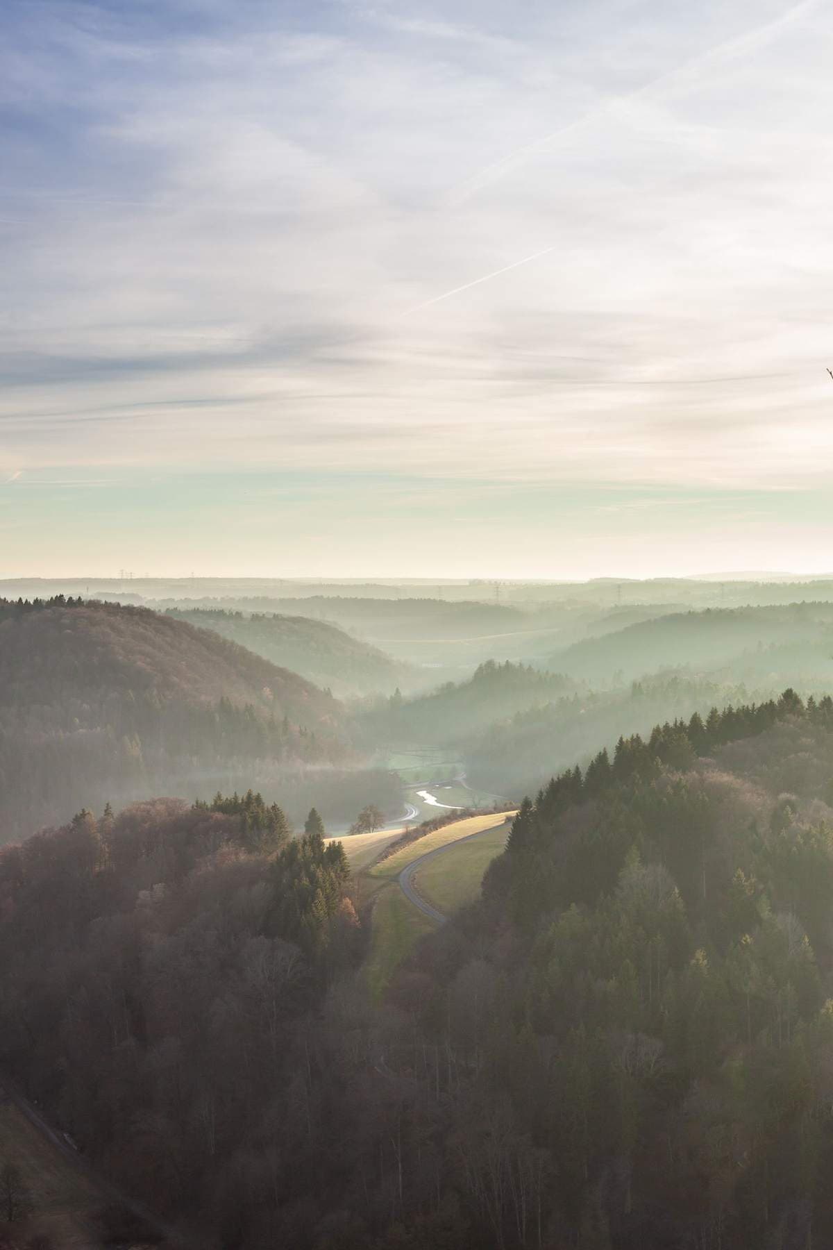
The window illusion depends on depth, and depth in a landscape is almost always built from three layers: a foreground that starts the eye’s journey, a middle ground where the main event lives, and a background that dissolves into distance. Photographers use a shoreline, a fence line, or a shadow; painters have used a dark repoussoir tree or a river bend for centuries. If an image ever feels oddly flat despite a pretty scene, it is usually missing its foreground — the eye has nowhere to step in.
Distance also has a color. Far hills go blue-grey and pale because the atmosphere itself tints them, an effect called aerial perspective, and landscapes that honor it feel genuinely deep. Images where the far ridge is as saturated and contrasty as the front field can look striking and graphic, but they read as pattern rather than place — fine if pattern is what you want, disappointing if you wanted the window.
Match the picture’s light to the room’s
A landscape carries its own weather into the room, and the match between the two is the most overlooked part of choosing one. A dim, north-facing room can borrow light from a bright, high-sun meadow or a snowfield; the picture becomes a second light source in feel, if not in fact. The same image in an already glaring room can feel like one window too many. Conversely, a misty, low-contrast landscape — morning fog on water, soft hills under cloud — calms a bright room down and pairs naturally with evening lamplight.
Time of day in the image sets the mood in the room. Golden-hour scenes bring warmth and a settled, end-of-day register; midday scenes are honest and energetic; the blue hour is contemplative, nearly nocturnal. Pick the hour you want to live with at the times you actually sit in that room — most people view their living-room art in the evening, and a landscape that glows at dusk in the picture will echo the lamps coming on around it.
Seasons change the room’s temperature
Every landscape also imports a season, and seasons are a quiet kind of thermostat. A snow scene cools a room in every sense — its blues and whites make warm-toned furnishings feel warmer by contrast, but in a room that already runs cold and grey, one more winter can tip it chilly. Spring and early-summer landscapes carry the freshest greens and the lightest mood; they are the classic choice for rooms that feel heavy. High summer is saturated and sleepy at once, all deep green and haze. Autumn is the boldest import: its golds and russets act almost like accent colors in the room, which is why an autumn landscape should be chosen with the existing palette open in front of you — it will argue with reds and oranges already present, or flatter them beautifully.
There is no rule that the season inside the frame must match the season outside the window; plenty of people hang a deep-winter scene precisely to enjoy in August. The point is only to notice that you are choosing one, and that you will live with its temperature in every month of the year.
Landscape wall art, painted or photographed?
Landscapes arrive in both media, and they behave differently. A painted landscape interprets: the artist has already edited the scene, softened what didn’t matter, and pushed the color toward a feeling. Painted views tend to sit calmly in traditional and layered rooms, and their brushwork gives a close-up reward that keeps the picture alive at arm’s length. A photographed landscape testifies: this place, this light, this exact morning existed. Photographs read as windows more literally, suit modern and uncluttered rooms, and hold their authority at large sizes where fine detail — surf, scree, forest edge — stays convincing. When the forest itself is the view rather than the edge of one, forest pictures and their green depth get a guide of their own.
A useful question when torn: does the room need a mood or a place? Paintings are usually the stronger mood; photographs are usually the stronger place. Neither is more “real” art than the other — the landscape tradition is centuries older than the camera, and the camera extended it rather than replacing it.
Shape: why landscapes love a wide wall
The classic landscape is horizontal because the land is: horizons run sideways, and the eye reads a wide image the way it reads an actual view, sweeping left to right. That is why the panoramic format feels so natural for this subject — a long, low scene above a sofa or sideboard behaves like a clerestory window, widening the room’s sense of itself. Panoramas suit coastlines, ridge lines, plains, and city skylines: anything whose interest spreads laterally. Ridge lines have a subject of their own in this series — mountain scenes that hold a wall — where scale and weather do the work.
But don’t overlook the vertical landscape. A tall, narrow image — a waterfall, a gorge, a single tree against sky, a path climbing out of frame — emphasizes height rather than breadth and can rescue a narrow wall between windows or beside a bookcase. Squarer landscapes sit in between: intimate, concentrated, well suited to reading chairs and quieter corners. The shape question is really a question about which direction your wall needs the room to stretch.
Choosing a view you can live with
Unlike a portrait, which you admire, a landscape is a place you imaginatively inhabit — so choose a view you would actually like to stand in. Some people want the geography of home: the coast they grew up on, hills like the ones behind their town. Others want the opposite — a landscape as elsewhere, chosen precisely because their street looks nothing like it. Both instincts are sound; the mistake is picking a famous postcard view you feel nothing about, which decorates the wall without ever feeding the eye. The exception is a famous view you have actually stood in — which is why national parks art, posters and photographs alike, works as testimony as much as decoration.
Also consider how much incident the scene contains. An empty moor or a calm sea is a low-information image: it rests the eye and lets furniture and people supply the room’s energy. A landscape full of incident — a harbor with boats, a valley with farms and roads — gives the eye work to do and holds attention in rooms where people sit facing it. Match the picture’s energy to the room’s job, and the landscape earns its wall for years.
Pairing landscapes with the room around them
A landscape is at its best when the room agrees with it in small ways. Echo one or two of its colors in a cushion, a throw, or a rug — not all of them, and never an exact match, which makes the picture look like it was dyed to order. Natural materials are its allies: wood, linen, wool, and stone all share the landscape’s register, which is why the subject settles so readily into the living room, the room where those materials gather. Against very sleek, urban furnishings, a landscape acts as the deliberate counterweight — the countryside admitted on purpose.
Finally, give the view a wall with a little emptiness around it. Landscapes suffer more than most subjects from clutter at their edges, because the illusion needs a clean frame of real wall to work against — the picture supplies the depth; the wall supplies the stillness. Choose the horizon, check the layers, answer the room’s light, and your landscape wall art will hold its place at eye level.
More in Subject Guides



Continue exploring: Subject Guides guides · All guides