

Abstract Wall Art: Color, Gesture, Scale
There is nothing to decode here — colour, gesture and scale do all the work. A practical way to read an abstract and know whether a wall wants it bold or quiet.
Key Takeaways
- Read colour first, then gesture: harmony-based abstracts feel calm and enveloping, argument-based ones energise, and fast gestures such as splashes raise a room's heart rate while washes and gradients lower it.
- Rhyme, do not match: let the dominant colours echo the room's large, quiet surfaces and repeat an accent colour once or twice at most, or the picture stops reading as art and starts reading as a scheme.
- Keep the picture's warmth in agreement with the room's and its intensity one notch above the room's — art should be the most awake thing on the wall, but one notch, not four.
- Go large with confidence, because abstracts become environment at big sizes; if size is limited, choose a small piece built on a single bold gesture that is complete at small scale by design.
- Buy for the hour you will live with the wall: bold, contrasty abstracts suit entryways, dining and social rooms, while quiet, tonal ones belong in bedrooms, reading corners and other recovery spaces.
Abstract art is the subject people apologize for not understanding, and the apology is unnecessary: there is nothing to decode. An abstract picture does not depict a place, a person, or a thing, so it cannot be misidentified — it works directly, through color, shape, movement, and scale, the way music works without lyrics. That directness is why abstract wall art is the most flexible subject in decorating, and also the one buyers feel least equipped to choose. This guide is the equipment: how to read an abstract by its three real ingredients, how to match one to a room’s palette without matching it to death, and how to know when a wall wants bold and when it wants quiet.
A note on terms, because the taxonomy keeps two doors open: abstract is both a subject — imagery with no scene to recognize — and a style, one way among many of treating any subject. This post is about the subject: pictures whose entire content is their color and gesture. If you love the look of a scene loosened toward abstraction, the style door is the one to browse after this one. For how the abstract subject sits among all the families — and how to choose between them — see the overview of wall art subjects.
Abstract wall art: read color first
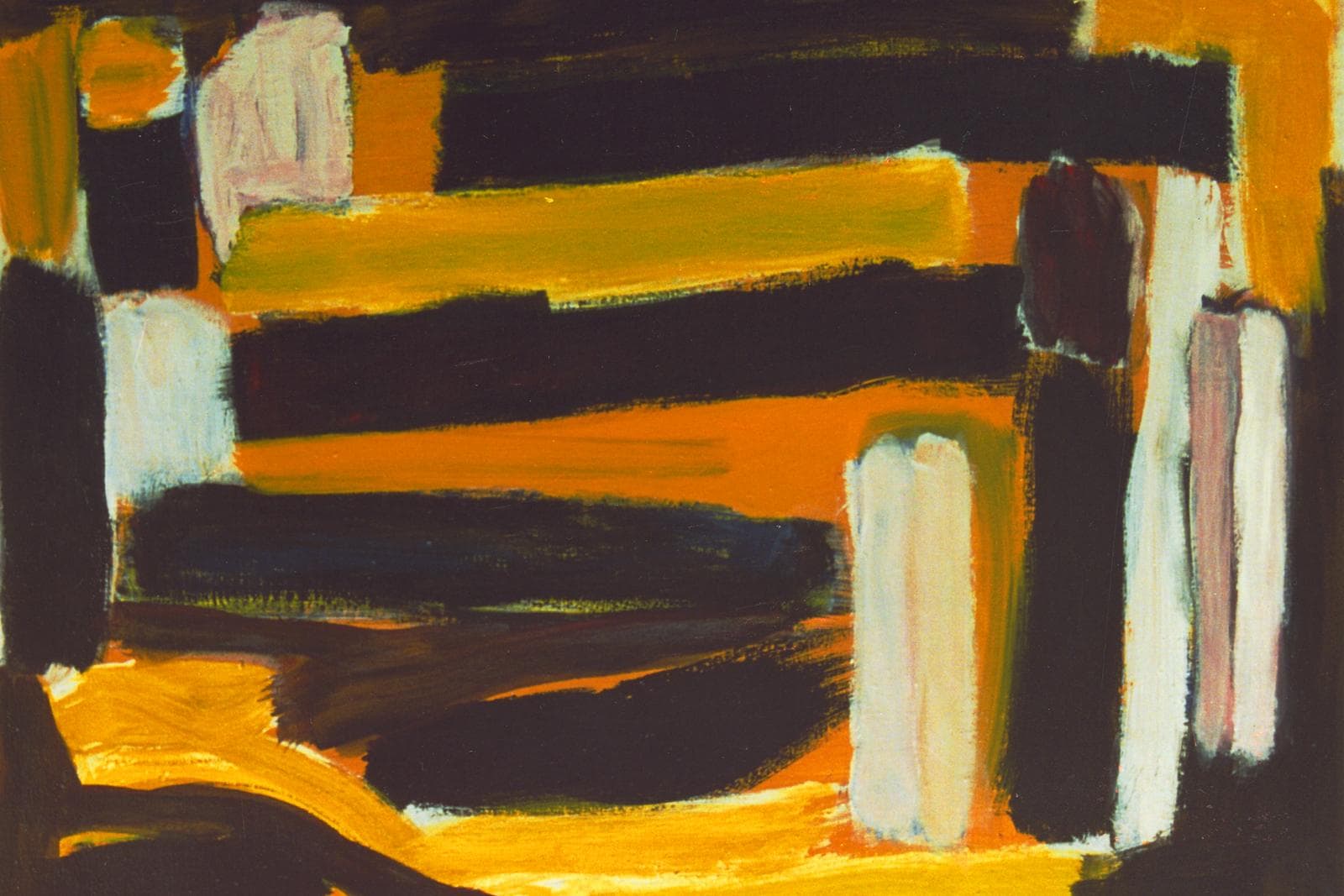
In an abstract, color is not describing anything — it is the event itself. So read it first and read it plainly: which two or three colors dominate, and what is their relationship? Some abstracts are built on harmony — blues into greens, warm neutrals shading into one another — and they feel like weather: enveloping, calm, easy to live beside. Others are built on argument — a saturated red against a cool ground, black slashes across gold — and they feel like music with drums: energizing at breakfast, possibly tiring at midnight. Neither is a quality judgment. The question is dosage, and dosage is set by how much time you spend in the room and what the room is for.
Also read the value structure — the spread of light and dark — because it decides how the picture behaves from across the room. High-contrast abstracts hold up at a distance and across big spaces; low-contrast, tonal abstracts dissolve at twenty feet and reward only the near view, which makes them the connoisseur’s choice for reading chairs, bedside walls, and other close-range seats.
Read gesture second
Gesture is the record of the movement that made the picture: the sweep of a loaded brush, the pour and tilt of fluid paint, the dragged edge of a palette knife, the calm edge of a taped line. Every abstract has a tempo. Fast gestures — splashes, slashes, energetic scribble — raise a room’s heart rate; slow gestures — washes, gradients, soft fields of color — lower it. When people say an abstract feels “busy” or “restful,” they are almost always reporting gesture, not color.
Gesture also sets the viewing distance the picture was composed for. Broad, sweeping work reads as a single statement from the doorway; intricate, layered work — small marks, scraped passages, glazes over drawing — keeps revealing itself at arm’s length. The best abstracts do both: a clear large rhythm carrying fine incident inside it. When you can, look at a detail view as well as the full image; the detail tells you what the picture will be like on the hundredth evening, after the doorway impression has become furniture.
Structure: geometric, organic, or field
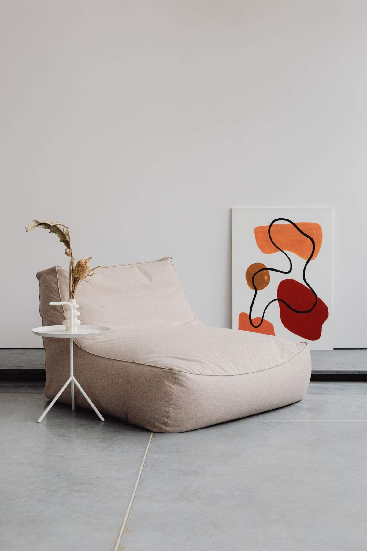
Under the color and gesture, abstracts are built three ways. Geometric abstracts compose with straight edges, grids, circles, and blocks; they feel architectural and deliberate, and they harmonize with modern furniture’s clean lines almost automatically — the risk is coldness, which warm color cures. It is the affinity behind modern wall art and its clean lines, a style with its own guide in this series. Organic abstracts compose with curves, blobs, and biomorphic shapes; they feel grown rather than built, soften hard rooms, and pair naturally with plants, woven textures, and rounded furniture. Color-field abstracts are the minimal extreme — large areas of color with soft edges and no incident at all — and they function less like pictures than like atmosphere: a wall of mood. Choose the structure your room lacks. A room full of straight lines begs for organic; a room of soft, squashy comfort often wants one geometric note to stand up straight against. The color-field end of that spectrum borders on minimalist wall art, one piece chosen slowly — a neighboring discipline with its own guide in this series.
Matching abstract wall art to a palette without matching it to death
The standard advice — pull the colors from the painting into the room — is half right. The working version: let the painting’s dominant colors rhyme with the room’s large, quiet surfaces (walls, sofa, rug), and let its accent color appear at most once or twice more, in small objects, or nowhere at all. A painting whose every hue is echoed in cushions and throws stops reading as art and starts reading as a scheme — the room looks decorated around it rather than alive with it. One completely un-echoed color in the canvas is often what makes the whole arrangement feel collected instead of purchased, because it proves the picture was chosen for itself.
The safer discipline is temperature and intensity. Keep the picture’s overall warmth in agreement with the room’s (warm abstracts in cool grey rooms look stranded; cool abstracts in warm wood rooms look like an apology), and keep its intensity one notch above the room’s. Art should be the most awake thing on the wall — but one notch, not four.
Scale: abstracts reward nerve
Of all subjects, abstracts tolerate — and usually reward — the largest sizes. A landscape printed huge can turn postcard-ish, its illusion strained; an abstract printed huge simply becomes environment, its gestures at body scale, its color at architectural scale. This is why the big abstract over the sofa is the workhorse of the living room: it fills a wide wall without demanding the attention a scene would, supplies the room’s whole palette in one object, and never goes out of date by depicting anything. The symmetric caution: small abstracts are the hardest size to make work. A small abstract reads as a sample of a bigger idea, a swatch with ambitions. If wall or budget limits the size, choose small abstracts with single, bold gestures — one sweep, one block of color — that are complete at small scale by design.
Orientation, rotation, and the hang-it-sideways test
Here is a freedom no landscape offers: many abstracts have no up. A color field, a pour, a composition of curves may hang in any of four orientations, and each rotation changes the picture’s balance — weight pooling at the bottom feels stable and grounded, weight at the top feels daring and airborne. Artists usually intend one orientation, and signed or asymmetric work should keep it; but for unsigned decorative abstracts, the sideways test is a legitimate choosing tool. Turn the image four ways before it goes on the wall and notice which way the room relaxes. Wide abstracts over furniture want their strongest movement running horizontally, in sympathy with the piece below; in narrow, vertical slots — beside a door, between windows — a rotated composition with upward gesture makes the slot feel designed rather than leftover.
Living with figurative neighbors
Abstracts are the diplomats of a mixed collection: they share walls with landscapes, photographs, and prints without quarreling over subject matter, because they bring none. In a gallery arrangement, one abstract among figurative pieces acts as a rest — a chord change that lets the eye reset before the next scene — and its colors can be used to stitch the group together, echoing a tone from each neighbor. The one negotiation is energy. An abstract is usually the loudest object per square foot in any grouping, since nothing in it is quiet by accident, so in mixed company choose it one size smaller — or one notch softer — than instinct suggests, and let the figurative piece with the strongest story hold the center. Where walls meet around a corner, abstracts also make the best hinge: a corner hung with one bold abstract lets two different rooms — different palettes, different centuries — pass each other without a treaty.
When bold beats quiet, and the reverse
Bold abstracts — saturated, contrasty, gestural — belong where energy is wanted and dwell time is short or social: entryways that need a pulse, dining rooms that host, living rooms that entertain, workplaces that must not feel like waiting rooms. Quiet abstracts — tonal, soft, slow — belong where the nervous system goes to recover: bedrooms, reading corners, baths, and any wall seen first thing in the morning. The most common decorating mistake with abstract wall art is a bold picture in a recovery room, chosen in a showroom mood and regretted at bedtime for a decade. Buy for the hour you will actually live with the wall.
One last reassurance, because it is the thing nobody tells abstract buyers: not liking a famous style of abstraction is not a failure of taste, and liking a picture “because of the blue” is not a shallow reason — for this subject, the blue is the content. Trust the direct response, verify it at two distances and two times of day, and the abstract will hold its wall honestly for as long as you keep it.
More in Subject Guides





Continue exploring: Subject Guides guides · All guides