

Minimalist Wall Art: One Piece, Chosen Slowly
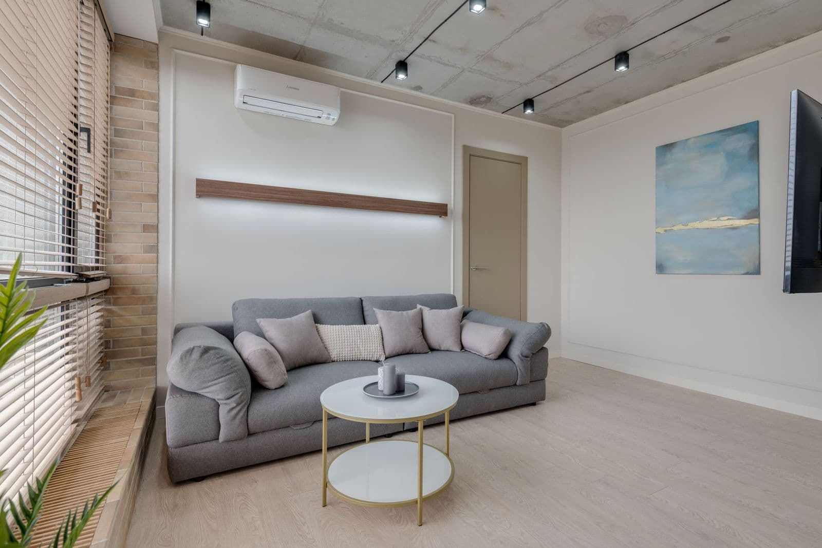
The calmest wall in the house is not an empty one — it is a decided one, where a single restrained image is given more quiet than you first think it needs.
Key Takeaways
- Minimalism is rationing, not a look: one complete, low-volume image — line art, a single motif, or quiet abstraction — chosen slowly and given generous negative space.
- Size up, not down: a substantial print with a wide field of quiet reads as calm, while a small print marooned on a huge wall reads as lost; minimalist does not mean small.
- Choose your temperature first — stark black-and-white or warm Scandinavian-Japanese softness — because a stark print in a warm room reads as an accusation, and vice versa.
- Presentation does half the talking: matte fine art paper, a far-wider-than-usual mat, and a whisper-thin frame in black, pale oak, or white.
- Hang alone, centered on the furniture it belongs to, and hold the line afterward — the style fails by accumulation, one reasonable addition at a time.
Minimalist wall art is the discipline of stopping. Where most decorating advice tells you what to add, this style asks what the wall can do without — and then insists that the one piece remaining be good enough to justify the emptiness around it. Minimalist wall art is therefore less a look than a standard: restrained images, generous negative space, and nothing hung out of habit. Done carelessly it reads as an unfinished room. Done well, it is the calmest wall in the house, and the one people remember.
Where the restraint of minimalist wall art comes from
Minimalism arrived as a named movement in the 1960s, when a generation of artists stripped painting and sculpture down to single gestures, repeated forms, and industrial plainness — art that refused to perform emotion and instead offered presence. The decorating style that borrows its name keeps the refusal but softens the doctrine. A minimalist room is not a gallery dare; it is a room edited to the pieces that earn their place, with the wall art held to the same rule as everything else. One image. Chosen slowly. Given room.
It helps to separate minimalism from its neighbors. Modern art, for all its clean lines, can be bold, colorful, and busy with geometry — minimalism is not a style of image so much as a rationing of them. And an empty wall is not minimalist either; emptiness is just the absence of a decision. The minimalist wall has been decided hard: someone looked at ten possible pictures and understood that the room wanted one — or, occasionally, none, which is also a decision when it is made on purpose. The neighbors it is separated from here, and the sixteen styles in all, are mapped in this series’ plain-language field guide to wall art styles.
The images that survive editing
The subjects that thrive under this discipline share one trait: they are complete at low volume. Line art is the emblem — a single contour drawing, a figure in a dozen strokes, a botanical rendered as outline rather than bouquet. It gives the eye exactly one thing to follow and nothing to sort through. Single-motif studies follow: one leaf, one wave, one arch, photographed or drawn against a ground quiet enough that the motif becomes almost a piece of calligraphy.
Quiet abstraction belongs here too — a wash of one or two muted colors, a soft horizon, a field of off-white with a single interruption. What matters is the ratio: most of the picture should be rest. Busy pattern, crowd scenes, and anything that rewards close inspection from six inches away are working against the style; minimalist art is composed to be received from across the room, all at once, like a held breath. Color, when it appears, is usually a soloist — one desaturated tone, repeated nowhere else on the wall.
Minimalist wall art in two temperatures: stark and warm
Minimalism has a reputation for coldness it only partly deserves. The stark end of the style — white walls, black line, hard light — is real, and in the right room it is bracing rather than bleak. It is also this style’s closest approach to black and white wall art, where monochrome is not one temperature of a style but the whole discipline. But the warmer school, shaped by Scandinavian and Japanese interiors, reaches the same restraint by softer means: off-white and oat instead of gallery white, pale wood frames, a single image in washed earth tones, and texture in the room’s textiles doing the comforting that extra pictures do elsewhere. The count of objects is identical. The feeling is entirely different. Decide which temperature your household runs at before choosing the piece, because a stark print in a warm room reads as an accusation, and a soft print in a stark room reads as an apology — both are failures of fit, not of the art.
Whichever temperature you choose, let the room carry the comfort and the wall carry the calm. The commonest way minimalist rooms go wrong is an owner nervously warming the wall itself — adding the second print, the small shelf, the trailing plant — until the one place designed for rest has been furnished like everywhere else. Blankets, books, and wood grain can make a spare room feel inhabited. The picture does not have to.
The arithmetic of calm
Restraint can be measured, which is good news for hanging it. Three proportions do most of the work. First, margin: the empty wall around the piece should be at least as generous as the piece is large — a small print marooned on a huge wall looks lost, but a substantial print with a wide field of quiet around it looks inevitable. Second, height: hang the center of the piece at the eye level of the room’s main activity — standing in a hallway, seated in a bedroom or living room — rather than by a universal number; calm is partly the feeling that nothing needs craning at. Third, company: whatever shares the wall’s sightline — a lamp, a door frame, the edge of a headboard — becomes part of the composition whether you planned it or not, so plan it: a minimalist piece wants its neighbors few and low-contrast.
Light deserves a sentence of its own. A restrained image in flat, grey light can go from quiet to invisible, and the fix is rarely a different picture — it is a lamp moved, a bulb warmed, or the piece relocated to the wall that catches the morning. When a minimalist print looks like nothing, check the light before you blame the art. Often the art was a whisper and the room was simply not quiet enough — in light — to hear it.
Paper, mats, and the frame’s quiet work
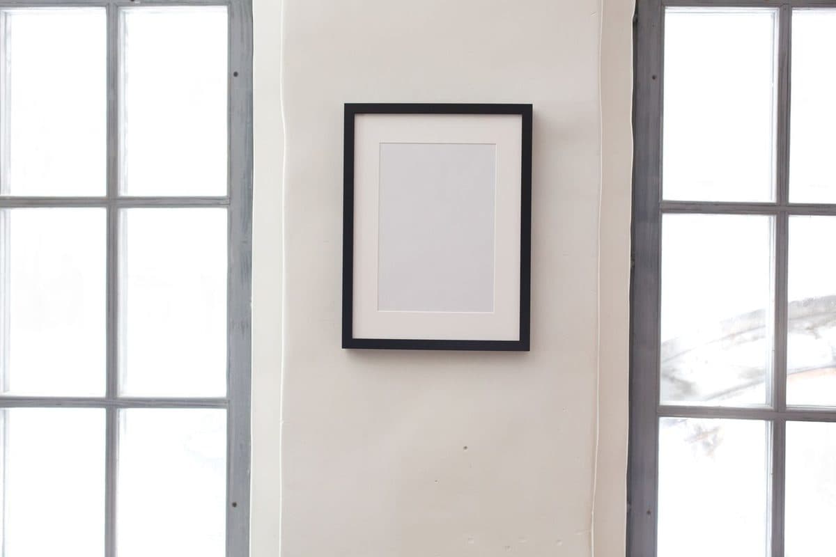
In a style this spare, presentation does half the talking, and the natural home of minimalist work is fine art paper prints. Matte paper suits restrained images the way quiet suits a library: no glare arguing with the picture, a surface that reads as an object made of fiber rather than a screen. A wide mat — far wider than habit suggests — is the minimalist’s framing signature. It builds a margin of stillness inside the frame, so the image floats in its own weather. Keep the frame itself to a whisper: thin black, pale oak, or white, with no bevel competing for attention.
Size surprises people. Minimalist does not mean small. A single large print, its image mostly empty ground, can be the most restful object in a house — scale and quiet are not opposites, and a big calm picture beats a cluster of small anxious ones. Judge size by the wall’s proportions, not by a fear of committing: the piece should be large enough that its emptiness looks intentional from the doorway.
Placement: one wall, one decision
Hang the piece alone on its wall, centered on the furniture it belongs to rather than the wall’s raw midpoint, and resist the satellite objects — the small print tucked beside it, the shelf creeping in from the left. Minimalism fails by accumulation, one reasonable addition at a time. If two pieces are truly wanted, make them a genuine pair: same size, same frame, same subject family, hung as one thought in two parts.
The rooms that ask for this treatment are the rooms meant to lower a pulse. A bedroom is the classic case: the last image seen at night and the first in the morning sets a tempo, and a restrained piece — line art above the bed, a single quiet photograph — keeps that tempo slow. Entryways benefit too, in the opposite way: one calm piece in a transitional space works like a deep breath between the street and the home. Wherever you hang it, hold the line afterward. The style is not a purchase; it is a promise the wall makes, and every later object in the room has to be negotiated with it.
Choose minimalist wall art when a room feels noisy rather than empty — when your eye finds nowhere to rest. The cure is rarely another object. It is one object, chosen slowly, and the confidence to let the rest of the wall be quiet.
More in Style Guides

Continue exploring: Style Guides guides · All guides