

Wall Art Styles: A Plain-Language Field Guide
Sixteen styles, grouped into families that behave alike — so you can read the room you already have and spot the art that will feel inevitable in it.
Key Takeaways
- A style is a visual language of line, color, subject, and finish — naming yours lets you predict whether a piece will settle into a room or argue with it.
- Your room is already voting: furniture lines, palette, and materials point to the style that will feel inevitable, and one contrasting piece still works if you choose it on purpose.
- Mix styles safely with one shared thread — palette, frame finish, era, or subject — and unify the frames when in doubt; mixing on every axis at once reads as accident.
- Check the format pairing when a piece looks vaguely wrong: vintage and fine art belong on matted paper, rustic on wood and canvas, and deco asks for a frame with presence.
- Minimalist pieces need more wall, not less — one piece per sightline, sized substantial, because emptiness around a too-small piece reads as absence, not calm.
Style is the word people reach for when a piece “goes” with a room or doesn’t — and it is rarely explained in plain language. A style is simply a visual language: a set of habits about line, color, subject, and finish that a group of artworks shares. Learn to name the main ones and two things get easier at once: you can describe what you are looking for, and you can predict whether a piece will settle into your room or argue with it. This field guide covers the sixteen wall art styles our catalog is organized by, grouped into families that behave alike — what defines each, the subjects it favors, and how styles mix.
The clean family: modern, contemporary, minimalist
Modern
Modern art grows out of the twentieth century’s great break with tradition: clean lines, confident color, abstraction, and a suspicion of ornament. Think bold shapes, uncluttered compositions, and images that announce themselves across a room. Modern art favors abstracts, graphic landscapes, and photography, and it is the natural partner of rooms with straight-lined furniture and little visual noise. In full, this is the territory of modern wall art, where the clean lines and confident color get their own chapter.
Contemporary
Contemporary means the art of right now — work being made in the present moment, in whatever language the moment speaks. It overlaps modern constantly but is broader and restlesser: bold scale, mixed media, current subjects, ideas still warm. Choose contemporary when you want a room to feel current rather than composed, and expect the unexpected: the category is defined by its date, not its look.
Minimalist
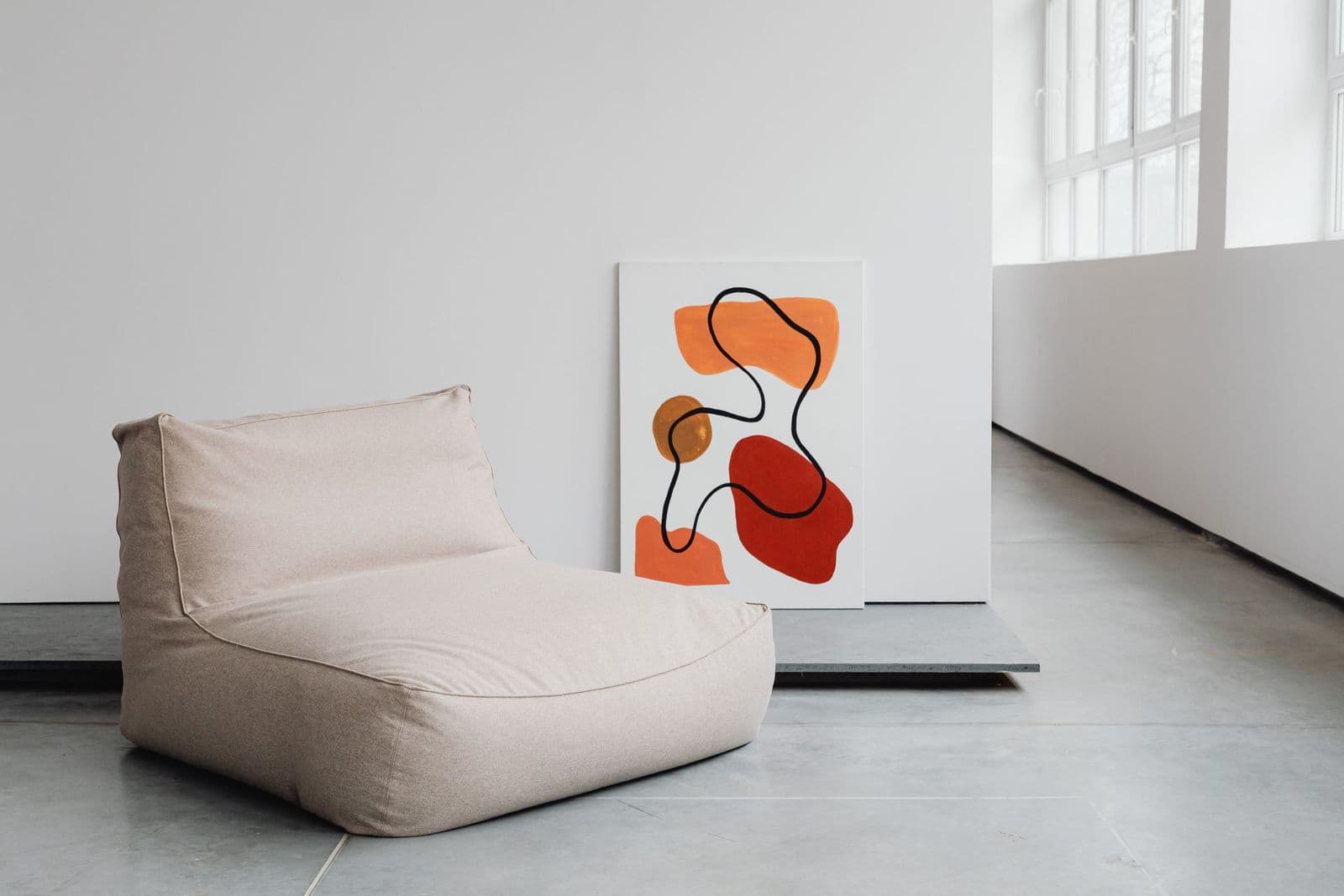
Minimalism is a discipline: restrained images, generous negative space, one idea given room to breathe. A single line drawing, a near-empty seascape, two shapes in conversation. Minimalist art is chosen slowly and placed generously — it needs empty wall around it the way a solo instrument needs a quiet hall. It suits bedrooms and calm living spaces, and it punishes clutter anywhere near it. That discipline — one piece, chosen slowly, given the wall it asks for — is the whole subject of our guide to minimalist wall art.
Practical minimalist discipline: the rule is not “own less art” but “give each piece the wall it asks for.” One piece per sightline, hung with unusual care about height and center, because with nothing else to look at, an inch of crookedness is a headline. Buyers new to the style often discover their one piece should be larger than planned — emptiness around a too-small piece reads as absence, while emptiness around a substantial piece reads as calm.
The classic family: traditional, vintage, decorative
Traditional
Traditional art takes the long view: classical landscapes, still life, portraits, and scenes composed the way painters composed them for centuries — balanced, detailed, and built to last. It asks for proper framing, and framing is half the pleasure here. Traditional pieces anchor dining rooms, studies, and living rooms with real furniture and long memories, and they mix with new rooms better than their reputation suggests: one classical landscape can give a plain room instant gravity.
Vintage
Vintage art is art from — or in the manner of — earlier decades: travel posters, botanical plates, advertising art, national park posters, photography with a period grain. Its appeal is partly the image and partly the patina, the sense that the picture has already lived a life. Vintage favors paper as a format, subjects with a date stamp on them (steamships, seedlings, skylines of 1930), and rooms that collect rather than curate. The posters and plates themselves — travel posters, botanical plates, old advertising — are collected in full in our guide to vintage wall art.
Decorative
Decorative art is chosen primarily to complete a room: its colors, scale, and subject are picked to serve the space first. That is not a dismissal — some rooms honestly need a calm, well-judged piece more than a statement — but it is a description of intent. Decorative work tends toward pleasant landscapes, coastal scenes, and gentle abstracts in the room’s palette, and it is the style most likely to be replaced when the sofa is.
The warm family: rustic, farmhouse, bohemian, cottagecore
Rustic
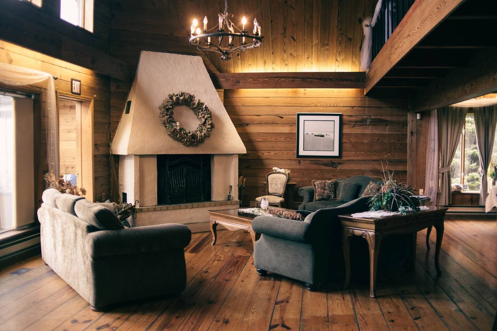
Rustic art is wood, weather, and work: barns and fences, wildlife, mountain and forest scenes, hand-lettered words — images with texture and a past tense. It favors wood prints and canvas, warm and faded palettes, and rooms with timber, stone, leather, and iron in them. Rustic is the fastest cure for a room that feels too white, too new, too smooth.
Modern farmhouse
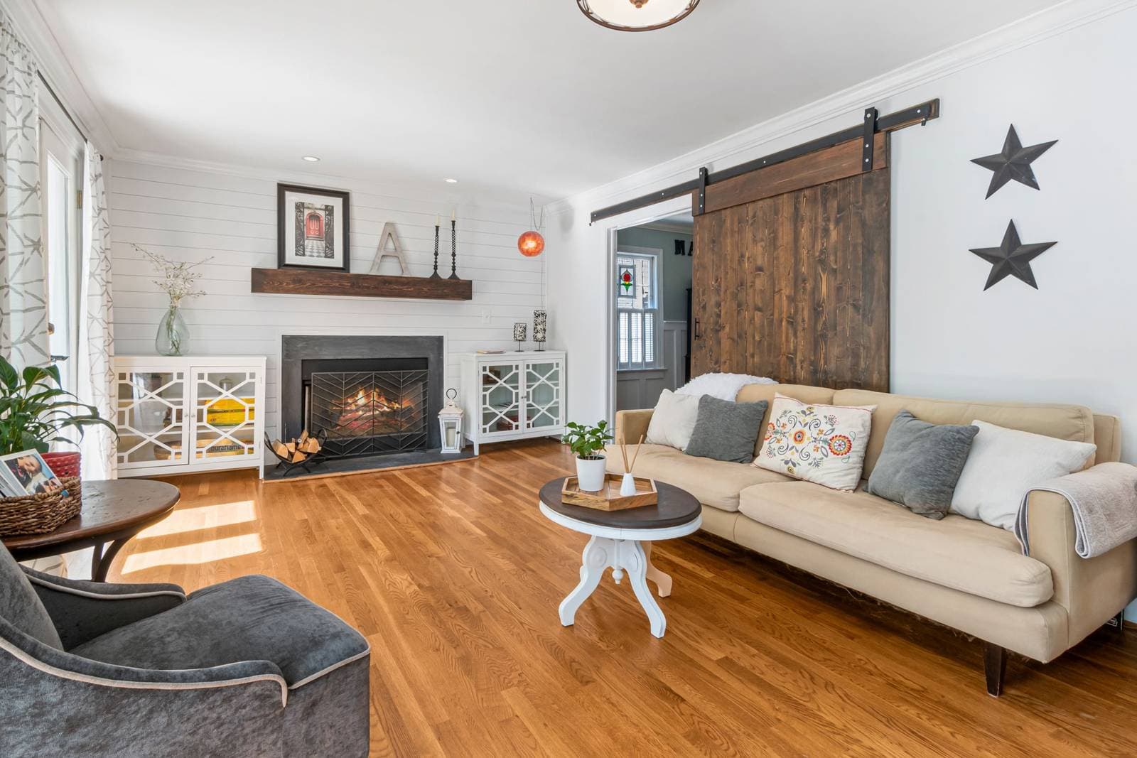
Modern farmhouse takes rustic’s subjects — botanicals, animals, simple typography, country landscapes — and edits them with modern restraint: neutral palettes, clean frames, plenty of white space. It is rustic with a tidier desk. The style suits kitchens and family living rooms especially, and its discipline is subtraction: every piece earns its place, and the wall is never crowded.
Bohemian
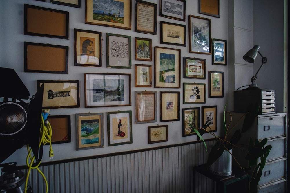
Bohemian art is collected, not matched: global patterns, earthy and jewel colors, textiles’ worth of texture, pieces gathered over time and travel. How such a wall is built in passes, and edited once it exists, is the subject of our guide to bohemian wall art. A bohemian wall layers — different sizes, frames, and subjects held together by palette and confidence rather than by sethood. It is the most forgiving style to build gradually and the hardest to fake in one afternoon, because its whole claim is that the collection is real.
Cottagecore
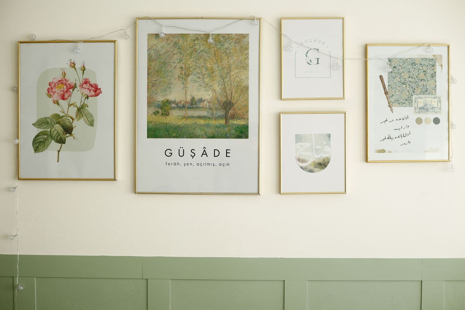
Cottagecore celebrates the romantic countryside: garden studies, wildflowers, cottages, soft animals, vintage botanicals in gentle light. It is nostalgia for a rural life most of its fans have never lived, and it makes no apology for that. Bedrooms, reading corners, and breakfast nooks are its home ground; its palette is cream, sage, rose, and butter, and its mood is a held breath.
The expressive family: abstract to maximalist
Abstract (as a style)
Abstract appears in this guide twice in spirit — as a subject family and as a style — because as a style it describes a way of seeing that crosses subjects: landscapes dissolved into color fields, portraits reduced to gesture. Abstract-styled art pairs with modern rooms, but a single abstract piece in a traditional frame and room is one of decorating’s oldest, best tricks.
Art deco
Art deco is geometry with glamour: fans, sunbursts, chevrons, stepped forms, and jewel tones with metallic accents, straight from the great design decade of the 1920s and 30s. One deco piece can set the register of an entryway, dining room, or bar cart corner the way a piece of jewelry sets an outfit. It rarely wants company on the same wall; it wants a frame with some shine and a little ceremony.
Mid-century modern
Mid-century modern speaks postwar: atomic shapes, starbursts, organic curves, and a palette of mustard, teal, walnut, and cream. It is the most furniture-loyal of styles — the art genuinely should respect the credenza it hangs over — and the most instantly dateable, which is its charm. Choose it to complete rooms with period furniture, or to give a plain room one confident era to stand in.
Maximalism
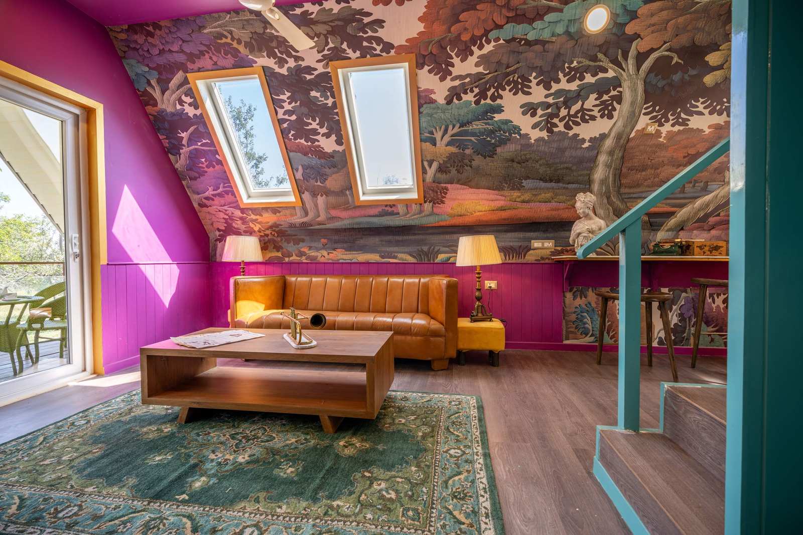
Maximalism is more, arranged with confidence: many pieces, saturated color, pattern on pattern, abundance as a deliberate aesthetic. Done with intent — one palette discipline, one spacing discipline — it reads as joy and collection; done carelessly it reads as storage. It is the gallery wall’s natural home and the opposite of minimalism in every way except one: both demand that every single piece be chosen.
Fine art and whimsical
Fine art, as a style label, marks work in the gallery tradition: detailed, considered, made for close looking, and best served by paper formats and rooms where people sit still. Whimsical is its lighthearted opposite: playful subjects, gentle jokes, storybook charm — the style of kids’ rooms and of adults who refuse to let a hallway be solemn. Between them they mark the range of seriousness a wall can hold, and most good collections live somewhere in the middle.
Wall art styles meet format: the natural pairings
Styles also have favorite physical forms, and honoring the pairing makes a piece look inevitable rather than printed. Vintage and fine art belong on paper, matted — the format they were born in. Rustic belongs on wood and canvas, where texture does half the talking. Modern and contemporary take canvas for warmth or metal and acrylic for gleam, depending on whether the room leans soft or hard. Art deco asks for a frame with presence — the framed canvas, the gilt edge — because the style is half jewelry. Farmhouse and cottagecore are happiest on canvas and paper in pale frames. Minimalism is format-quiet by principle: thin frames, wide mats, nothing competing with the image’s restraint.
These pairings are defaults, not laws — breaking one on purpose is a legitimate move, and a vintage poster on metal is nobody’s business but yours. But when a piece looks vaguely wrong and you cannot say why, check the pairing first. Very often the image is right, the style is right, and only the physical form is speaking the wrong dialect.
Reading your room: the style you already have
You do not choose a style from a standing start; your room has been voting all along. Read the evidence: furniture lines (clean suggests modern or minimalist; carved and upholstered suggests traditional), palette (neutral and white leans farmhouse or minimalist; saturated leans maximalist or deco), materials (glass and chrome versus wood and linen), and the objects you already love. The art style that will feel inevitable is usually the one those votes elect. Buying slightly against your style is fine — one contrasting piece is a classic move — but know that you are doing it on purpose.
Mixing wall art styles without a mess
Styles mix safely when one thread runs through the mixture: a shared palette, a shared frame finish, a shared era, or a shared subject. Vintage plus modern works when the colors agree. Abstract plus traditional works when the frames shake hands. What fails is mixing on every axis at once — different palette, era, frame, and energy — which reads as accident rather than collection. When in doubt, unify the frames and let the art be various; frames are the cheapest diplomacy in decorating.
A gentler way to think about it: mix across one boundary at a time. Rooms usually hold two neighboring styles happily — the families in this guide are arranged so neighbors get along — and a third style can visit as an accent piece if the first two have settled their arrangement. Eclectic, the word people use for successful mixing, is not the absence of a decision about wall art styles. It is several style decisions that agreed to share a palette and a frame finish, and it took more discipline, not less, than any single style on this list. And when you are ready to look at pieces with your style named, browse the catalog by style — the sixteen languages above become a filter, and the wall gets much easier to shop for.
More in Style Guides
Continue exploring: Style Guides guides · All guides