

Vintage Wall Art: Posters, Plates, a Past
These images were made to work — selling train tickets, teaching botany, moving soap — and that past life is exactly why they hold a modern wall so well.
Key Takeaways
- Start with the three great families: travel posters built to be read at a distance, botanical and natural-history plates that reward grouping, and playful old advertising for kitchens and bars.
- A well-made reproduction is often the honest choice for decorating — right size, no conservation anxiety — if lettering stays crisp, colors stay in period inks, and paper tone is cream, not blue-white.
- Hang each family where its original job points: posters in public rooms, plates where the house slows down, advertising where a room is allowed to be funny, each near the size it was born at.
- Frame on matte paper with simple, warm frames and a generous off-white mat — never distress a new print to fake age or bury a poster in heavy gilt.
- Avoid the themed room by mixing eras on one wall and keeping furniture plainly of its own time; begin with one strong poster and let the wall grow by attraction.
Vintage wall art is the only style in this series’ field guide to wall art styles that comes with a provenance. A vintage piece is not merely old-looking; it is — or faithfully reproduces — work that was actually made in an earlier era, for that era’s purposes: a railway poster that once sold train tickets to the seaside, a botanical plate engraved to teach botany, an advertisement drawn to move soap. Vintage wall art brings those working images home, and their past lives are exactly their charm. They were not designed for your wall. That is why they look so good on it.
The great families of vintage paper
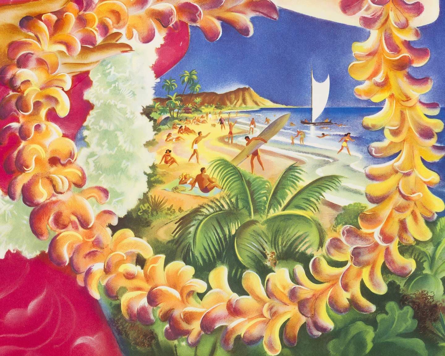
Travel posters are the gateway family. From the 1890s through the 1950s, railways and steamship lines commissioned serious artists to sell destinations, and the results — flat color, bold lettering, landscapes simplified into geometry — were printed in the thousands and pasted up outdoors to weather. The French, Swiss, and British railway posters of the interwar years are among the most collected, and in the United States the national parks posters produced under a Works Progress Administration arts program in the late 1930s and early 1940s have become beloved in their own right. The sleekest of the period’s travel images — ocean liners, express trains, grand hotels, drawn as geometry with glamour — belong also to art deco wall art, whose posters carry that glamour at length. Their design logic is a gift to modern rooms: a travel poster was built to be read across a station concourse, so it reads across a living room just as easily.
Botanical and natural-history plates are the second great family: engravings and lithographs made for the illustrated books of the eighteenth and nineteenth centuries, when a plate of a tulip or a kingfisher was serious science publishing. The wider world of florals and botanical art descends from these images, but vintage plates carry what modern versions smooth away — plate marks, Latin captions, the slight irregularity of hand coloring. Hung in a set of four or six, they bring a library calm to dining rooms and hallways; hung singly and large, a single plate can hold a wall with surprising authority.
Old advertising and ephemera complete the trio: the drawn advertisements, seed packets, circus and exhibition bills, and magazine covers of the pre-photograph era of print. These are the most playful of the families and the most time-stamped — their lettering alone dates them within a decade — which makes them natural citizens of kitchens, bars, and anywhere a room is allowed a sense of humor about itself.
Why so much of it is free to reproduce
A practical fact shapes this whole category: copyright expires. In the United States, works published before 1930 are now in the public domain, and a great deal of vintage poster and plate art falls on the far side of that line — which is why libraries, museums, and public repositories can offer high-quality scans of these images for anyone to print. The art on a vintage-style wall is often genuinely historical even when the sheet of paper is new. That is not a compromise; it is the tradition. Most original posters led hard outdoor lives, and the survival of the image, reprinted cleanly, is what the style has always really collected.
Originals versus reproductions: an honest word
Collectors do hunt true originals — posters pulled from station walls a century ago, plates cut from antique books — and a genuine period sheet carries things no reprint can: the paper itself, the printing’s slight irregularities, the knowledge that this object was there. Originals in good condition can be valuable, and the market prices them accordingly. But for decorating, the honest verdict favors the reproduction more often than snobbery admits. A well-made reprint from a high-quality scan shows the image at its intended strength, can be produced at the size your wall actually needs, and hangs without the conservation anxiety an antique sheet deserves — no worrying about sunlight doing in a season what a century spared.
What separates a good reproduction from a bad one is fidelity, and it is checkable. The scan should be detailed enough that lettering stays crisp at reading distance; the colors should sit in the family of the period’s inks, not boosted into modern saturation; and the paper tone matters more than any other single thing — a poster printed on blinding blue-white stock looks wrong before you can say why, because the originals lived on cream and buff. Choose sellers and sources that show you the image plainly, and be suspicious of any vintage print that looks airbrushed. Age in these images is a quality of the design. It does not need to be faked in the printing.
Where vintage wall art settles in a home
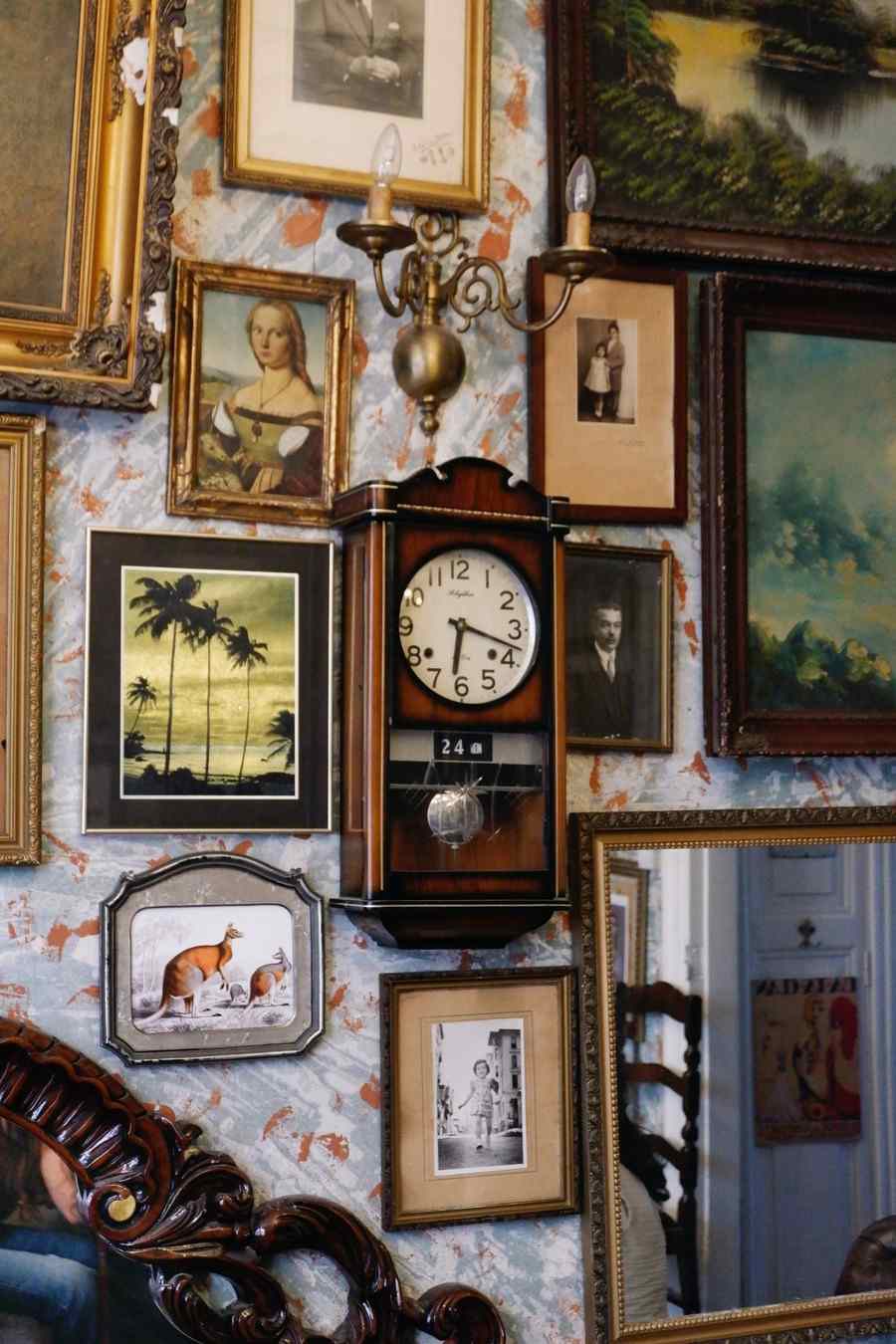
Different families settle in different rooms, following the logic of their original jobs. Travel posters were public announcements, and they still thrive in a home’s public rooms — living rooms and entryways, where their scale and confidence greet people the way they once greeted passengers. Botanical plates were library objects, and they settle where a house slows down: dining rooms, studies, hallways you pass rather than cross, where a set of four can be read plate by plate over months. Advertising art was commercial and a little cheeky, and it belongs where rooms are allowed to be funny — kitchens, breakfast nooks, home bars, the wall behind a desk.
Scale follows the same logic. These images were designed at poster size, and most lose their nerve reduced to a postcard; if a wall can take the genuine article at something near its original dimensions, let it. The exception is the plate families, which were book-sized by birth and gain authority from grouping rather than enlargement. Judge each piece by the size it was born at, and you will rarely hang one wrong.
Framing vintage wall art kindly
Vintage images ask for presentation that respects their age without cosplaying it. The natural vehicle is the fine art paper print: matte paper keeps faith with the original medium, since posters and plates were ink on paper and never glossy. Frames should be simple and warm — a thin wood profile, a quiet black, an off-white mat with enough width to give old paper its margin. Avoid two temptations: distressing a new print to fake age, which fools no one and insults a genuinely handsome image, and sealing a colorful poster behind a heavy gilt frame, which dresses a railway advertisement for the opera. The image was workmanlike and proud of it. Let the framing be the same.
Mixing eras without a theme-park effect
The standing fear with vintage art is the themed room — the kitchen that becomes a fake 1950s diner. The antidote is mixture. One era per wall is a display; several eras in conversation is a collection. Pair a 1930s travel poster with a nineteenth-century botanical plate and something unmistakably current, and the room reads as owned by a person with a long memory rather than a decorator with a single idea. Keep one thread running through the mixture — a palette of aged paper tones makes almost any eras sit together — and let furniture stay plainly of its own time. Vintage art mixes worst with vintage everything; it mixes best as the oldest thing in an honest, present-day room. It also earns its keep as one genuinely old layer inside a weathered, material-first room — the wood, weather, and faded color of rustic wall art.
If you are starting from nothing, begin with one strong poster rather than a planned set. Live with it for a season. Vintage walls grow best by attraction — a plate found because the poster taught you what your eye likes, an advertisement chosen because its lettering argues happily with both. The collectors whose rooms feel most inevitable rarely bought them in a weekend; the decades in the images reward a little patience in the acquiring. And because so much of this material is reproduced from public sources, the pace of a vintage wall is set by your taste rather than your budget — a freedom no other style in this series can offer to the same degree.
Choose vintage wall art when a home feels new in the rootless sense — well furnished, without a past. No other style lends history this quickly or this honestly: these are real images from real decades, doing on your wall what they were made to do, which is to be looked at, enjoyed, and read at a glance. They have been practicing for a hundred years.
More in Style Guides
Continue exploring: Style Guides guides · All guides