

Mid-Century Modern Wall Art: Atomic Shapes
Match the closed palette, honor the horizontal line of the furniture, and leave the wall breathing — that discipline is what separates a citizen of the era from a souvenir.
Key Takeaways
- Respect the closed palette — mustard, teal, burnt orange, avocado, walnut, cream, and black, vivid but earthbound — and audition pieces against the actual wood in the room, because walnut and pale oak change the result.
- Use the translation test: if an image could be redrawn in five flat shapes without losing itself, it speaks the dialect, whether it is an atom, a kidney shape, or a stylized skyline.
- Choose your dialect per wall: desert rooms take bolder color and larger scale, northern rooms take paler wood, quieter geometry, and more bare wall.
- Hang wide and low over long furniture in slim wooden frames that join the furniture tones; density and heavy ornate frames are the fastest ways to break the period spell.
- When in doubt between a literal starburst and an abstract in the palette, choose the abstract — it is the more historically literate citizen, and kitsch quietly demotes a serious room.
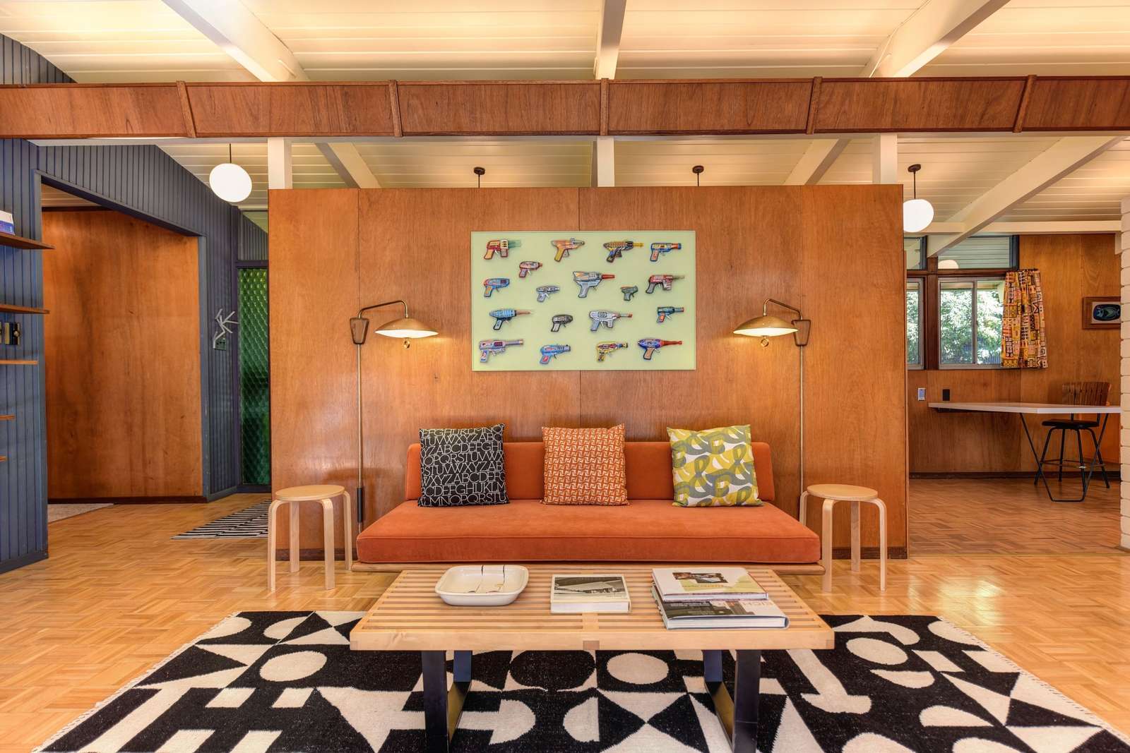
The decades after the Second World War produced the most confident popular design of the twentieth century, and its art still speaks in that voice: atomic shapes, starbursts, boomerangs, and abstract geometry in mustard, teal, burnt orange, and warm wood tones. Mid-century modern wall art is how that voice gets on the wall — but the style rewards respect for its rules. Its palette is a closed set, its furniture has strong opinions, and a piece that ignores either looks like a souvenir of the era rather than a citizen of it.
A note on the territory: mid-century modern overlaps its neighbors without being them. It is warmer and more organic than the modern style that preceded it, and more disciplined than the bohemian layering it sometimes sits beside. Its spirit is optimism engineered — new materials, new shapes, a future imagined from a California patio — and the art should feel like it believes in tomorrow. The style is one of the sixteen mapped in our field guide to wall art styles.
Mid-century modern wall art shapes: atomic, organic, abstract
The era’s vocabulary starts with the atom and the starburst — science rendered as ornament, electrons on their orbits, suns with rays of uneven length. Beside them run the organic counter-melodies: kidney and boomerang shapes, amoeba blobs, sweeping arcs, the biomorphic curves that softened the period’s geometry. Pure abstraction was the era’s serious art as well — fields of color, hard-edge geometry, gesture paintings — and a large abstract in mid-century colors is often the most authentic statement a wall in this style can make.
Figure and landscape appear, but stylized: a city skyline reduced to rectangles, a desert scene built from three flat shapes, a portrait drawn in a handful of lines. Photography, when it hangs in these rooms, tends toward architecture and era scenes rather than nature in detail. The test for any candidate piece is translation: if the image could be redrawn in five flat shapes without losing itself, it speaks the dialect.
The palette is a closed set — respect it
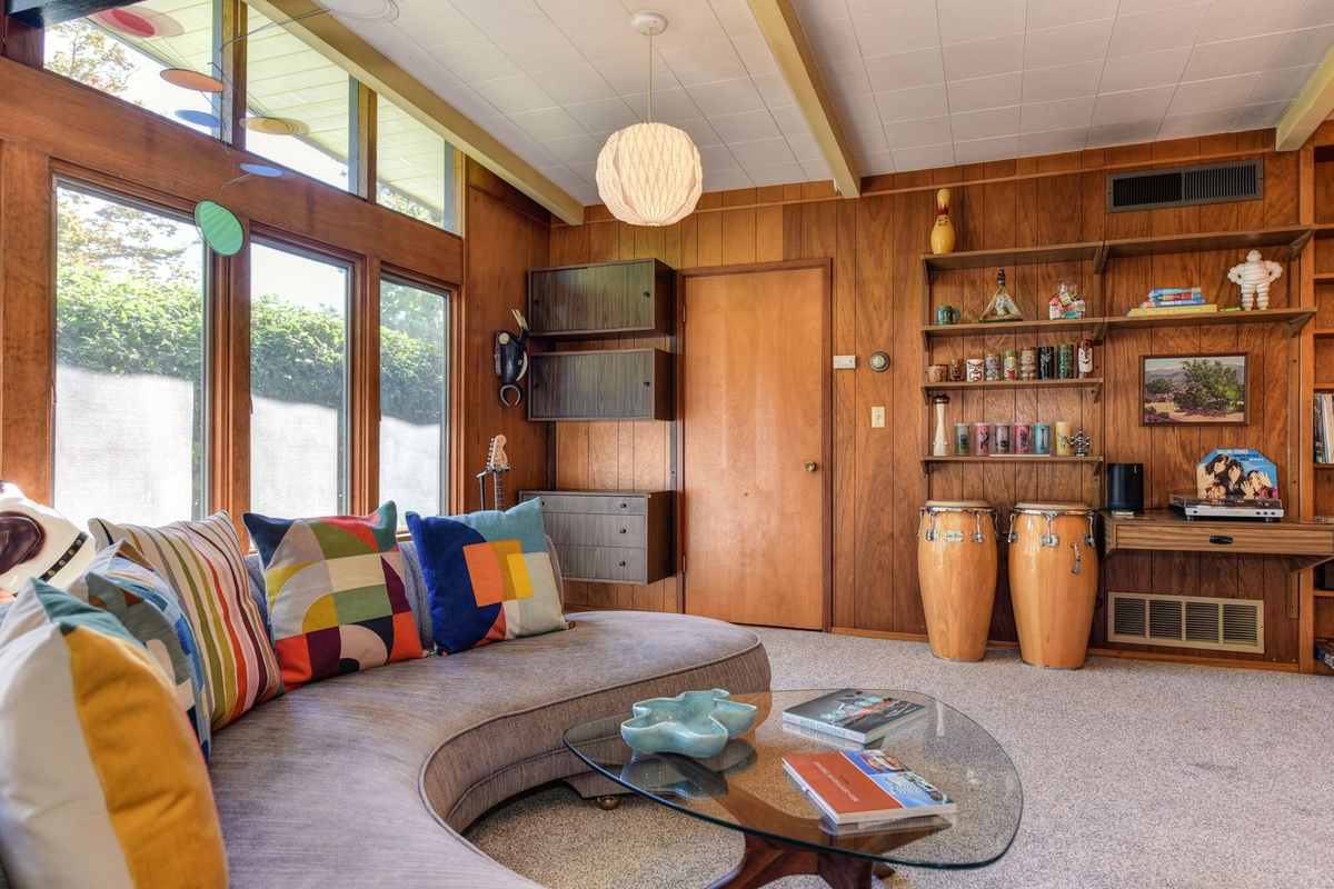
Mustard, teal, burnt orange, avocado, walnut brown, cream, and black: the mid-century palette is famous partly because it is finite. Art for these rooms should draw from that set and its near neighbors, and should mostly sit at the era’s characteristic saturation — vivid but slightly earthbound, never neon, never pastel-soft. One piece may break the set as an accent; a wall where every piece invents its own colors has left the style, however retro each image is individually.
Wood is a color in this palette, not just a material. The warm mid-tones of teak, walnut, and beech furniture form the field the art plays against, and pieces should be auditioned against the actual wood in the room: a print that sings against walnut may go flat against pale oak. When in doubt, the era’s own answer was contrast at the extremes — cream and black grounds make mustard and teal carry, which is why so much period art is bold shape on a quiet field.
Two homelands: the desert and the north
The style grew up in two climates that seem opposite and produced its two dialects. The American version — Palm Springs, Los Angeles, the postwar suburbs — is sun-struck: desert scenes, pool-blue accents, starbursts like a sky full of satellites, art sized wide for ranch-house walls. The Scandinavian version is the same decades under a lower sun: paler woods, quieter geometry, abstract prints in muted versions of the shared palette, designed for long winters and democratic living rooms. Historians debate how separate the two really were — designers read the same magazines across the Atlantic — but as a hanging guide the distinction works: the desert dialect takes bolder color and larger scale; the northern dialect takes restraint, more wall left bare, and art chosen like furniture, one considered piece at a time.
Knowing your dialect settles choices elsewhere. Desert rooms welcome the big atomic print and the saturated abstract; northern rooms are happier with a pair of quiet geometric prints and the wood left to warm the wall between them. Mixed rooms exist happily — most real homes are mixed — but choose per wall, not per piece, so each wall keeps one accent rather than averaging two.
The other rooms: dining, kitchen, hall
Dining rooms in this style take the wide format over the sideboard — landscape or abstract, low and long — and add one era pleasure the living room cannot: the matched pair of small prints flanking a serving hatch or window, hung with the period’s fondness for exact symmetry. Kitchens, which mid-century design loved and modernized first, carry the style’s playful end: atomic-pattern prints, era advertising styles, and still lifes of the period’s optimistic tableware, in the brightest corner of the palette. Halls and entries suit the single starburst — the era’s hello — sized to be read at walking pace and gone, like a chord struck at the door.
Framing mid-century modern wall art: low, wide, and lean
Mid-century rooms are horizontal: low credenzas, long sofas, wide windows. Their art follows — wide landscape formats above long furniture, hung lower than in other styles so the piece converses with the furniture line rather than floating above it. Frames are slim and wooden when present, in tones that join the furniture rather than contrast it; a heavy or ornate frame is the fastest way to break the period spell.
The living room is the style’s showcase — the wide abstract above the credenza is practically its coat of arms — and the arrangement there is typically restrained: one large piece doing the work, not a gallery. Smaller rooms take single starburst or atomic-motif pieces well, and a pair of era prints flanking a doorway keeps the rhythm without crowding. Density is the enemy here; mid-century rooms breathe, and their walls should too.
The serious art behind the style
It is worth remembering that the era’s walls were not only decorative. The same decades produced abstract expressionism, color-field painting, and a poster and print culture of real ambition — and the popular style absorbed their influence at household scale: the sweeping gesture became the boomerang, the color field became the flat abstract print, the exhibition poster became a normal thing to frame. Art historians still debate how direct those borrowings were in any given case, but the household result is not in doubt: mid-century homes were unusually comfortable with abstraction, and a genuinely abstract piece — fields, geometry, gesture — is the most historically literate choice a wall in this style can make. If in doubt between a literal starburst and an abstract in the palette, the abstract is the elder and usually the better citizen.
Authenticity: original, in-the-spirit, or kitsch
Pieces come in three grades, and it helps to know which you are hanging. Genuine period art and posters exist and carry real presence, but supply is finite and condition varies. The wider world of period posters and plates — originals, reproductions, and how to tell a faithful one — is the subject of our guide to vintage wall art. Contemporary work made honestly in the style — new art using the era’s vocabulary — is plentiful and entirely respectable; the era itself was mass-produced and proud of it. Kitsch is the third grade: diner signs, cartoon atoms, irony in a frame. It has its place in a den or a bar, but it will quietly demote a serious mid-century room, because the original style, for all its playfulness, was never joking about itself.
Start from the furniture you actually have and browse the wider catalog with the palette in hand — abstracts, landscapes, and city subjects all have mid-century dialects, and the right piece is often filed under its subject rather than its era. Hang mid-century modern wall art by its rules — match the palette, honor the horizontal, keep the wall breathing — and the room will do what the best rooms of that optimistic era did: look like the future its owners were promised, kept.
More in Style Guides
Continue exploring: Style Guides guides · All guides