

Art Deco Wall Art: Geometry With Glamour
One sharp sunburst or fan, set like jewelry against a calm wall and warm light, will do more than a whole room papered in deco pattern.
Key Takeaways
- Ration the dose: one strong piece or one exact pair per room is the classic arrangement — more tips the room from glamorous to themed, the one failure this style cannot absorb.
- Demand sharpness: deco is built on symmetry and clean edges, so a sloppy reproduction reads worse here than in looser styles; measure twice and center truly.
- Treat gold as structure, not garnish — it should read as light, not yellow — and hang pieces where warm artificial light will find them, against deep, quiet fields like navy or charcoal.
- Frame slim, precise, and metallic or black, like a jewelry setting; a rustic or ornate frame argues with the geometry in two directions at once.
- Save the strongest dose for small, briefly seen rooms — powder rooms, bar nooks, entryways — where close viewing, warm light, and a few minutes are deco's exact conditions.
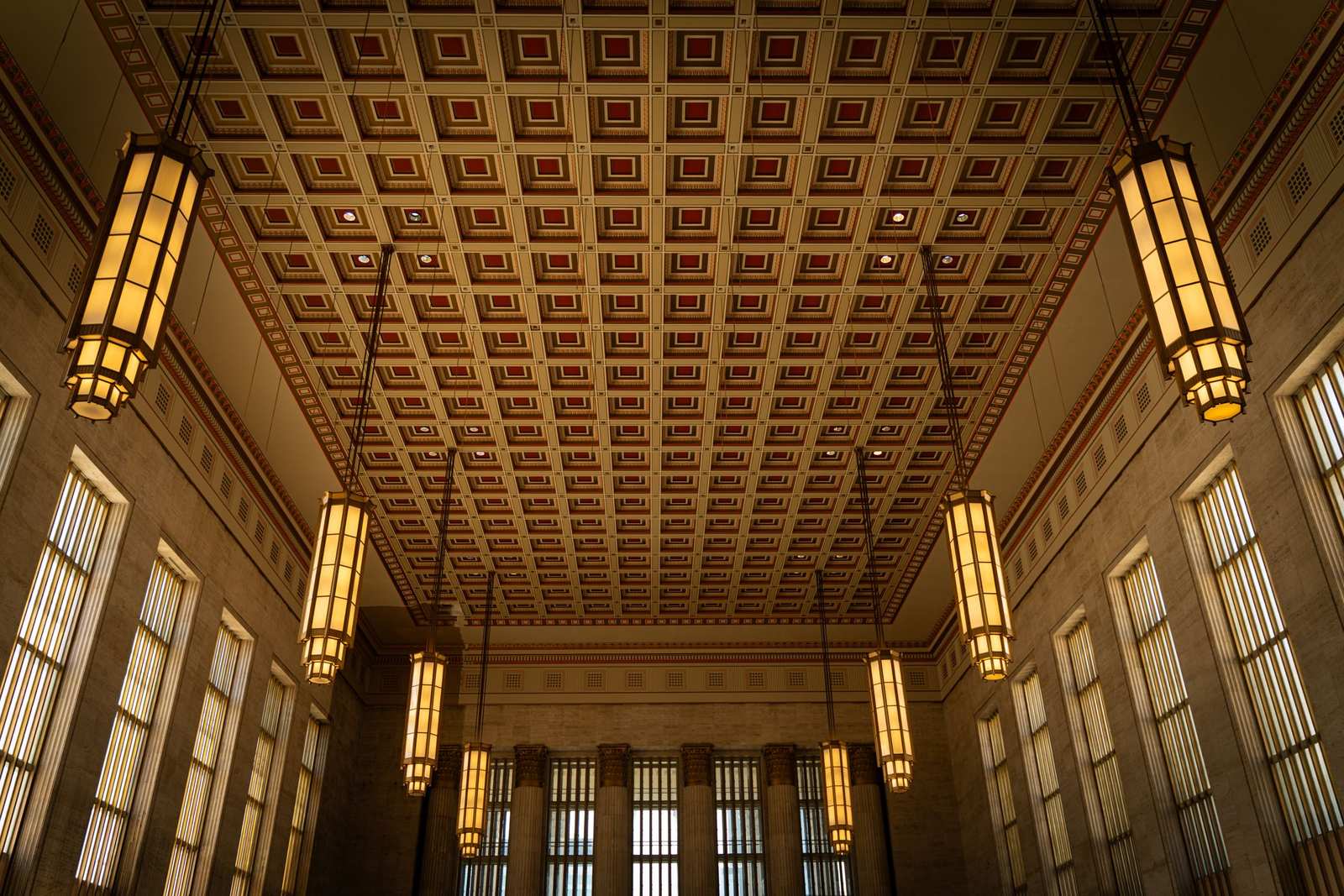
Some styles furnish a room; art deco sets its register. Born in the 1920s and named for the Paris exhibition of 1925 that announced it, deco turned geometry into glamour: fans, sunbursts, chevrons, stepped profiles, and arcs, all drawn with a ruler and finished like jewelry. Art deco wall art carries that DNA onto the wall, and it is unusually efficient at its job — a single deco piece can make an otherwise plain room feel deliberate, dressed, and faintly ceremonial.
Two cautions frame everything else. First, deco is a strong flavor: the whole room rarely wants to be deco, any more than a whole meal wants to be saffron. Second, the style is exact — its patterns are built on symmetry and clean edges, so a sloppy reproduction reads worse here than in looser styles. Choose few pieces, and choose them sharp.
Art deco wall art motifs: fans, sunbursts, stepped lines
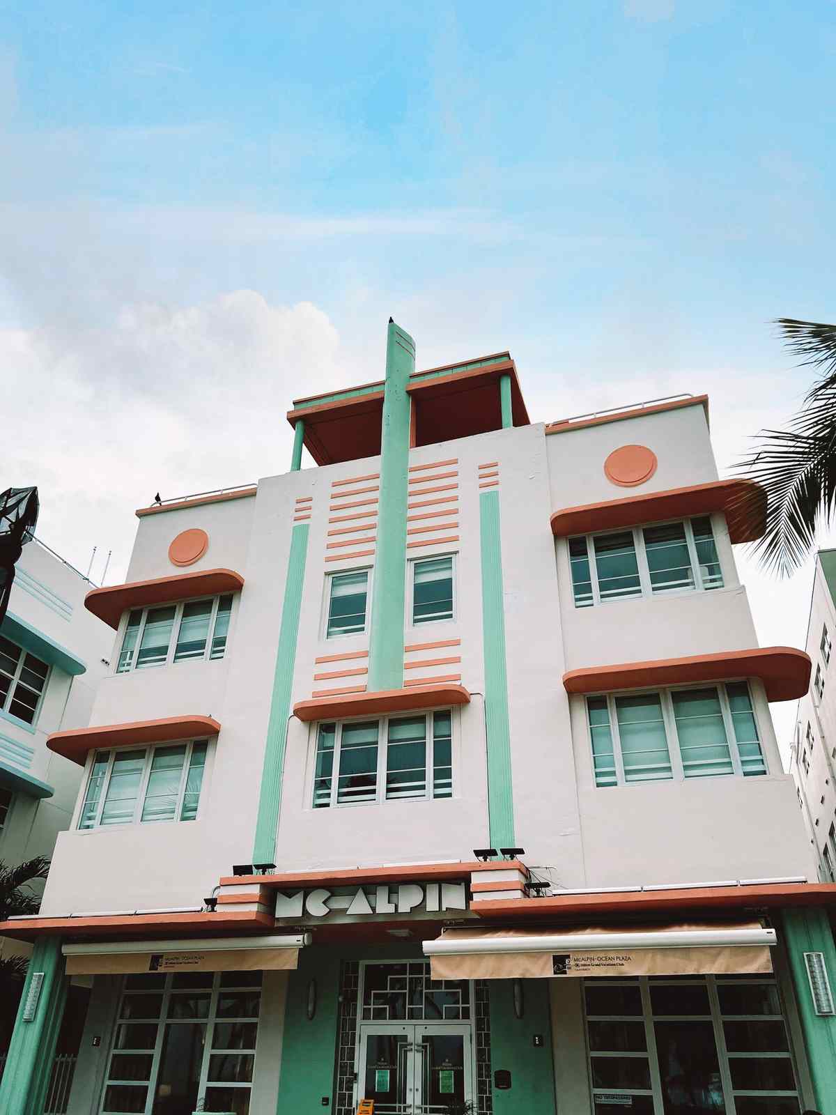
The fan and the sunburst are deco’s signatures: rays spreading from a single point, rendered as a rising sun, a peacock’s train abstracted into geometry, a shell, a skyscraper’s crown. Around them orbit the chevron, the zigzag, and the stepped profile borrowed from the era’s architecture — the setback towers of New York translated into pattern. Figures, when they appear, are stylized to the edge of abstraction: greyhounds, dancers, and gazelles drawn as emblems rather than animals, all line and poise.
Travel imagery from the period — ocean liners, express trains, grand hotels — forms the style’s other great family, and its posters are among the most handsome ever made — the vintage wall art guide devotes a full section to the era’s travel posters: flat color, bold diagonals of speed, typography as part of the design. A single period-style travel poster can carry a room’s whole deco argument by itself, and it brings narrative with it in a way pure pattern cannot.
An era in brief — and honestly hedged
Deco’s dates are usually given as roughly 1910 to 1939, flowering between the wars, though its roots reach back into pre-war Paris and its echoes run long after — historians argue about the borders, as they do about every style’s. What is not in dispute is the source of its confidence: it was the design language of new machines and new money, of ocean liners, cinemas, radio, and the skyscraper, and it absorbed influences omnivorously — Egyptian motifs after the Tutankhamun discovery of 1922, Aztec and African pattern, the geometry of Cubism and the machine aesthetic — refining all of it into streamlined, symmetrical luxury.
That history explains the art’s particular feeling: optimism with posture. Deco images rarely depict rest; they depict arrival — ships docking, trains at speed, dancers mid-step, suns rising. Hang one and the room borrows a little of that forward lean. It also explains the style’s two registers, which helps to keep straight when choosing: the earlier, more floral and handcrafted French manner, and the later, sleeker streamline manner of the 1930s. Both are deco; the first pairs with softer rooms, the second with lacquer, chrome, and black. The postwar style that streamlining fed into — atomic shapes, starbursts, mustard and teal over warm wood — is mid-century modern wall art, covered in its own guide.
The palette: jewel tones under lamplight
Deco color is evening color: emerald, sapphire, ruby, and deep teal, struck through with gold, brass, black, and cream. Gold is structural in this palette, not decorative garnish — it carries the lines, the rays, the frames — and a piece whose metallic element is printed weakly loses the style’s engine. Look for images where the gold reads as light rather than as yellow, and hang deco pieces where warm artificial light will find them; this is a style designed by a lamplit generation, and it still prefers the evening.
The room around the art should hold its saturation in check. Deco pieces glow against deep, quiet fields — navy, charcoal, bottle green, black lacquer, or clean cream — and fight against busy wallpaper and scattered bright color. One deco piece above a sideboard against a calm wall will out-glamour a room papered in deco pattern floor to ceiling, because glamour is contrast: the jewel needs the setting.
Framing: the jewelry setting
In deco, the frame is not a border but a setting, and it should behave like one: slim, precise, and metallic or black. A framed presentation with a clean-lined profile completes the piece’s geometry, where a rustic or ornate frame would argue with it in two directions at once. Symmetry in hanging matters as much as the frame itself — a deco pair flanks a mirror or a doorway in exact balance, a single piece centers truly on its wall or its furniture. Measure twice here; the style forgives nothing off-level.
Scale should be confident but rationed. The classic deco arrangement is one strong piece, or one exact pair, per room — a sunburst above the sideboard, a matched pair of posters flanking the bar cart — with every other element in the room comparatively plain. More than that and the room tips from glamorous to themed, the one failure this style cannot absorb, because its whole effect rests on looking expensive rather than eager.
Lettering as ornament in art deco wall art
Deco is one of the few styles in which typography itself is a first-class image. The era’s posters set their lettering as architecture — tall, geometric capitals, letterspaced like a facade — and its monograms, hotel crests, and theater marquees were designed as emblems in their own right. A framed piece of strong deco lettering — a single initial worked as a crest, a poster whose words are half its design — hangs with the same glamour as a sunburst and adds a graphic crispness that pure motif cannot. Choose examples where the lettering is drawn, not merely typed; the style lives in the hand-finished geometry of its letters, and a modern font set in imitation usually reads thin beside the real article.
Small rooms, full register
If deco has a secret stronghold, it is the small room where other styles whisper. A powder room, a bar nook, a dressing area: confined square footage means the piece is seen close, briefly, and often in warm light — deco’s exact conditions. In these rooms you may also break the rationing rule in one direction: a small room can carry a stronger dose, even pattern on more than one wall, because the dose is measured in minutes. Guests experience it as an event, the way they experience the lobby of a grand hotel — a register the home’s quieter rooms could not sustain all day, and do not have to.
Where deco earns its keep
The dining room is deco’s natural stage: evening use, warm light, ceremony built into the furniture. A fan or sunburst piece above the sideboard sets the room’s register before a plate is served. Entryways take it brilliantly for the opposite reason — ten seconds of viewing, one bold emblem, a promise of glamour kept by the rooms beyond. Bars, powder rooms, and dressing areas, small spaces where drama is an asset, all give deco exactly the confined stage it plays best on.
Use art deco wall art more sparingly where the day is lived long and quietly. A deco piece can anchor a living room if the seating stays calm around it, and a bedroom usually wants the style at its softest — a single fan motif in muted gold and cream rather than the full jewel register. Let one room in the house wear the jewelry. Deco’s power was never abundance; it is precision, confidence, and a straight line drawn like it means it. Deco is one of the sixteen styles mapped in the series’ field guide to wall art styles.
More in Style Guides
Continue exploring: Style Guides guides · All guides