

Modern Wall Art: Clean Lines, Confident Color
When a room feels shapeless rather than empty, one composed, geometric piece with committed color can give the whole space its governing idea.
Key Takeaways
- Modern means the modernist language of clean line, composition over detail, and confident color — not just anything new or current.
- Let the art carry the color budget: either one saturated accent picked up almost nowhere else, or a black-and-white structure where form does the work.
- Go large and leave the rest of the wall alone — a small geometric print on a big wall reads as a postage stamp, and eclectic scatter breaks the architectural logic.
- Keep presentation frameless or thin-framed in black, white, or pale wood; metal suits the crisp edge, canvas suits color fields, and carved gilt fights the style.
- A modernist poster is the easiest first step in — its lettering gives the eye a handhold where a big abstract canvas can feel too mute.
Modern is the most misused word in decorating. People reach for it to mean anything that is not their grandmother’s furniture — current, new, on trend. But modern wall art names something more specific and more interesting: the look that came out of the modernist movement of the early and middle twentieth century, when artists and designers deliberately broke with ornament and rebuilt pictures out of line, geometry, and honest color. A modern room is not a room that happens to be new. It is a room composed with intent, where every piece on the wall is there because its shape earns the space.
That distinction is what makes modern art so satisfying to hang. A painting built from clean lines and confident color does not need a busy room to hide in — it holds a plain wall the way a well-cut sentence holds a page. This guide covers what defines the modern look, the subjects it favors, the formats that flatter it, and how to size it for rooms that value clarity over clutter. Modern is one of the sixteen styles named in the plain-language field guide to wall art styles, where the families that behave alike are laid out side by side.
What “modern” actually means
Modern art grew out of an argument that started before the First World War and ran through the middle of the century: that a picture did not need to imitate the visible world to be complete. The movements that followed — De Stijl in the Netherlands with its grids of black lines and primary blocks, the Bauhaus school in Germany (founded in 1919) with its marriage of art and industrial design, the abstract painters who treated color itself as the subject — all shared a conviction that form could carry feeling on its own. You do not need to know the names to recognize the results. You have seen them all your life: the poster of nothing but circles and diagonals, the canvas that is two rectangles and a horizon, the chair-like geometry of a mid-century sunburst.
For wall art, the practical inheritance is threefold. Clean line: edges are deliberate, shapes are closed and legible, nothing trails off into sketchy suggestion. Confident color: modern palettes commit — a true red, a cobalt, a mustard — rather than hedging in pastels, though disciplined black, white, and grey are just as characteristic. And composition over detail: the picture is arranged like architecture, balanced masses and deliberate empty space, instead of being filled corner to corner with incident. If a piece could be reduced to a diagram and still hold together, it is thinking the modern way.
Not contemporary, not minimalist
Two boundaries are worth drawing before you shop, because the words get traded loosely. Modern is a settled style with a history; contemporary means the art of right now, whatever that happens to look like this decade — it is a moving window, not a look, and it gets its own guide in this series. Minimalist, meanwhile, is a discipline of subtraction that modern art sometimes practices but does not require: a modern canvas can be large, loud, and covered in color, which no minimalist would allow. The subtraction itself — one piece, chosen slowly, and nothing hung out of habit — is pursued in full in our guide to minimalist wall art. If the piece feels composed, geometric, and sure of its color, you are in modern territory — even if it was painted last year, and even if it fills the wall.
The subjects modern wall art favors
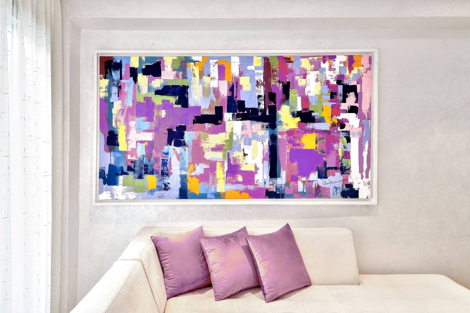
Geometric abstraction is the core subject: grids, arcs, diagonals, and color fields that read as structure. Hung large, a single geometric piece can set the proportions of a whole room the way a rug sets a floor plan. Bold color-block work follows close behind — paintings and prints whose subject is the meeting of two or three strong colors. These are the pieces that let a neutral room keep one vivid accent without scattering cushions and throws to match.
Mid-century motifs — starbursts, atomic boomerangs, kidney shapes, stylized suns — bring the movement’s lighter, postwar side: playful geometry with a graphic designer’s neatness. They suit dining rooms and entryways that want period character without period heaviness. Architecture and the designed object also belong here: a photograph of a great modernist building, or a print celebrating a classic chair silhouette, speaks the same language of form following function. What you will rarely find in a modern scheme is the soft-focus landscape or the sentimental portrait — not because they are lesser subjects, but because their grammar is storytelling, and modern art’s grammar is structure.
One more branch deserves its own mention because it hangs so well: the modernist poster. In the postwar decades, graphic designers — the Swiss school most famously — turned the exhibition poster and the advertisement into small essays in grid, type, and flat color. A framed poster in that tradition brings modern art’s discipline in its most legible form, and it solves a practical problem: rooms that find a big abstract canvas too mute often take instantly to a poster, because the lettering gives the eye a handhold. If your first modern piece feels like a leap, a poster is the step halfway in.
Formats that flatter modern wall art
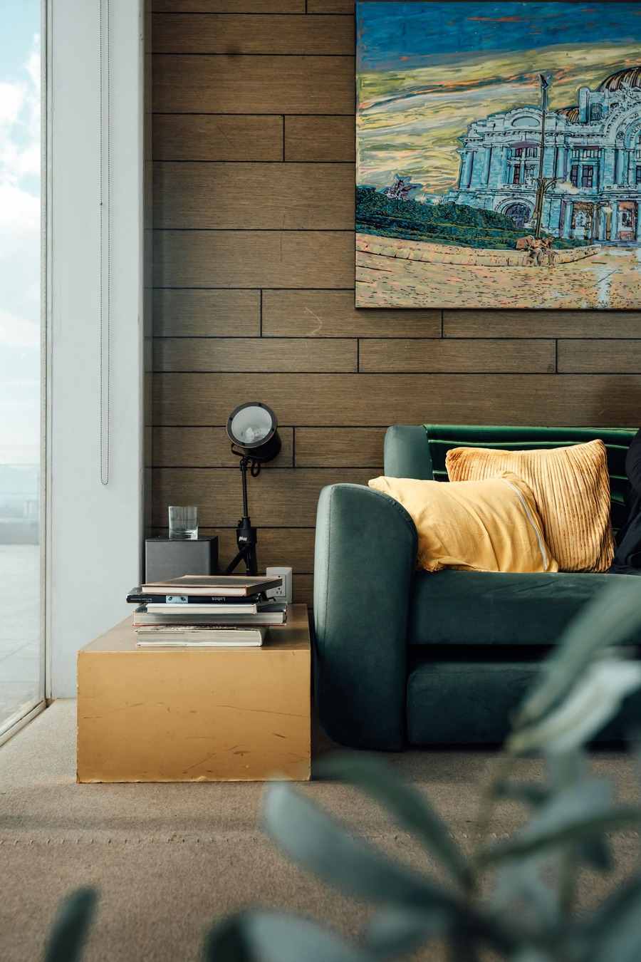
Modern art asks for formats with the same crispness as the image. Frameless presentations suit it because the picture ends where it ends — no molding pretending to be a window frame. That is one reason metal prints pair so naturally with modern work: the image sits on a clean, flat panel with a precise edge and a slight sheen, and a geometric composition printed that way looks less like a reproduction and more like an object that was manufactured to be exactly this. Canvas works too, especially for color fields, where the matte surface drinks the light and keeps big flat areas calm. What tends to fight the style is the heavily carved or gilded frame — ornament the image was designed to refuse. If you frame, keep the profile thin and the finish quiet: black, white, or a pale wood.
Color: the modern lever
Because modern rooms keep their furniture and walls quiet, the art usually carries the room’s entire color budget — which makes the color decision the decorating decision. The reliable approaches are two. The first is the single saturated accent: one piece in a strong, clear color — vermilion, ultramarine, a true yellow — against a room of neutrals, with the color picked up nowhere else, or almost nowhere. The discipline is the effect; the moment the red appears in four cushions and a rug, the accent becomes a scheme and the wall loses its authority. The second approach is the black-and-white structure: a graphic piece in blacks, whites, and greys that treats color as unnecessary. It suits rooms with strong architecture and owners whose confidence runs to form rather than hue.
What modern color avoids is the middle register — muddy mid-tones, tasteful beiges inside the picture itself. A modern piece can be quiet, but its quiet should come from restraint of means, not from indecision of palette. If a candidate print looks like its colors were chosen to offend nobody, it is probably a contemporary neutral piece wearing modern’s clothes, and it will sit in the room without governing anything.
Sizing and placing it
Modern composition rewards scale. A small geometric print on a large wall reads as a postage stamp — the negative space inside the picture needs wall around it that is equally calm, and the piece needs enough presence to hold its own geometry. In a living room, the classic modern arrangement is one large piece over the sofa, hung so its center sits at standing eye level, with the rest of the wall left alone. The restraint is the point: a modern wall is a composition, and compositions are ruined by additions.
If you want more than one piece, think in systems rather than collections. A pair of prints designed as a diptych, or a tight grid of four small works with identical frames and even spacing, keeps the architectural logic intact. What breaks it is the eclectic scatter — different sizes, different frames, arranged by feel. That is a legitimate pleasure, but it belongs to other styles. Modern asks you to decide the arrangement the way the artist decided the picture: on purpose, and then stop.
Choose modern wall art when a room feels shapeless rather than empty — when it needs a governing idea more than it needs more things. One composed, confident piece supplies that idea. Everything else in the room can relax around it.
More in Style Guides

Continue exploring: Style Guides guides · All guides