

Color & Decorating Fundamentals
Black and White Wall Art: Monochrome Power
Removing color does not remove the decisions. Value, contrast, and how a piece is framed do the work that hue would have done in a colored print.

Key Takeaways
- Monochrome contributes pattern, structure, and mood without contributing a hue, so it cannot clash with the rug or fight the cushions - but a weak photograph that color would have flattered becomes merely gray.
- Contrast matters more than subject: high-contrast pieces with true blacks and clean whites read graphic and modern and hold big walls and bright rooms, while low-contrast pieces in a soft ladder of grays read atmospheric and calm and suit bedrooms and quiet corners.
- Choose from three families by how the piece should read: photography for tone and moment, line work for quiet walls and close viewing, and graphic prints built from a few flat values to hold a wall from across the room.
- Frame and border are part of the picture: a thin black frame sharpens, a white frame softens the boundary, natural wood warms, and a generous white border is the brightest value in the composition that lets the blacks read as black.
- Avoid the dorm-room look with presentation: frame the piece with a rigid back, scale it up, hang it at eye level with space around it, and choose subjects with some specificity rather than generic fame.
Choosing black and white art feels like declining to choose wall art colors, and it is nearly the opposite: monochrome swaps the color decision for a harder set of decisions about value, contrast, and subject. Get those right and black and white wall art settles into more rooms than almost any colored piece — over patterned sofas, beside warm wood, in rooms whose palette was decided by someone with stronger opinions than yours. This guide covers the three families monochrome comes in, the contrast dial that matters more than the subject, and the framing habits that separate a gallery wall from a dorm wall.
What monochrome does to a room
A black and white piece contributes pattern, structure, and mood without contributing a hue — which makes it the great peacekeeper of wall art. It cannot clash with the rug. It will not fight the cushions. In a room with several colors already negotiating, monochrome is the one addition that raises the energy without raising the volume. The trade is real, though: stripped of color, an image lives entirely on its lights and darks, so a weak photograph that color would have flattered becomes merely gray. Monochrome is honest, and it asks the image to be honest back.
Black and white wall art: the three families
Most black and white wall art falls into three families, and they behave differently on a wall. Photography is the largest: portraits, street scenes, architecture, landscapes — the camera’s native monochrome tradition, all about tone and moment — the family that photography as wall art follows across landscape, street, and portrait prints. Line work is the lightest family: drawings, etchings, single-weight ink studies of figures, plants, and buildings, which read as thought rather than statement and suit quiet walls and close viewing. Graphic prints are the boldest: high-contrast shapes, abstract compositions, poster-like images built from a few flat values, which hold a wall from across the room. City subjects straddle the first and third families — cityscapes in black and white turn skylines and bridges into pure structure, which is why they are the classic office and hallway choice.
Contrast is the real dial
Within monochrome, the decision that most changes a room is not the subject but the value structure. High-contrast pieces — true blacks, clean whites, little in between — read graphic and modern; they hold big walls and bright rooms, the natural home of modern wall art, with its clean lines and uncluttered, deliberate spaces. Low-contrast pieces — a soft ladder of grays, fog, pale skies — read atmospheric and calm, and they suit bedrooms and quiet corners. As a rule of thumb, match the piece’s contrast to the room’s: a gentle gray image on a white wall in bright light can wash out to a rumor of a picture, while a hard graphic piece in a dim, cozy room can shout. Mid-gray images are the risky middle — lovely at arm’s length, muddy from the doorway — so judge a muted piece at the largest size you are considering, from the distance you will actually see it.
Paper, mats, and the white border
Monochrome has a long partnership with paper. On fine art paper, a black and white image gains a physical white border or mat that is not packaging — it is the brightest value in the composition, the margin that lets the blacks read as black. That is why so much classic monochrome is presented with generous white space around it: the image is composed of the photograph, the paper, and the frame together. When comparing prints, count the border as part of the picture. A tightly cropped image and the same image floated in white are two different walls.
Framing monochrome
Frames steer monochrome more than they steer color, because the frame supplies one of the few hard edges in the piece. A thin black frame sharpens everything: it underlines the graphic reading and suits photography and graphic prints. A white frame softens the boundary, letting a pale image breathe into a light wall — and letting a dark image float, dramatically, in a bright frame of light. Natural wood warms the whole arrangement and is the traditional answer when monochrome threatens to feel cold or clinical; a single wood frame among black ones can be the note that keeps a gallery human. Whichever you choose, keep the frame family consistent within one wall — monochrome forgives mixed subjects far more readily than mixed edges.
Grouping monochrome: sequence by value
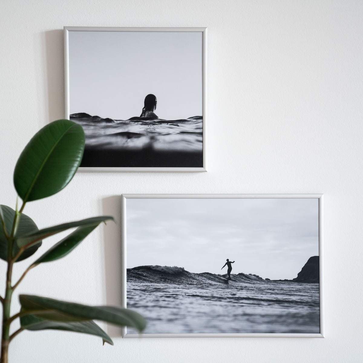
A set of black and white pieces arranges differently from a set in color. With hue unavailable as an organizing principle, groupings cohere by value: a wall that steps gradually from pale to dark — or holds a deliberate rhythm of dark, light, dark — reads as composed, while a random scatter of mid-gray images reads as static. Two layouts serve most collections. The strict grid, identical frames at identical intervals, turns a series — street scenes, studies of one coastline, portraits — into a single architectural gesture, and it forgives modest individual images by making the set the artwork. The salon arrangement, mixed sizes fitted closely, suits a varied collection and rewards darker anchors at the corners to hold the edges. In both, mix the families freely: a photograph beside a line drawing beside a graphic shape is not a compromise in monochrome, because the shared value language is already doing the unifying work that color would have to do elsewhere.
Monochrome on colored walls
Black and white art is usually recommended for neutral rooms, but it performs some of its best work on saturated ones. Against a deep green, navy, or oxblood wall, a black and white photograph in a pale mat becomes the room’s rest stop — the one place the eye is not being asked to process hue — and the wall color, given a single strong contrast to lean on, reads richer rather than louder. The pairing also disciplines colorful furniture: a patterned, multicolored sofa settles noticeably when the art above it declines to add a sixth color. The caution runs the other way on pale walls, where monochrome is so expected that it can slide into invisibility; there, choose pieces with true blacks and let the frames be black too, so the wall keeps its punctuation.
Avoiding the dorm-room look
Everyone has seen the failure mode: a famous photograph, printed thin, unframed, curling slightly, at a size too small for its wall. The image is blameless; the presentation is the entire problem. The fixes are unglamorous and total. Frame it — any real frame, with a rigid back, ends the poster reading. Scale it up — monochrome’s simplicity tolerates, and usually demands, larger sizes than color does. Hang it deliberately — at eye level, with space around it, in a group composed by value rather than grabbed in a pile. And choose subjects with some specificity: a bridge you have walked, a coastline you know, a face with a story. Generic fame is what reads as dorm; personal conviction reads as collection, even in a set of three.
One more habit separates the two readings: restraint about quantity. The dorm wall is usually not one poster but nine, added one per semester with no plan and no editing. A collection has a boundary — this wall, these frames, this value range — and new pieces earn entry by displacing something or extending the sequence deliberately. Monochrome makes the discipline easier, because the test for a new piece is quick: does its contrast family match the wall’s, and does its frame already live there? Two yeses and it belongs; anything else is a poster waiting for a dorm.
Where black and white wall art earns its keep
Some rooms are simply built for it. A room with one strong color already — a green sofa, a red rug — often wants its art in black and white so the wall supports rather than competes. Hallways and stairwells, seen in passing and in slices, suit the graphic clarity of high-contrast pieces. Home offices borrow focus from structured city and architectural images. And a colorful, pattern-rich room that feels one note from chaos will calm visibly when its largest piece goes monochrome. Treat black and white wall art not as the safe default but as a deliberate instrument — value, contrast, and edge, played on purpose — and it stops being the absence of a color decision and becomes the strongest one on the wall.
More in Color & Decorating Fundamentals
Continue exploring: Color & Decorating Fundamentals guides · All guides