

Color & Decorating Fundamentals
Wall Art for Neutral Rooms: Three Routes
With hue removed, a room has only value, texture, and shape left to speak with. Art is usually where whichever of those is missing finally arrives.
Key Takeaways
- A neutral room offers three distinct routes: a single color statement, texture that reads quietly, or tone on tone - and the real task is reading which one your space is asking for.
- For a color statement, keep it to one piece and let the color reappear once or twice at small scale in a throw, a book spine, or a cushion, because a second colorful piece starts negotiating and the calm is gone.
- Texture works through light, so it rewards walls that get side light and can look disappointingly flat on walls that never do; it also scales gracefully, making it usually the safest route for a very large wall in a quiet room.
- For tone on tone, keep a clear value step: hold a candidate against the wall, and if you cannot tell at a glance whether it is two shades deeper or lighter, it is too close and will read as an invisible rectangle.
- Choose at a scale that occupies the wall on purpose, and test with a black-and-white phone photo: if the art vanishes into the wall in grayscale, the cure is a deeper value step or a larger piece.
A neutral room — white, warm gray, beige, greige, pale wood — is the most forgiving starting point in decorating and the easiest one to leave unfinished. Everything matches, nothing argues, and somehow the room still reads as a backdrop waiting for a subject. Wall art for neutral rooms is usually where that subject arrives. This guide is about the three honest routes a neutral room offers: one clear color statement, texture that works quietly, or tone on tone. They are genuinely different rooms at the end, so the real task is reading which one your space is asking for.
Wall art for neutral rooms: why they stall
Neutrals stall for a structural reason: with hue removed as a source of interest, a room has only value, texture, and shape left to speak with — and most neutral rooms are furnished in a narrow band of all three. Similar tones, smooth fabrics, rectangular everything. The eye slides across it and finds nowhere to land. Art fixes this not by “adding a pop,” a phrase that has launched a thousand regretted cushions, but by supplying whichever ingredient the room lacks most: a hue, a surface, or a deeper step in the same tonal ladder.
Route one: a single color statement
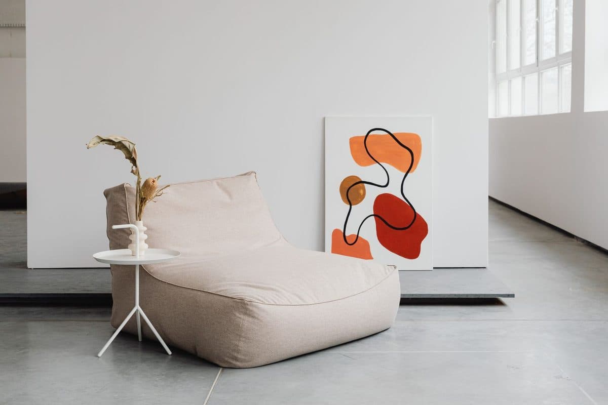
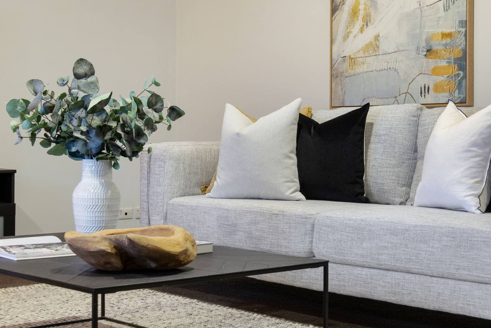
The boldest route is one piece in one unmistakable color, hung in a room that otherwise stays quiet. A deep teal canvas over an oatmeal sofa, a rust-red photograph in a white kitchen — the piece becomes the room’s accent color by appointment, and everything else gets to relax. Two disciplines make it work. First, one statement, not three: the moment a second colorful piece arrives, the two start negotiating and the calm is gone. Second, let the color reappear once or twice at small scale — a throw, a book spine, a cushion — so the piece reads as chosen rather than stranded. The route suits rooms that feel flat in every dimension, and rooms whose furniture you love but whose palette puts you to sleep. It is at its best in the bedroom, where a single saturated piece above the bed can carry the whole room while everything around it stays restful — the calm, above-the-bed placement that bedroom wall art sizes and positions for a restful room.
Route two: texture that reads quietly
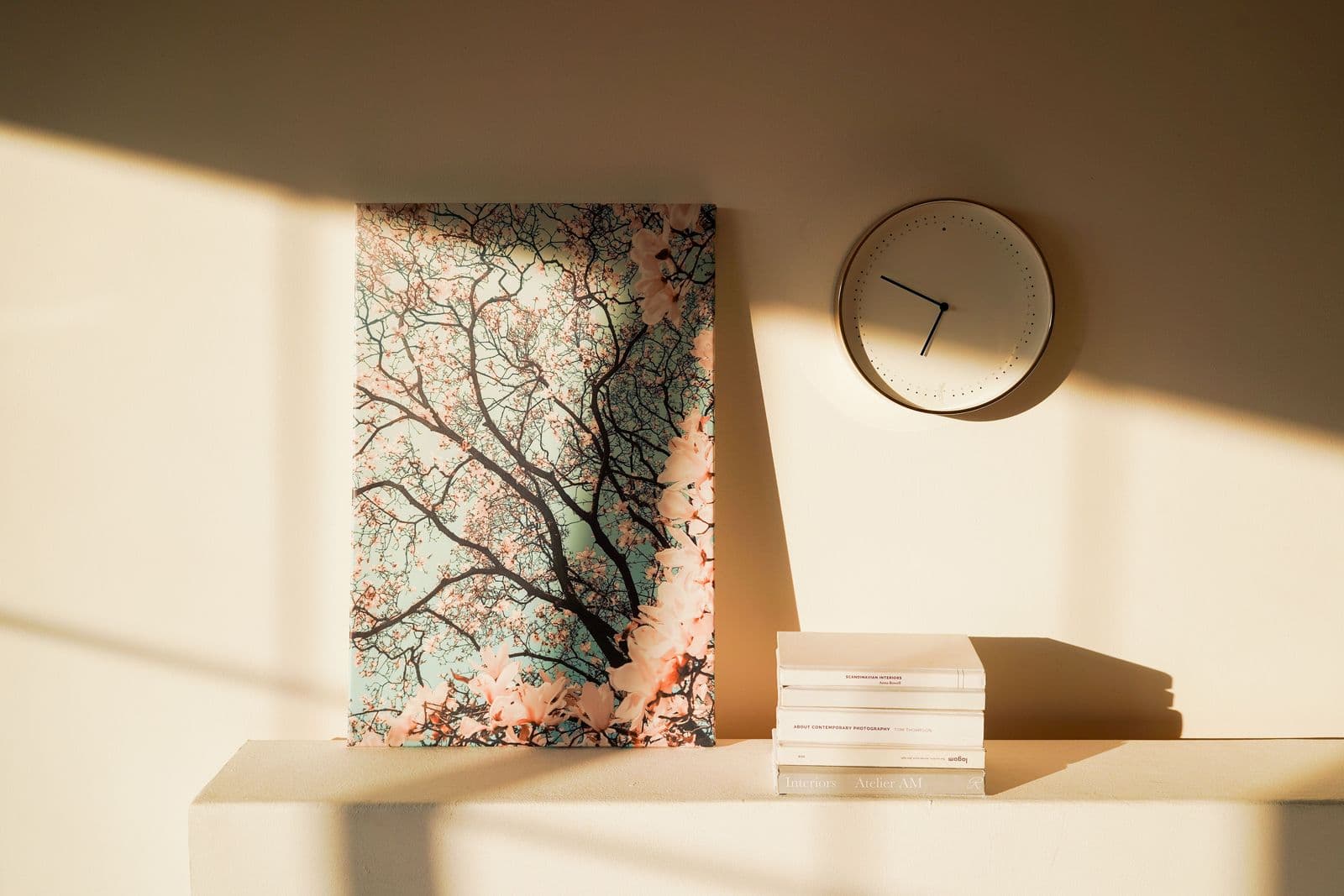
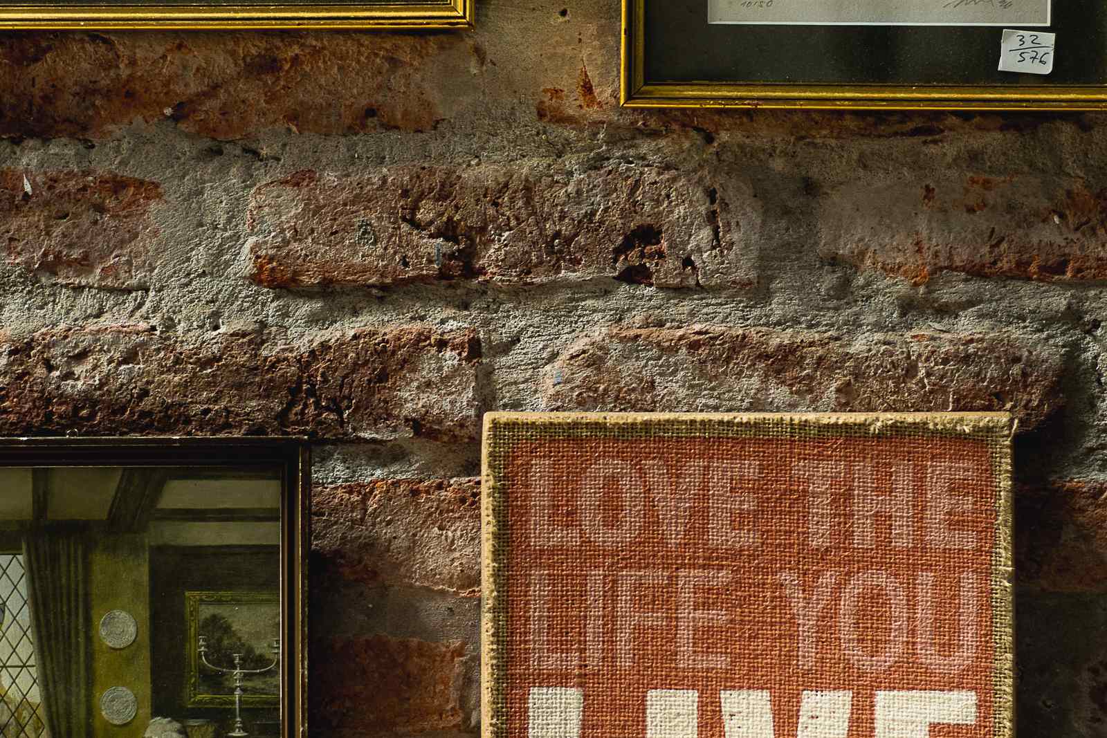
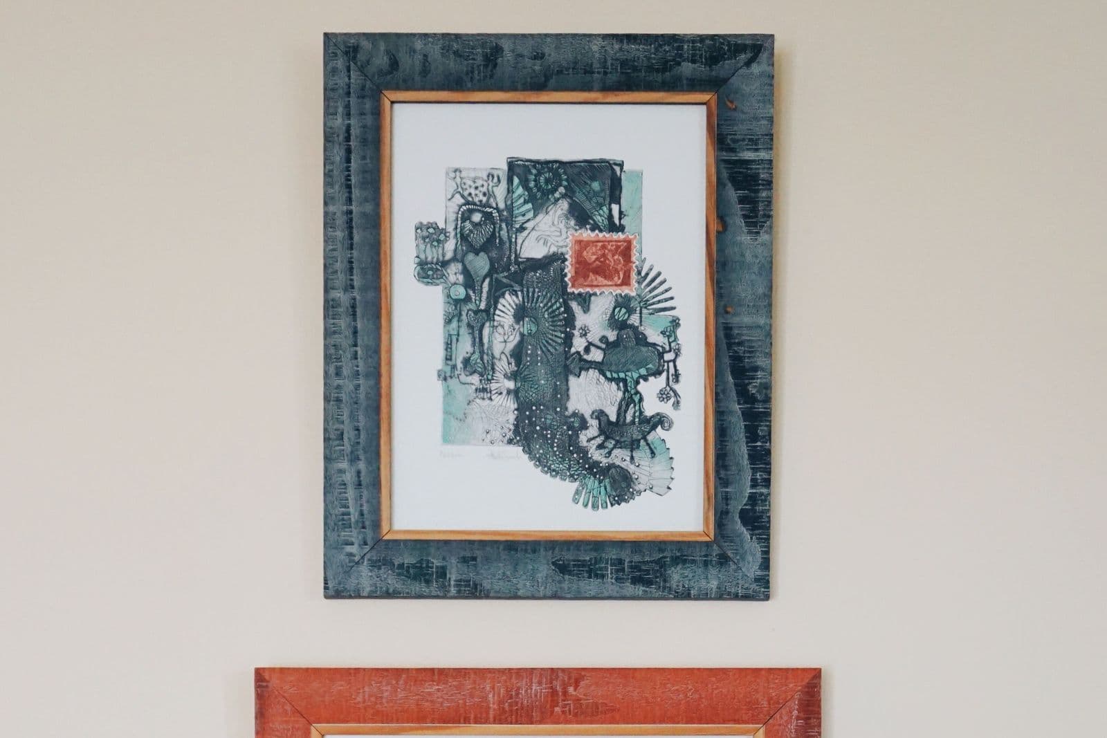
If color feels like too much personality before coffee, texture is the quieter currency. A heavily worked painted surface, a woven or relief piece, a photograph of weathered wood or dune grass, a print with visible grain — these give the eye incident without giving the room a new hue to manage. Texture works through light: a raking morning sun turns a flat print into a landscape of small shadows, which is why textured pieces reward walls that get side light and can look disappointingly flat on walls that never do. This route suits rooms that already carry pattern or color in their furnishings — a floral rug, a checked throw — where one more hue would start an argument but a surface would simply deepen the peace.
Texture also scales gracefully, which makes it the safest route for very large walls. A single huge color statement can dominate past the point of pleasure, and tone on tone at that scale risks the invisible-rectangle problem — but a big textured surface just gets better as it gets bigger, because there is more incident for the light to find. If the wall is the largest in the house and the room’s temperament is quiet, texture is usually the answer the other routes are politely circling.
Route three: tone on tone
The subtlest route keeps the art inside the room’s own family and finds contrast in value instead of hue: a print in warm grays and stone over a greige sofa, cream and sand photography on a white wall, a charcoal-leaning piece where the room needs one dark anchor. Done well, tone on tone is the most restful wall in the house — depth you feel rather than notice. Done carelessly, it is the invisible picture: art so close to the wall color and the sofa fabric that it reads as a slightly darker rectangle. The safeguard is a clear value step. Hold a candidate against the wall; if you cannot tell at a glance whether it is two shades deeper or lighter, it is too close, whatever the screen suggested. This is the route that leans naturally toward minimalist rooms, where restraint is the point and a whisper of tonal depth finishes the thought — the restraint that minimalist wall art turns into a discipline of one piece given room to breathe.
Reading which route your room wants
Three questions usually settle it. What is the light doing? A bright, sun-washed room can absorb a strong color statement or carry tone on tone without going murky; a dim north-facing room often needs the color route just to wake up, or texture positioned where the little light it gets rakes across it. What texture is already there? A room full of linen, boucle, raw wood, and woven rugs is texture-rich — the texture route adds least there, while a smooth, flat-furnished room gains the most from it. And what is the room for? Rooms for sleeping and reading usually choose calm — texture or tone. Rooms for gathering can carry the statement. Answer honestly and the route tends to pick itself.
Scale and the grayscale test
Neutral rooms punish small art more than colorful ones do. In a vivid room, a modest piece can borrow energy from everything around it; in a neutral room it has nowhere to borrow from, and a too-small picture reads as an afterthought the wall is politely ignoring. Whatever route you choose, choose it at a scale that occupies the wall on purpose — the expanse above a sofa, the full height of a reading corner — because in the absence of color, size and value step are what read as confidence. A useful check before committing: photograph the room, or a candidate image taped in place, and convert the photo to black and white on your phone. The grayscale version strips the situation to values alone, which is exactly how a neutral room is experienced. If the art vanishes into the wall in the photograph, it will vanish in person, and the cure is a deeper value step or a larger piece — not a different cushion.
One lead, two supports
The routes combine, but they need a hierarchy: one leads, the others support at lower volume. A color statement over the sofa can coexist with tone-on-tone pieces on the side walls, because the side pieces are not competing in the same register. Texture can lead on the main wall while a small, muted color study warms a corner. What fails is three leads at once — a saturated canvas, a busy relief piece, and a dark tonal anchor all insisting — which produces the peculiar unrest of a room where every wall is talking. If you are drawn to all three, sequence them by wall, not by square inch.
Wall art for neutral rooms: mistakes that flatten
The confetti effect: many small, unrelated colorful pieces scattered across a neutral room, each too small to lead, together reading as noise. One piece at real scale beats six apologies. The invisibility error: matching art almost exactly to the sofa or wall, usually in the name of safety — safety that succeeds so completely the art disappears. And the undertone clash: neutrals have warm and cool leanings, and a cool gray print in a warm beige room reads dirty rather than calm. The pillar guide to how to choose wall art colors covers undertones in depth; here it is enough to hold the candidate against your largest neutral surface and trust your squint.
However you choose your wall art for neutral rooms, choose at scale and in the room’s real light, with the other routes consciously declined rather than accidentally mixed. Browse the formats with these three routes in mind at the shop, and a neutral room stops being a waiting room: it becomes the quietest kind of deliberate.
More in Color & Decorating Fundamentals

Continue exploring: Color & Decorating Fundamentals guides · All guides