

Home Staging Wall Art: Neutral and Bright
A staged room has to let strangers picture their own mornings there. That means calm, roomy art in the photographs - and personal pieces packed away.
Key Takeaways
- Choose neutral subjects with broad appeal - soft landscapes, gentle abstracts, botanicals, and quiet coastal scenes - and remove family photos, diplomas, and anything religious, political, or confrontational.
- Size for the camera first: generously scaled pieces over the sofa and bed anchor listing photos and make rooms read larger, so when in doubt stage one size up.
- Prioritize the walls photographs actually show: the entry sightline, the wall behind the sofa, the master bed wall, and any long hallway that would otherwise read as a tunnel.
- Reduce holes and hassle with lightweight pieces on a single small fixing or wall peels that come down without a trace, and ask about rental or rotation options before buying more inventory.
- Check the result on a phone from each doorway, hang pairs centered on furniture below, and err slightly lower and larger than at home so pieces do not shrink or drift out of listing shots.
Staging art has the strangest brief in decorating: it must make a room feel loved without saying anything about the people who loved it. Buyers are not shopping for your taste; they are trying to imagine their own mornings in the room. Home staging wall art is the stager’s fastest tool for that job, because bare walls photograph cold and personal walls photograph someone else’s. The staged middle — neutral subjects, generous scale, nothing that starts an argument — is a learnable discipline.
Home staging wall art: neutral subjects, chosen for breadth
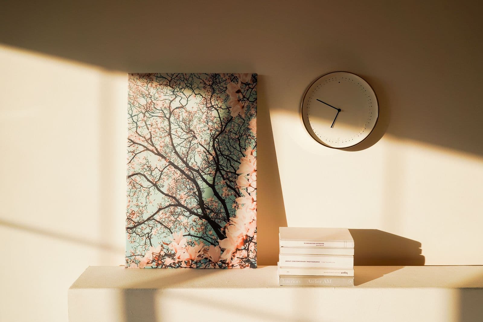
The staged palette of subjects is short and proven: soft landscapes, gentle abstracts, botanicals, quiet coastal scenes. What unites them is breadth of appeal — nearly every buyer can project onto a pale landscape — and the absence of friction. Off the walls go the things that narrow a room’s audience: family photographs, diplomas and certificates, anything religious or political, strong nudes, and the one confrontational piece the sellers adore. None of that is a judgment on the art. It is the simple recognition that a staged room is an advertisement, and advertisements do not pick fights.
Color follows the same logic. Work in the house’s existing neutral register — the choice our wall art for neutral rooms guide breaks into a colour statement, quiet texture, or tone-on-tone calm — and let the art carry one soft note of color — sage, dusty blue, warm clay — that the cushions and a throw can echo. Buyers experience that echo as “the room feels pulled together” without ever seeing the mechanism.
Home staging wall art at generous scale: the camera is the first viewer
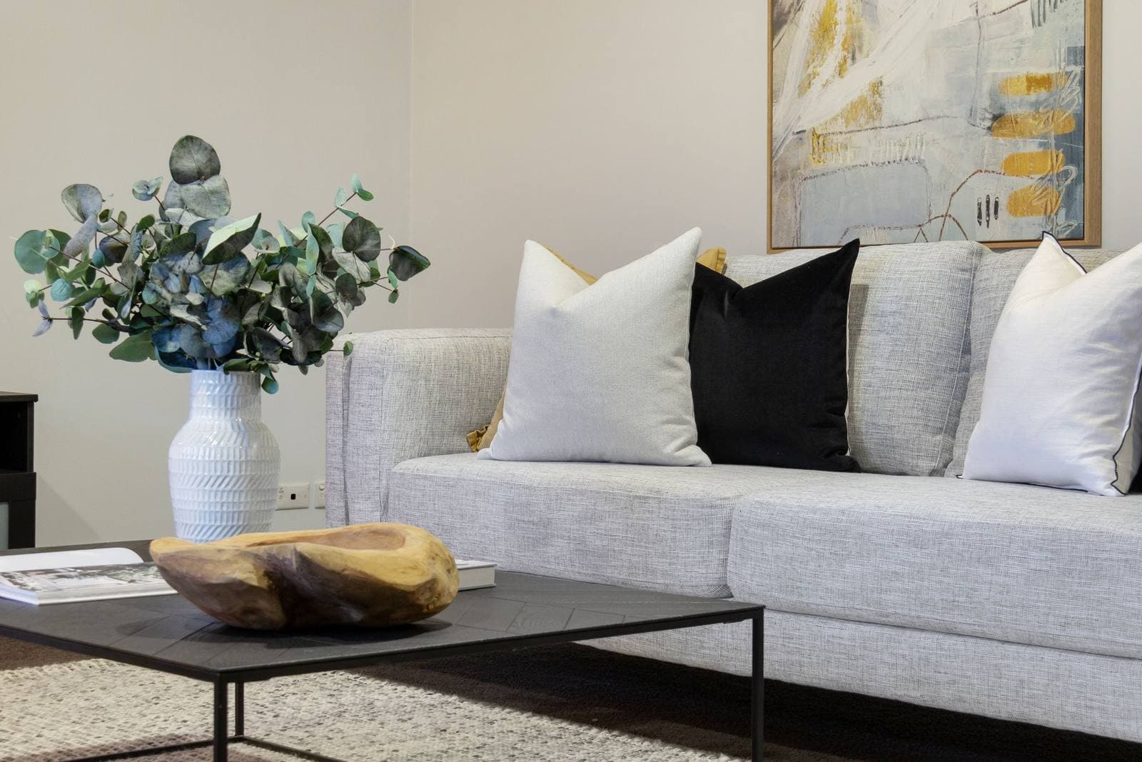
Most homes are now bought twice: once in the listing photographs and once at the viewing. Art should be sized for the first purchase. Small pictures vanish in listing photos and leave walls reading empty; generously scaled pieces — a wide landscape over the sofa, a substantial piece over the bed — give the camera an anchor and make rooms read larger and calmer. When in doubt, stage one size up from what the sellers lived with. The living room earns the largest piece in the house, because it is the photograph that sells the click.
Cover the cold spots in priority order: the wall the camera faces from the doorway, the wall behind the sofa, the master bedroom’s bed wall, and any long hallway that would otherwise photograph as a tunnel. A staged home does not need art in every room; it needs art in every photograph.
Rentals, peels, and holes you do not have to fill
Stagers work in other people’s walls, and every nail hole is a small debt. That practical fact explains the profession’s affection for lightweight pieces that hang from a single small fixing — and for wall peels, the removable format that goes up smooth, reads as a real print at camera distance, and comes down without a trace when the listing closes. Peels are the honest answer for short listings, fresh paint you may not mark, and walls the seller will not let you touch. Rented art libraries and lease arrangements through a supplier’s trade program solve the same problem at the inventory level — ask what rental and rotation options exist before you buy another storage unit’s worth of frames; it is the same sourcing discipline the designers’ guide to sourcing wall art recommends — terms, proofs, and timelines in writing before money moves.
The first ten feet: entry and sightlines
Buyers decide how a house feels within seconds of the front door, and the camera rehearses that decision for them a week earlier. Whatever hangs on the wall the door opens toward — or the wall visible straight ahead down the first hallway — is the hardest-working picture in the listing. Give it the full staging treatment: landscape or gentle abstract, the house’s soft color note, hung at a generous scale and a proper eye level, with the sightline kept clear of the clutter that creeps into entries. A buyer who has already felt one calm, composed wall forgives a small kitchen. A buyer greeted by bare plaster starts the tour doing arithmetic about work.
Sightlines run through the house, not just at its door. Stand in each doorway and note which wall the eye lands on; those landing walls are your staging priority list, in order, and any wall never seen from a doorway can go bare without costing the sale a thing.
Height, pairs, and other mechanics
Staged art obeys the same hanging arithmetic as any art — center near eye level, art spanning roughly two-thirds of the furniture below it, pairs and rows sharing one level line — with one staging-specific twist: err a touch lower and larger than you would at home. Listing photographs are taken from standing height in doorways and corners, and a piece hung for the seated view can drift up out of the frame or shrink against the wall in the shot. Before the photographer arrives, take your own phone pictures from the doorway of every staged room and check the walls in the screen, not the room: what reads in the photograph is what the buyer is buying.
Pairs and trios photograph better than odd singles in bedrooms and dining rooms, because symmetry reads as intention at thumbnail size — and thumbnails are where listings are chosen. A matched pair over a bed, bookending nothing, centered on the bed rather than the wall, is close to a universal solvent for a tired bedroom.
Working with the sellers’ own art
Most homes already own some usable staging art; it is simply mixed in with the unusable. The audit is quick. Keep: quiet landscapes, abstracts in the house’s register, botanicals, anything whose subject a stranger could like in three seconds. Pack early: portraits and family galleries, travel souvenirs with text, loud pieces that dominate a room’s photograph, and anything small — the sellers’ cherished little print will read as a smudge on the wall in the listing. Fill the gaps from staging inventory in the house’s two or three sizes, so the walls speak in one calm voice. Sellers hear this better framed as editing than as rejection: their art is not being judged, it is being given the same rest as the family photographs, to return in the new house where it belongs.
Small rooms, dark rooms, awkward rooms
The secondary rooms are where staging schemes go to die, usually by omission. A small bedroom does not need small art — it needs one piece larger than instinct suggests, because generous scale is what keeps a small room from reading as the house’s leftover. A dark room wants the brightest, palest piece in the inventory and the warm end of the neutral register; cool grey art in a north facing box room is how listings acquire the word “cozy” in the comments and silence everywhere else. And the awkward wall — the chimney breast, the staircase turn, the wall interrupted by three doors — wants either one disciplined piece centered on the interruption or a clean, deliberate nothing. Half-measures on awkward walls photograph as mistakes; confidence, in either direction, photographs as design.
Check every one of these rooms on the photographer’s screen before the shoot ends, not after the listing posts. Retakes cost a phone call on the day and a new booking after it.
The rooms buyers photograph
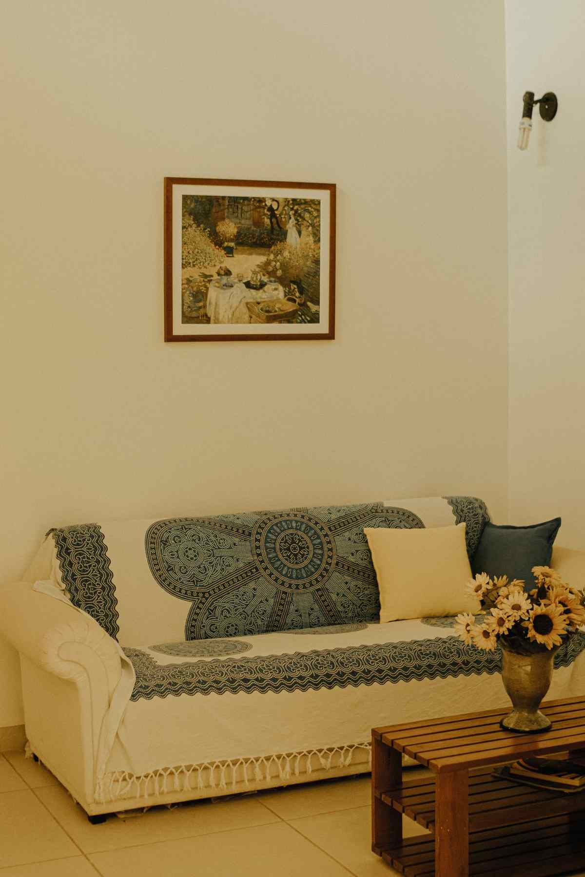
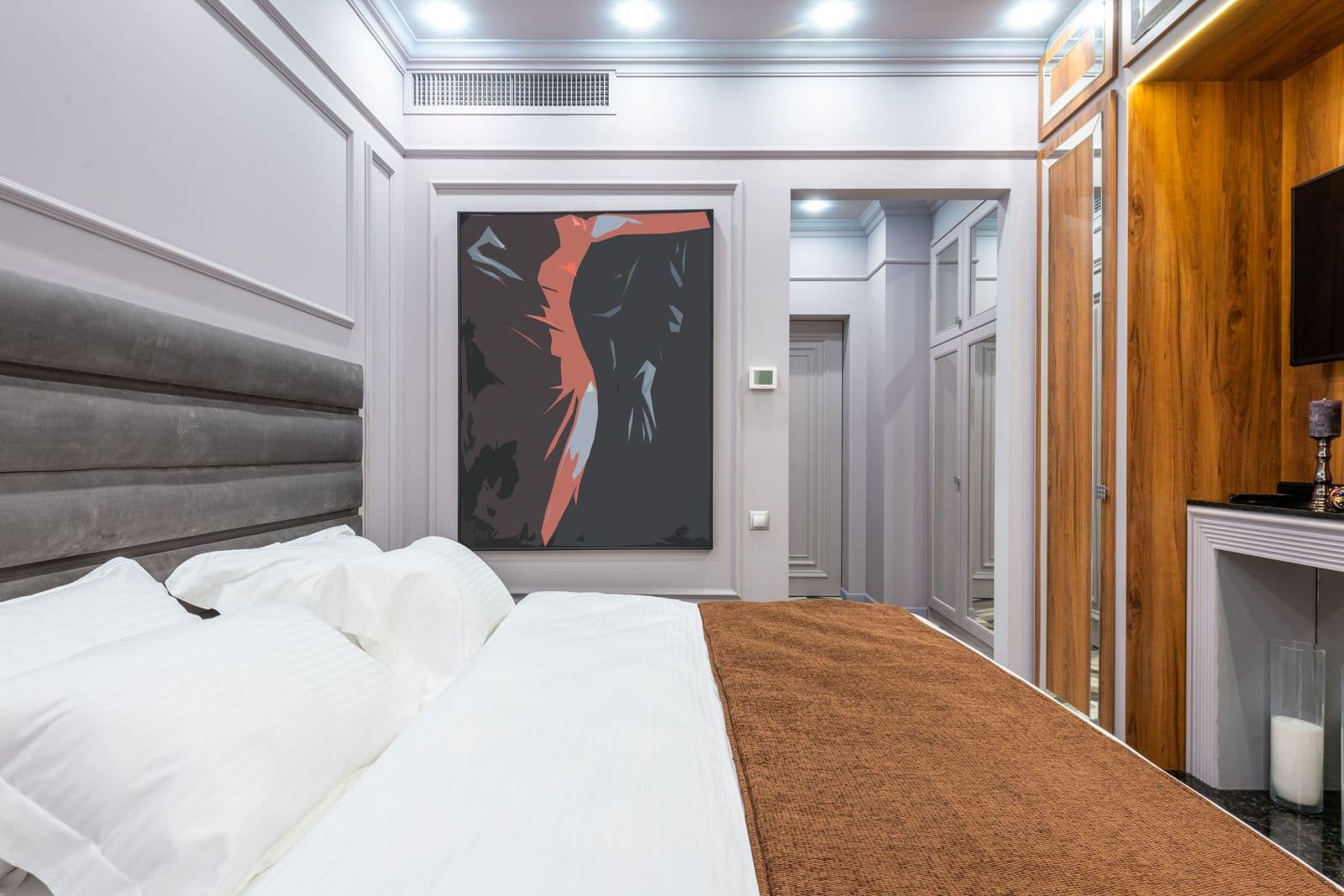
Walk the house as the photographer will. The living room gets the wide, calm anchor — the room our living room wall art guide covers in full, from sizing over a sofa to hanging height. The dining room takes a pair or a still life at seated eye level. The master bedroom wants the softest piece in the inventory, centered over the bed at a scale that makes the bed look generous. Kitchens take one small, fresh piece — a botanical, a market scene — or none; counters do the talking there. Bathrooms, if they get art at all, get something small, bright, and unbothered by steam.
Neutral, bright, and broadly liked is not a synonym for forgettable. It is the discipline of home staging wall art: every wall answering the buyer’s only real question — could this be mine? — with a calm, well-lit yes.
More in Trade & Designer B2B


Continue exploring: Trade & Designer B2B guides · All guides