

Home Office Wall Art for Better Video Calls
One wall works for the camera and one works for you. Confusing the two is how a backdrop ends up busy, glaring, or growing out of your ear on calls.
Key Takeaways
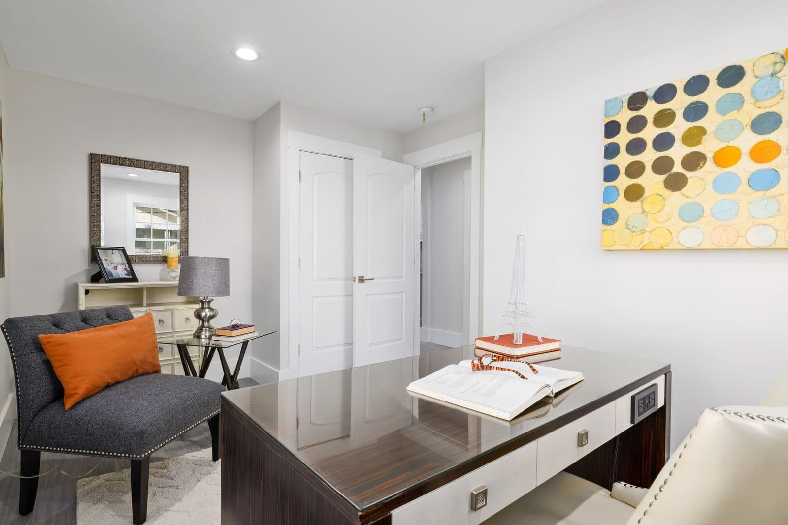
- Compose the backdrop for the camera, not the room: take a screenshot in your usual meeting setup and lower and centre the art on your chair until a comfortable margin shows above your head.
- Keep the backdrop calm and legible on video — bold shapes and gentle contrasts, no text, no faces and no glossy surface reflecting your window.
- Put the piece you like most on the wall you face, at eye level from your chair, ideally a view with depth such as a landscape or map that rests eyes used to a screen.
- Hang glazed pieces on walls perpendicular to the window and use matte canvas or low-reflection glazing where a piece must face the glass.
- Plan for rotation with a ledge or standard-spaced fixings, swapping the thinking wall seasonally before familiarity turns a good piece into wallpaper.
A home office has two audiences for its walls, and they want different things. The first is you, eight hours a day, needing the room to help you focus and to give your eyes somewhere kind to rest between tasks. The second is the camera, which shows your colleagues exactly one wall of your home and reads it as a statement about your competence. Home office wall art has to serve both. For the browse view, see home office wall art; this guide covers the backdrop wall, the thinking wall, and the glare problem that offices suffer more than any other room.
Home office wall art for the camera: the backdrop wall
Start with the wall behind your chair — the one on every call. The camera crops it tightly, so think in terms of what fits in the frame: your head and shoulders occupy the middle, and the art should sit above and behind them, high enough to be visible over your head, composed enough to read as intentional rather than accidental. A single calm piece centered over the desk is the reliable arrangement; a symmetrical pair works if the camera sees both halves.
Backdrop specifics that matter on video: fine, busy detail shimmers and crawls under webcam compression, so favor bold shapes and gentle contrasts over intricate pattern. Text in frame is a distraction and can appear reversed depending on the setup — keep lettering out of the backdrop. Anything with a face will upstage yours; portraits belong on the walls the camera never sees. And a glossy piece behind you may spend every call holding a bright reflection of your window — check the backdrop with the camera on, in the light you actually work in, before you drill anything.
Before you hang anything, do the ten-second test: sit in your chair, turn the camera on in your usual meeting setup, and take a screenshot of yourself. That still image is the exact composition your colleagues get. Check what the art is doing in it — whether a frame edge juts from behind your head like a speech bubble, whether the piece sits so high only its bottom third is ever seen, whether a horizon line appears to grow out of your ear. Most backdrop mistakes are framing mistakes, invisible from anywhere in the room except the camera’s exact seat. Lower the piece until a comfortable margin of it shows above your head, center it on your chair rather than on the wall, and let the screenshot, not the tape measure, have the last word.
The wall you face is the one that matters
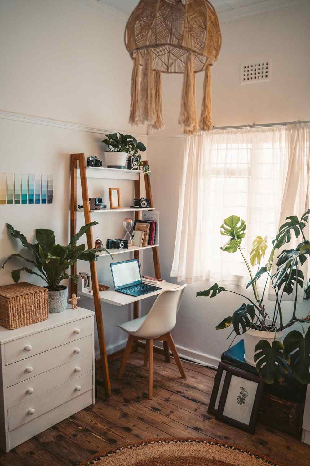
The backdrop is for other people. The wall across from your desk — the one you look at while thinking, waiting for a file, or gathering a sentence — is for you, and it should hold the piece you like most in the room. This is where art earns its keep cognitively: a view with some depth gives the eyes a focal distance far beyond the screen, which is genuine rest for eyes that spend the day at eighteen inches. Hang your favorite at eye level from your chair, not from standing, and let it be the room’s largest piece; the backdrop can be the supporting act.
Keep the thinking wall’s subject matter on the calm side of interesting. The office failure mode is art that is either so bland it might as well be paint, or so stimulating it competes with the work. The middle ground is a scene or an arrangement you can look into — somewhere the eye can wander for ten seconds and come back with the sentence it was looking for.
Home office wall art subjects that help you think
The office’s signature subject is the map. Maps reward exactly the kind of looking an office day is made of: a wandering eye travels a coastline or a street grid, rests, and returns — and on camera, a map reads as thoughtful in a way few subjects manage. A map of a city you have lived in, a region you travel, or a coastline you sail carries personal meaning without personal exposure, which is precisely the register a professional backdrop wants — the thread our guide to map wall art and places that mean something follows in full. Landscapes do similar work, especially the open, horizon-led kind that reads as a window where the room has none. Quiet abstracts in low-contrast palettes suit focus well, since they give the eye color and movement without a scene to decode.
Subjects to ration: high-energy color fields and aggressive geometrics can keep a wired brain wired; anything with a slogan will be read by colleagues and quoted back at you; and the trophy wall — diplomas, awards, team photographs — belongs, if anywhere, on a side wall at modest scale, where it reads as history rather than advertisement.
One subject deserves a special office mention: the view you wish you had. A photograph of the coast you grew up on, a print of the mountains your weekends go to, the street in the city you mean to move to — personal-geography art works in an office the way it works nowhere else, because the room is where ambition and routine negotiate, and a picture of the point of it all is a legitimate productivity tool disguised as decoration. Keep it on the thinking wall, where it is yours, rather than in the backdrop, where it invites questions you may not want in a meeting.
Glare: the office-specific enemy
Offices concentrate the three glare sources that plague art: windows, screens, and task lamps, all in a small room. A glass-fronted piece hung opposite the window will mirror it all morning; an acrylic opposite your monitor becomes a second, dumber screen. The fixes are placement and surface. Hang glazed pieces on walls perpendicular to the window, where light strikes them at an angle. Where a beloved piece must face the glass, choose matte surfaces — canvas, or fine art paper prints behind low-reflection glazing, which keep the detail paper lovers want without the mirror effect. Test with the desk lamp on and the screen lit: office light is a committee, and the piece has to get along with all of it.
Rotation: the office advantage
No room stares at its art longer than an office, and familiarity dulls even good pieces into wallpaper by the hundredth day. The office is therefore the best room in the house for deliberate rotation: two or three pieces that suit the space, swapped seasonally or quarterly, so the thinking wall keeps offering the eye something slightly new. Rotation also turns the office into the house’s overflow gallery — the piece displaced from the living room gets a second life where it will be looked at most — and the room it came from is planned in living room wall art for the main wall. Hang the thinking wall’s anchor on a system that tolerates change — a ledge, a pair of standard-spaced fixings, frames of one size — and the swap becomes a five-minute reset rather than a redecoration.
If your chair faces a window instead of a wall, this whole section still applies, one wall over: give the side wall your eye drifts to the favorite piece, and keep the backdrop behind the chair doing its quiet work for the camera. The principle is unchanged — one wall composed for others, one wall composed for you.
Zoning a borrowed corner
Many home offices are not rooms but territories — a desk in the guest room, a corner of the bedroom, the end of a dining table. Art is the cheapest border fence ever made. A pair of pieces at consistent height marking the desk’s span, or one strong piece squarely behind it, declares where the office is and, just as usefully, where it ends. Keep the office zone’s art palette related and its style distinct from the host room’s, and the corner reads as a workplace that happens to share a room — which is a far better headspace at nine in the morning than a bedroom that happens to contain email.
Serve the camera with a calm, glare-free backdrop; serve yourself with the best piece on the thinking wall; let maps and open views do the resting — and your home office wall art will be working as many hours as you are. A shared workplace scales the same thinking up — corridors, meeting rooms, reception walls — in wall art for offices and calmer meeting rooms.
More in Room Guides
Continue exploring: Room Guides guides · All guides