

Fall Wall Art: Autumn Color, No Plastic Leaf
Skip the plastic leaves. Autumn lands best when one generous picture carries russet and ochre while the rest of the room stays calm.
Key Takeaways
- Three kinds of images do the work — autumn landscapes, harvest still life, and warm-toned abstracts — and most rooms need only one of them, in one generous piece, rather than a little autumn everywhere.
- Restraint is what separates a good autumn landscape from a calendar cliche: look for warm colors balanced by something cool, like a grey sky, blue distance, or deep shadowed green, so the picture does not shout for three months.
- Treat fall color as a shift in proportion: choose two autumn tones as the season's voice, let the picture carry them at full strength, repeat one quietly in a cushion or throw, and change nothing else.
- Refuse the shortcuts that date a scheme: literal seasonal word art, orange that exists nowhere in nature, matched harvest sets bought as a bundle, and covering every wall.
- Check candidates in lamplight, not noon light: fall evenings arrive during dinner, warm images deepen kindly under lamps, and anything already dark goes darker — still lifes and deep forest images age best across the whole season, including moodier November.
Fall is the easiest season to decorate badly and the most rewarding to decorate well. The bad version announces itself: plastic leaves, a pumpkin on every surface, orange so aggressive it fights the furniture. Good fall wall art is quieter. It takes the season’s real pleasures — turning color, harvest weight, earlier evenings — and lets the walls carry them through pictures, the way they carry every other mood in the house.
Three kinds of images do the work: autumn landscapes, harvest still life, and warm-toned abstracts. Most rooms need only one of them, in one generous piece.
Fall wall art as autumn landscapes: color that behaves
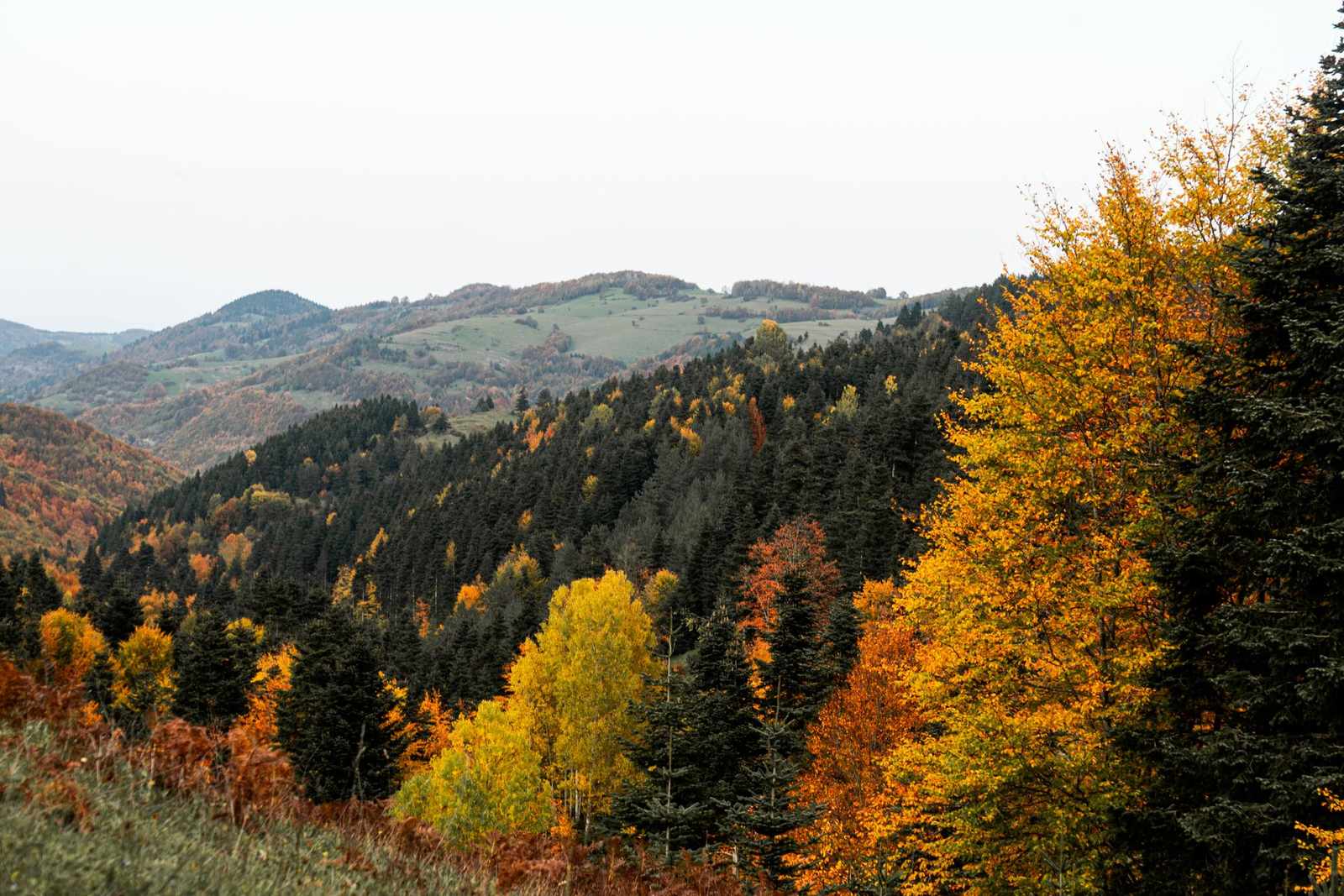
The autumn landscape is the season’s anchor image: a hillside turning amber, a road through russet woods, fields gone gold under a lower sun. What separates the good ones from the calendar clichés is restraint in the palette. Look for images where the warm colors are balanced by something cool — a grey sky, blue distance, deep shadowed green — because a picture that is all orange will shout at your room for three months.
Browse the landscapes with your room’s existing palette in mind. Fall art does not need to match the sofa; it needs to argue with it politely. A warm landscape in a cool grey room is the classic move — the picture becomes the room’s fireplace. In a room that already runs warm, choose the moodier end of autumn: mist, bare branches, the last green holding on.
Harvest still life: the season at table scale
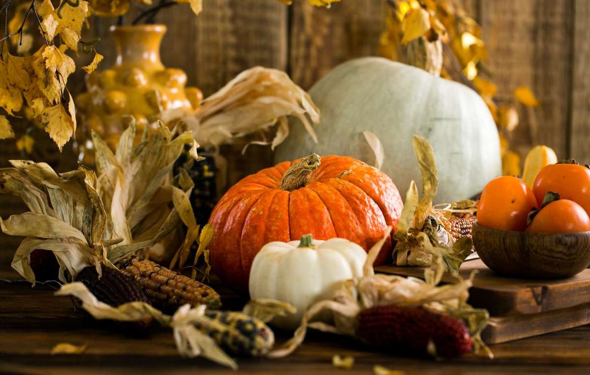
Where landscapes give you the season outdoors, still life gives you its table: orchard fruit, grain, squash and gourds painted rather than piled, bread, copper, late roses going brown at the edges. The still life tradition is centuries deep, and its autumn branch is the richest — paintings made to celebrate weight and ripeness in low, golden light.
Still life suits the rooms where fall is actually eaten: the dining room, the kitchen, the end of a hallway that needs a reason to exist. It also scales down gracefully. A single modest still life in a dining room does more for the season than a garland ever did, and it does it without a single plastic leaf.
Warm abstracts: the season as temperature
If your rooms are modern, or your autumn is more about light than leaves, an abstract in the season’s range — ochre, umber, rust, olive, one note of cranberry — gives you the temperature change without the literal subject. Abstracts rotate in gracefully because they ask nothing of the room but color agreement, and they pair well with the textiles fall brings out anyway: wool throws, heavier curtains, lamplight arriving an hour earlier.
Reading the fall wall art palette like a decorator
Fall color fails when it is applied as a coat of paint over the whole house and succeeds when it is treated as a shift in proportion. The practical version: choose two autumn tones to be the season’s voice — say russet and ochre, or burgundy and old gold — and let everything else stay in the room’s existing register. The picture carries the two tones at full strength; a cushion or throw repeats one of them quietly; nothing else has to change. Rooms decorated this way read as autumnal from the doorway without a single object that has to be packed away in December being anything but a picture.
Wood deserves a mention, because fall is when it comes into its own. In rooms with warm wood — floors, beams, a farmhouse table — autumn art is finishing a sentence the furniture started, and the risk is monotony rather than clash. Break it with value, not hue: a pale, misty autumn image against dark wood, or a deep shadowed forest against pale oak. The season is warm; the composition still needs contrast to stay awake.
Scale: one generous piece beats a harvest of small ones
The plastic-leaf school of decorating works by accumulation — a little autumn everywhere — and it fails the way accumulation always fails, as clutter. Pictures work by the opposite logic. One generously scaled autumn landscape above the sofa changes the room’s season outright; four small prints of leaves change nothing but the nail-hole count. If the budget or the wall only allows one move this year, make it the largest single piece the main wall can take, hung at the two-thirds proportion the furniture asks for, and let the season live there with full conviction.
Small pieces have one honest job in fall: the dining room and kitchen, where still life works at intimate range and a modest scale is the tradition rather than a compromise. Everywhere else, think in anchors, not accents.
What to leave in the store
A short list of refusals will save most fall schemes. Refuse the literal word art of the season — gratitude is a practice, not a wall treatment, and text dates faster than any image. Refuse the orange that exists nowhere in nature; real autumn runs amber, rust, wine, and brown, and the neon version will fight every honest color near it. Refuse the matched set, the harvest-themed series bought as a bundle: three pictures saying the same thing in the same voice is merchandise, not decorating. And refuse to cover every wall. A room where one wall has changed for fall and the others are calm is a room with a point of view.
Late autumn: the season’s second half
Fall has two acts, and art can honor both. September and October are the color — the turning, the harvest, the gold. November is the moodier movement: bare branches, mist, fields gone quiet, the first woodsmoke register. Rooms that carry one rich autumn piece all season do not need to acknowledge the shift, but if your anchor is at the blazing end of the palette and it starts to feel loud by Thanksgiving, that is the signal the picture was a first-act piece. The still lifes and the deep forest images age best across the whole season, which is worth knowing in September, when everything in the store is shouting October. When that second act ends, the next swap is December’s — and festive wall art without the tinsel overload is an easier handover if the fall piece was chosen to age, as the still lifes do.
Lamplight is the other half of the equation. Fall evenings arrive during dinner, and the picture chosen in bright noon light will actually be lived with under lamps. Warm images deepen kindly in lamplight; anything already dark goes darker. Check a candidate the way the room will present it — evening eyes, warm bulbs — before you commit the wall.
The entryway gets the handshake
If one room outside the living room earns a seasonal piece, it is the entryway. It is where the season is first felt — coats coming in, the smell of rain, the light already changed — and a single autumn piece there sets the house’s register before a guest reaches the sofa. Entryway walls also forgive boldness: it is a pass-through room, so a richer, moodier autumn image can live there happily even if it would brood in a room where people sit all evening.
Rotating in, and putting summer away properly
A fall wall art swap works best when it is a true exchange — one move in a seasonal rotation system — the autumn piece takes the hook, size, and frame line of the piece it replaces, and the summer piece goes into storage in the same hour. Wrap it face-protected, store it upright in a dry, temperate spot, and label it — next spring you will thank yourself for writing “summer — living room” on the wrapping instead of playing the guessing game. The same labeling pays off at the other end of winter, when a light spring refresh asks you to find the pale pieces quickly and store the heavy ones well.
That is the whole method: one season, honestly colored, carried by pictures instead of props. The plastic leaf was never the point. The point is a house whose walls notice the year turning — and fall, done this way, is the easiest season of all to notice beautifully.
More in Seasonal

Continue exploring: Seasonal guides · All guides