

Best Photos for Canvas Prints: How to Choose
Some beloved frames go flat on a wall while quieter ones shine. The difference is usually light, simplicity, and what sits near the edges.

Key Takeaways
- Strong light comes first: favor directional daylight or window light with clear modeling, and be wary of flat noon light, mixed light, and direct on-camera flash.
- Pick one clear subject you could describe in five words, with negative space around it, so the eye has somewhere to rest across a room.
- Check all four edges for expendable image, because a gallery wrap folds the outer border around the sides and tight subjects can bend awkwardly.
- Judge sharpness and color at full size: focus must hold where the eye lands, and lightly edited images with honest midtones usually print more gracefully than heavily filtered or dark ones.
- If a loved photo fails the checklist, print it smaller in a group and give the large statement spot to a frame that passes every test.
Everyone has a photograph they love that somehow falls flat as a print — and another, half-forgotten frame that turns out to be magnificent on a wall. The difference is rarely the camera. The best photos for canvas prints share a small set of traits, and once you can name them, choosing from your own library stops being a gamble. This is the checklist version of that judgment: the traits in order, what each one looks like in a real photo, and how to spot the photos in your collection that already have them.
Two of the traits surprise people. The first is that a canvas print is not a photograph under glass — the image wraps, the texture shows, and the piece is seen from across a room. The second is that the strongest print photos are usually simpler than the strongest screen photos. A picture can be a wonderful record of a day and a weak piece of wall art at the same time; this guide is about finding the ones that are both — and for what happens after the choosing, our complete guide to printing a photo on canvas covers the process end to end.
Strong light, honestly recorded
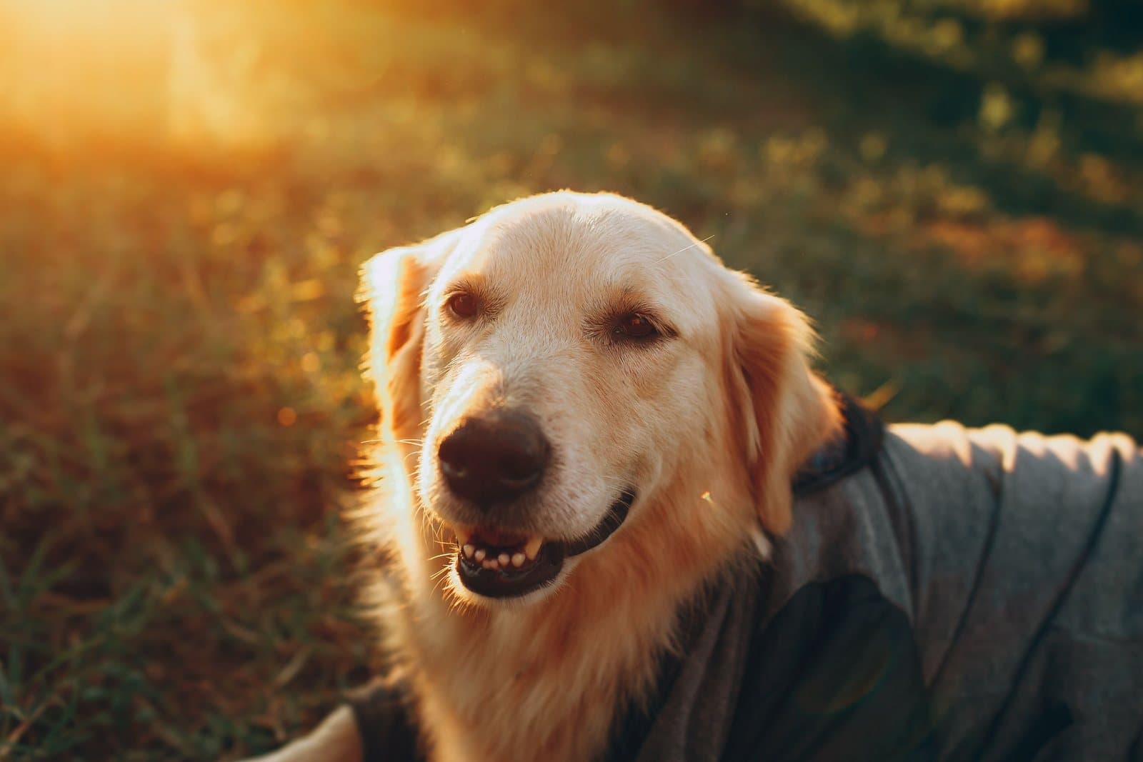
Light is the first trait because prints are less forgiving of bad light than screens are. A screen glows and flatters; a print reflects the room’s light and shows exactly what the camera captured. The photos that print best tend to have one clear light source and a clear direction: morning sun across a landscape, window light on a face, the raking glow of late afternoon. Directional light builds the modeling and shadow that give a printed image its depth.
The situations that print worst are the opposite — flat overhead noon light that flattens everything it touches, and mixed light, where a warm room lamp and blue window light fight across the same face. Direct on-camera flash is the classic offender: it flattens features, hardens shadows, and announces itself in every print. When you are scrolling your library, favor the frames where the light has a point of view.
Best photos for canvas prints have one clear subject

On a phone, a busy photo is information. On a wall, a busy photo is noise — the eye enters, finds nowhere to rest, and leaves. The photos that hold walls have a hierarchy: one subject the picture is about, and everything else arranged in support. A portrait where the person fills the frame. A landscape with one tree, one ridge, one boat doing the talking. A still life that is really about the light on a single object.
Negative space — the quiet area around the subject — is an asset in a print, not a waste. It is what lets a piece breathe in a room full of furniture, and it is why some very simple photographs make such confident art. When two candidate photos compete, ask which one you could describe in five words. That is usually the one that prints.
Edges that can spare the wrap
This is the trait unique to canvas, and the one most often learned the hard way. A gallery-wrapped canvas print folds the image around the sides of the frame, which means the outer border of your photograph becomes the edge of the object. Whatever lives near the edge of the frame — a head, a hand, the top of a building, a horizon that matters — will bend around the side or sit awkwardly half-folded.
So check the borders of any candidate. The best canvas photos have a margin of expendable image on all four sides: sky above the roofline, ground below the feet, breathing room beside faces. A photo composed tightly to its edges may be a wonderful photograph and still be wrong for a wrap — it belongs on a format that keeps the whole frame flat, or it needs a border treatment. Building this check into your selection takes ten seconds and prevents the commonest custom-print regret.
Best photos for canvas prints are sharp where it counts
A print does not need to be sharp everywhere — depth of field is a legitimate artistic tool, and a soft background behind a crisp subject prints beautifully. What it needs is sharpness in the place the eye lands: the eyes in a portrait, the boat in the harbor, the bloom in the garden shot. Slight softness there grows with enlargement in a way softness at the edges does not, because the focal point is where viewers look longest and closest.
Judge sharpness at full size, not from the thumbnail. Open the photo, zoom to the subject, and look honestly. Motion blur, missed focus, and the waxy smoothing that phones apply in low light all announce themselves at full size while hiding in the small preview. A photo that is sharp where it counts, from the original file, is most of the way to a good print before any other trait is considered.
Color and shadow that can live on a wall
Prints render a slightly narrower, calmer world than screens do, and two habits of phone photography collide with that. The first is heavy filtering: the saturated, high-contrast look that pops on a feed can turn harsh and clipped at print size, with skies banding and skin tones going orange. Lightly edited or unfiltered originals almost always print more gracefully. The second is darkness. A moody, underexposed photo reads as atmosphere on a glowing screen and as murk on a wall, because prints do not emit their own light — the shadows in a dark photo print darker than they looked.
Prefer photos with a full, honest range: real blacks, clean highlights, and midtones where the detail lives. If a favorite is on the dark side, a gentle brightening of the midtones — not a filter, just exposure — often rescues it for print. And remember the room: a print lives under warm evening lamps as much as daylight, and colors that survive both are the ones with some depth to spare.
The photo you love versus the photo that prints
One more distinction saves real disappointment. The photo you love most is often loved for its cargo — who is in it, what day it was — and that love is entirely legitimate, but it is not one of the traits above, and it does not transfer to a wall by itself. Visitors to the room will meet the print as an image first. When a beloved photo fails the checklist, the answer is usually not to abandon it but to give it the job it can do: a smaller print among several in a grouped wall, where its meaning is the point and its scale asks little of it, while the large statement piece goes to a frame that passes every test.
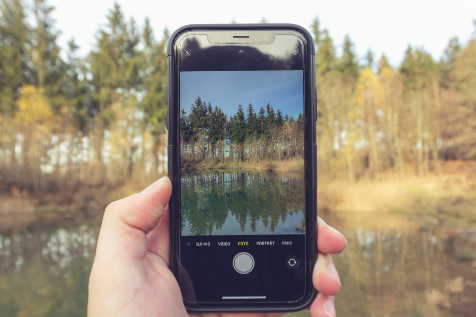
It also helps to judge candidates in the room’s terms, not the camera roll’s. Hold the phone at arm’s length, walk to the far side of the room where the print will hang, and look again. The images whose subject and mood still read clearly from there are wall images. The ones that dissolve into detail and context are screen images, however fine. This thirty-second test predicts more printing success than any specification sheet — though the numbers behind it are worth understanding too, as print resolution, DPI, and viewing distance sets out.
The five-minute checklist
Run any candidate through these questions, in order — they are the test the best photos for canvas prints pass. Is this the original file, at full size? Is the light directional and the subject lit the way I want to live with? Can I describe the subject in five words? Do all four edges hold only expendable image, safe for the wrap? Is it sharp exactly where the eye will land? And does its color range look honest rather than filtered? A photo that passes all six is not a risk — it is a print waiting to happen. If your candidate starts life as a painting or drawing rather than a camera file, digitizing your artwork for prints covers capturing that original faithfully first.
When we open custom printing here, this checklist is the review we believe a photo deserves before it is ever printed — applied by a person, with the honest answer given up front. And if your library honestly holds no photo that passes, that is a fine outcome too: it means the wall wants art chosen for it instead, which is what the rest of the shop is for. The goal was never to print a photo. It is to hang something that earns its wall.
More in Custom Photo & Gifting

Continue exploring: Custom Photo & Gifting guides · All guides