

How-To: Sizing, Hanging & Arranging
Large Wall Decorating Ideas: One Big Anchor
Big walls go wrong when decent pieces are spread thin across them. Think in one footprint — a single anchor or a group composed to act like one — and leave calm around it.
Key Takeaways
- Decorate a large wall with one footprint: a single oversized piece or a group acting as one, running roughly 60 to 75 percent of the furniture's width — about 58 to 72 inches above a 96-inch sofa.
- Judge size from viewing distance: a 60-by-40-inch piece has about a 72-inch diagonal and reads whole at roughly one and a half to two times that, about 9 to 12 feet, so bold shapes carry better than fine detail across a room.
- Leave breathing room on purpose: a 60-inch-wide work centered on a 14-foot (168-inch) wall leaves 54 inches of plain wall on each side, and that emptiness is part of the design.
- Make a group behave like one piece with identical gaps and a disciplined outer boundary — six 18-by-24-inch frames in three columns and two rows with consistent 3-inch gaps form a single 60 by 51 inch footprint.
- Center the composition over the furniture it serves, not the wall's geometric middle, and avoid the three shrinkers: one postage-stamp piece, scattered small confetti, and art stretched edge to edge with no margins.
A large wall is the most generous canvas a home offers — and the one most often under-served. The instinct with large wall decorating ideas is to hang what you have and spread it out, and the result is a familiar one: decent art, made lonely. Pieces drift apart, each too small to hold its territory, and the wall reads as undecided rather than decorated. Big spans are not actually hard to fill; they just obey a different rule than small walls. On a large wall, you do not decorate with pieces. You decorate with a footprint — one commanding presence, whether that presence is a single oversized work or a group composed to act as one. That choice — one statement piece or a gallery wall — has a decision framework of its own if you are torn.
Large wall decorating ideas: one oversized anchor
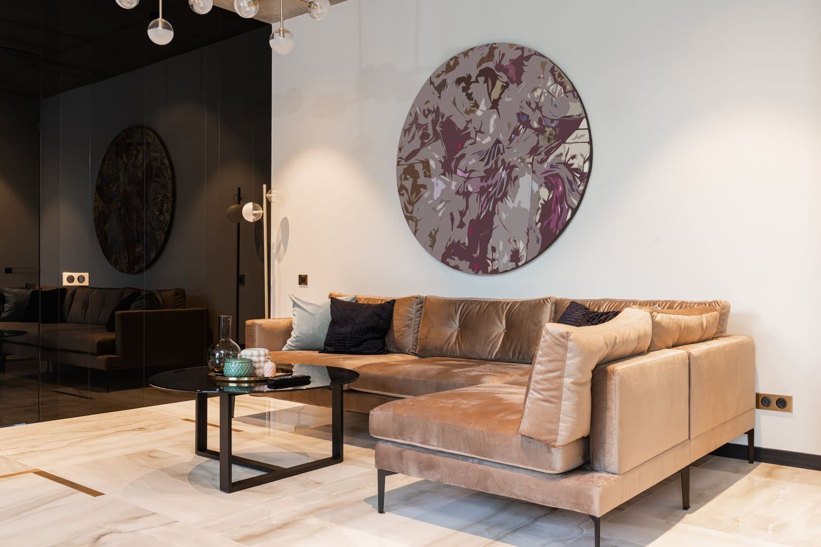
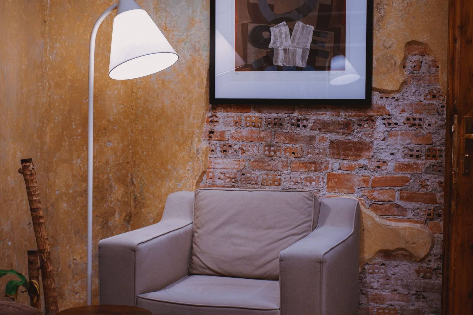
The most confident answer to a big wall is one big piece. A single large work gives the eye one place to land, sets the room’s register in a way no cluster of small frames can, and — counterintuitively — is the easier composition to get right, because there is only one decision: scale. The proportion that governs it is the furniture beneath. Art above a sofa, console, or sideboard should run roughly 60 to 75 percent of that furniture’s width: above a 96-inch sofa, that means a piece somewhere between about 58 and 72 inches wide. Much narrower and the sofa makes the art look stranded; much wider and the art starts to argue with the furniture for the same territory. Those ratios come from the wall art sizing rules that govern smaller walls too.
On a wall with no furniture against it — a long hallway span, a double-height entry — judge by the wall itself and by viewing distance. Large walls are usually seen from large distances, and distance shrinks apparent size: a piece that would dominate a small room can look modest from fourteen feet away. This is the natural home of the large and oversized formats, and it is where erring bigger is almost always the right correction.
Viewing distance: the large wall’s hidden variable
Small walls are read at conversational distance; large walls are read from across the room, and the distance rewrites the size question. A useful way to feel it is the picture’s diagonal. A 60-by-40-inch piece has a diagonal of about 72 inches, and a comfortable viewing distance for taking in a whole image at once runs roughly one and a half to two times that diagonal — here, about 9 to 12 feet. Stand closer and you are inspecting details; stand much farther and even a large piece shrinks toward decoration. Big living-room walls routinely offer 12 to 15 feet of viewing distance, which is the arithmetic behind the recurring surprise that the “huge” piece looks merely right once hung. When you mock up a size in tape — always mock up a size in tape — judge it from the seat or doorway you will actually view it from, not from the ladder.
Viewing distance also governs subject. At twelve feet, fine detail is atmosphere, not content: what carries is bold shape, strong value contrast, and uncluttered composition. A delicate, intricate piece can be wonderful art and still the wrong choice for a wall read from across a great room, where it will dissolve into texture. Save the intricate work for the walls you stand next to, and let the far wall hold the image with the big, calm shapes.
Breathing room is part of the design
Scale is only half the lesson; the other half is the empty wall you deliberately leave. A large piece needs a margin of bare wall around it the way a sentence needs spaces — without it, the piece reads as wallpaper rather than art. Put numbers on it: center a 60-inch-wide work on a 14-foot (168-inch) wall and you have 54 inches of plain wall on each side, and that emptiness is not wasted space, it is the frame the room itself provides. Resist filling those margins with small companions. On big walls, one clear statement surrounded by calm beats a busy committee of pieces every time, and the calm is what makes visitors describe the room as generous rather than crowded.
Option two: a group that behaves like one piece
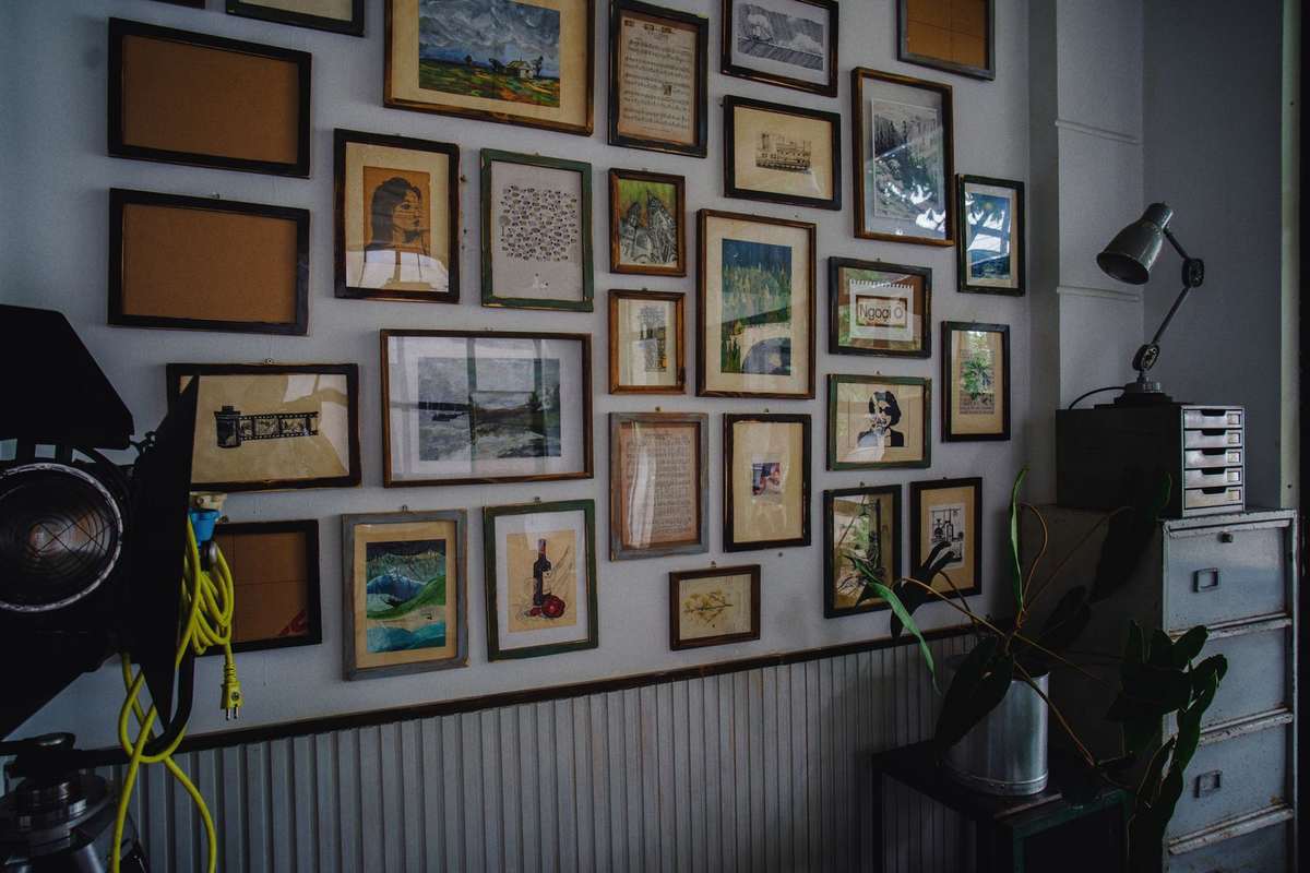
If your art is a collection rather than a single statement, the large-wall solution is to compose the group into one footprint and hang it as a unit. A tight grid is the most architectural version: six 18-by-24-inch frames in three columns and two rows, with consistent 3-inch gaps, occupy a single footprint 60 inches wide and 51 inches tall — suddenly comparable to one oversized piece, and readable as one gesture from across the room. The discipline is in the gaps: keep them identical everywhere, align the outer edges as if the group had a frame of its own, and let the footprint, not the individual frames, obey the same 60-to-75-percent proportion against the furniture below. A looser gallery arrangement can work at this scale too, but it earns its place by holding a clear outer boundary — a cloud of frames with ragged edges reads as drift, not design.
Option three: go wide, not tall
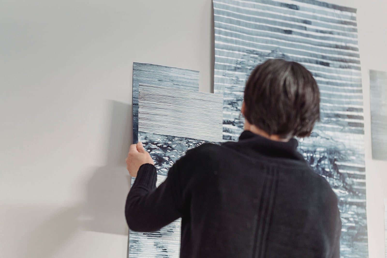
Some large walls are large in the wrong direction for a conventional piece: long, low spans above extended seating, along a dining wall, or under a sloped ceiling. For those, the panoramic format is the native answer — a wide, low image that matches the wall’s own proportions instead of fighting them. A panorama also solves a subtle problem of big walls: it keeps its center of interest near the eye level of seated viewers, where a tall piece on a long wall can end up looming above the conversation. A related way to go wide is multi-panel canvas art, one scene split across diptych or triptych panels.
Anchor to the furniture, not the wall’s center
On a wall shared with furniture, the composition’s center belongs over the furniture, not at the wall’s geometric middle. If a sofa sits off-center — pushed against a corner, balanced by a bookcase — art centered on the bare wall will look misplaced even when its scale is perfect, because the eye reads art and furniture as one arrangement. Center over the anchor piece, let the wall’s remainder be breathing room, and the whole span settles. This is why the living room, with the longest walls and the largest furniture in most homes, is where the large-wall discipline pays off most visibly.
One wall, two jobs
Large walls increasingly do double duty — the open-plan span that is living room at one end and dining room at the other, the long wall a home office shares with a reading chair. Treat such a wall as two compositions with a border, not one composition with a theme. Each zone gets its own anchor, scaled to its own furniture, and the zones are separated by the breathing room this guide keeps defending: a stretch of genuinely empty wall is what tells the eye one arrangement has ended and another begun. What the two zones should share is register rather than content — a similar depth of frame, a palette that nods across the gap, comparable visual weight — so the wall reads as one household’s taste expressed twice, not as two rooms arguing through a partition that happens to be missing.
Height deserves the same zonal thinking. On tall walls there is a temptation to use the altitude — to hang a second row, or to center a piece in the wall’s full height and leave it addressing the rafters. Resist it. Art is for the people in the room, who live in its lower eight feet; above that, the wall’s emptiness is doing the generous work of making the room feel tall. One composition at human height, with calm above it, beats an expedition up the wall every time.
Large wall decorating ideas: the mistakes that shrink big walls
Three errors account for most underwhelming large walls. The first is the postage stamp: a modest piece, correctly hung, alone on a span three times its width — the fix is not a better piece but a bigger footprint, by scale or by grouping. The second is confetti: many small pieces scattered to “cover” the wall, which covers nothing and reads as indecision; consolidate them into one grouped footprint or edit down to the strongest few. The third is filling to the edges — art stretched corner to corner with no margins, which makes a large wall feel smaller and louder at once. A large wall is an asset precisely because it can hold one big idea and the calm around it. Choose the footprint first — the first rule of large wall decorating ideas — and the wall stops being a problem to cover and becomes the room’s main event.
More in How-To: Sizing, Hanging & Arranging
Continue exploring: How-To: Sizing, Hanging & Arranging guides · All guides