

How-To: Sizing, Hanging & Arranging
How to Light Wall Art: Angles and Glare
A picture with light aimed at it on purpose looks quietly luminous; one left to the ceiling fixture looks like an afterthought. Angle, width, and color do most of the work.
Key Takeaways
- Aim the beam so it strikes the center of the art at about 30 degrees from vertical; steeper throws the fixture's reflection into viewers' eyes, and shallower rakes across texture.
- Size a picture light to its frame at about half to two-thirds the frame's width — roughly 18 to 24 inches of light for a 36-inch-wide frame — so the wash stays even with no hot pool in the middle.
- For ceiling fixtures, mount out from the wall by a little over half the drop to the picture's center: with an 8-foot ceiling (96 inches) and a center at 60 inches, the 36-inch drop puts the fixture roughly 21 inches out.
- Choose honest color: most homes suit 2700–3000K, and a color rendering index (CRI) of 90 or above is worth asking for, since cheap LEDs in the 70s and low 80s quietly eat reds.
- Fight glare geometrically — light glossy or glazed pieces from above or the side at the thirty-degree angle, keep them away from facing bright windows, and keep valuable pieces out of direct sun, which fades pigments cumulatively.
Museums do not light art to be kind to it. They light it because unlit art is only half hung: colors sit dull, texture disappears, and a piece you chose carefully becomes wall decoration in the dimmest sense. Homes rarely need museum hardware, but they benefit enormously from the museum’s one insight into how to light wall art — a picture should have light of its own, aimed at it on purpose, rather than whatever the room’s ceiling fixture happens to spill. Good art lighting is invisible as equipment and obvious as effect: the picture glows, slightly, as if it were the source. Here is how that effect is built, and the two enemies — glare and fading — it has to defeat.
The three ways to give a picture its own light
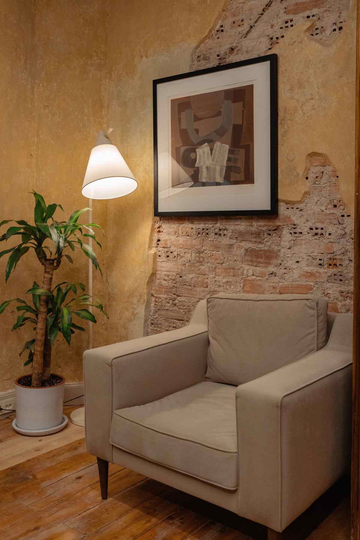
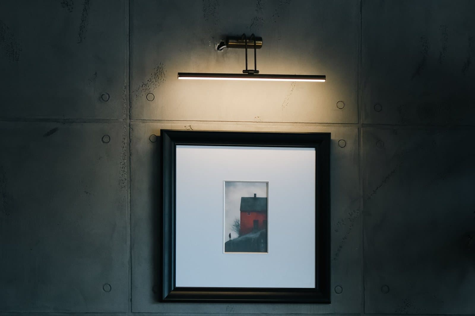
The classic tool is the picture light: a slim fixture mounted on the wall or the frame itself, just above the piece, washing light down its surface. Modern versions are LED, run cool, and come in corded, hardwired, and battery-powered forms — the battery kind asks for no electrician at all, which makes it the renter-friendly entry point, at the price of occasional recharging. The second route is ceiling light aimed deliberately: a track head or an adjustable recessed fixture whose beam is dedicated to the picture rather than to the room. This suits larger pieces and groups, and it keeps the wall itself free of hardware. The third is the wall washer — a ceiling fixture designed to throw an even sheet of light down a whole wall — best for gallery arrangements and ledges, where several pieces share one wash.
How to light wall art: the thirty-degree rule
However the light is delivered, its angle decides whether you see the picture or see the light. Aim the beam so it strikes the center of the art at about 30 degrees from vertical — the angle measured off the wall’s own vertical line. Steeper, and the fixture’s reflection lands in the viewer’s eyes and the top of the frame casts a shadow; shallower, and the light rakes down the surface, exaggerating every bump of canvas weave or paper texture. Thirty degrees is the working compromise the framing and museum trades settled on, and it converts into a simple measurement for ceiling fixtures: take the vertical drop from the fixture to the picture’s center, and mount the fixture out from the wall by a little over half that distance. For an 8-foot ceiling (96 inches) and a picture centered at 60 inches, the drop is 36 inches, and 36 times the tangent of 30 degrees is about 21 — so the fixture sits roughly 21 inches out from the wall. Frame-mounted picture lights arrive at the same angle by geometry: their short arms hold the light just far enough off the surface for the wash to even out.
Sizing the light to the picture
A picture light should look like it was made for its frame, and the proportion that achieves it is width: a fixture running about half to two-thirds the width of the frame it serves. On a 36-inch-wide frame, that means a light of roughly 18 to 24 inches — long enough to wash the whole surface evenly, short enough to stay the frame’s servant rather than its headline. Too short a fixture concentrates a hot pool of light in the picture’s middle and lets the corners go dim, a spotlight effect that flatters nothing printed flat. Brightness wants the same restraint. The goal is a gentle step up from the room’s ambient light, not an interrogation: if visitors notice the lighting before the picture, it is too much or too steep. This is the practical argument for dimmers and for choosing fixtures whose output you can adjust after installation — the right level is found from the viewing chair, in the evening, at the brightness the room actually lives at, and it is almost always lower than the showroom suggested. The picture itself, of course, has to be sized to its wall first — how to size wall art covers that decision.
Lighting a group instead of a piece
Groups and ledges change the geometry. A single picture light serves a single frame; a gallery arrangement wants the evenness of a wash — a track run or ceiling fixtures whose beams overlap across the group’s whole width, each aimed at the same thirty-degree angle, so no frame in the row is brighter than its neighbor. Judge the result by the edges: light that pools on one piece and abandons the next makes the bright one look important and the dim one look forgotten, whatever their merits. For ledges, a wash from ceiling height has the further virtue of keeping fixtures off the shelf itself, where leaning frames would crowd them. And where a group mixes glazed and unglazed pieces, aim for the glazed ones’ sake and let the matte pieces — which forgive nearly everything — take the same light as it falls. On a genuinely big span, the group itself should first be composed as one footprint — the approach in filling a large wall.
How to light wall art: glare and the glossy formats
Glare is light bouncing off the picture’s surface into the viewer, and how much you fight it depends on the format. Matte canvas is the forgiving case — its surface scatters light in every direction, so almost any sane angle works. Glazed frames and glossy formats are mirrors in waiting. An acrylic print has a polished, glass-like face by design, and a light placed opposite a window or aimed too steeply will turn that face into a reflection of the room. The fixes are geometric, not expensive: light from the side or above at the thirty-degree angle rather than from directly in front, avoid placing glossy pieces where a bright window faces them, and test from the actual viewing position — glare exists only from somewhere, so check from the chair, not from the ladder. If a reflection persists, tilting the piece a degree or two forward on its hangers tips the reflection down to the floor. Glare ignored is one of the common wall art mistakes: right size, right height, wrong light.
Color: warmth and honesty
Light has a color, and it repaints your art nightly. Bulbs are sold by color temperature: around 2700K is the warm amber of traditional home light, 3000K a slightly cleaner warmth, and 4000K and above a cooler, more clinical daylight that can make a warm-toned picture look gray at the edges. Most homes live happily with art lit at 2700–3000K. At least as important is the bulb’s color rendering index, or CRI — a measure, out of 100, of how faithfully a light shows colors compared with a reference source. Cheap LEDs with a CRI in the 70s and low 80s quietly eat reds and complexions; a CRI of 90 or above is the specification worth asking for over art, and it costs little more. A dimmer earns its keep too: the right level is the one where the picture stands gently forward from the wall, and in a dining room, where light drops low and warm over a meal, art lit to match that mood — rather than lit like a gallery at noon — belongs to the evening instead of interrupting it.
Daylight: the free light that bills you later
Sunlight is the finest picture light there is, and the most expensive in the long run: its ultraviolet component fades pigments and yellows paper, cumulatively and irreversibly. Direct sun falling on a piece for hours a day is the fastest fade there is; bright indirect light is far gentler, and north-facing windows (in the northern hemisphere) deliver the steadiest, most indirect light of all — the reason artists’ studios have prized them for centuries. Practical care is simple: keep valuable or light-sensitive pieces out of direct-sun walls, use curtains or blinds at the sun’s strongest hours on the walls that get them, and rotate pieces between bright and dim walls if a collection matters to you, so no single piece takes all the weather. Our frequently asked questions cover the care side of prints in principle; the lighting half of care is simply this: how to light wall art deliberately — from the angle that flatters it, in the color that honors it — and let the sun visit rather than move in.
More in How-To: Sizing, Hanging & Arranging
Continue exploring: How-To: Sizing, Hanging & Arranging guides · All guides