

How-To: Sizing, Hanging & Arranging
Gallery Wall Layout Ideas: Grids and Salons
A collection holds together because something repeats across it, not because the pieces match. Pick that thread first, then let a grid, salon, or shared line organize the rest.
Key Takeaways
- Choose a unifying thread before the layout: at least one element repeated across most pieces — frame finish, mat treatment, palette, or subject; one thread is enough and two is polished.
- For a grid, use identical or near-identical frames and measured gaps: six 11 by 14 inch frames, three across and two down with 2-inch gaps, make a 37 by 30 inch footprint.
- For a salon hang, start with the largest piece low and off-center as the anchor, build outward in rough rings, keep gaps in the 2-to-3-inch family, and hold the cluster inside a roughly rectangular boundary.
- For an asymmetric layout, give the group one shared line — a common center line, baseline, or top line — and let everything else vary around it.
- Balance visual weight rather than just geometry: heaviest pieces sit low and toward the middle, and plan the winning arrangement on the floor inside a taped footprint before anything reaches the wall.
A gallery wall fails or succeeds before the first nail: at the layout stage, where the arrangement is still movable. The layouts that hold together are not lucky accidents of taste — they follow one of a handful of grammars, each with its own discipline, and they all begin with the same move: choosing the thread that unifies pieces which were never made to match. This guide owns the design half: gallery wall layout ideas, decided before anything hangs. The companion guide in this series covers how to hang a gallery wall itself — templates, spacing transfer, and fixing drift. Here, we decide what goes where, and why.
Gallery wall layout ideas start with a unifying thread
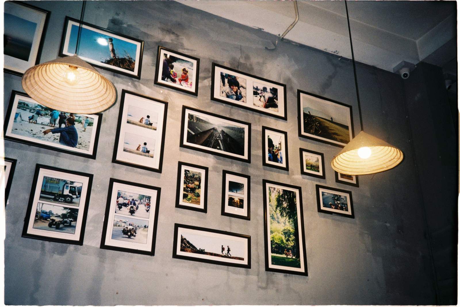
Every durable gallery wall has at least one element repeated across most of its pieces. The candidates: frame finish (all black, all natural wood, all one metal), mat treatment (generous white mats make unrelated images read as one family), palette (the art shares a color temperature or two recurring hues), or subject (all botanicals, all family photographs, all seascapes). One thread is enough; two is polished; zero is the visual static of a hallway in a dentist’s office. Choose the thread before the layout, because the thread decides how strict the layout is allowed to be: identical frames license anarchy in placement, while a loose palette asks for a stricter geometry to supply the order.
The grid: order as the whole idea
The grid is the most disciplined grammar: identical or near-identical frames, even counts, measured gaps, edges in perfect registration. It flatters series — same-subject sets, matched photography, anything where the pieces are variations on one thought — and it is the natural home of square formats, which tile without argument. Run the footprint arithmetic before falling for it: six 11 by 14 inch frames in portrait orientation, three across and two down, with 2-inch gaps. Width: 3 × 11 + 2 × 2 = 37 inches. Height: 2 × 14 + 1 × 2 = 30 inches. Over a 54-inch console, 37 inches is about 69 percent of the furniture’s width — inside the two-thirds band the sizing guide for wall art recommends, so this grid reads as furniture-scale, not decoration-scale. Grids forgive nothing: a gap a quarter inch off announces itself, which is why grid walls are planned to the eighth of an inch and then left alone.
The salon: abundance with an anchor
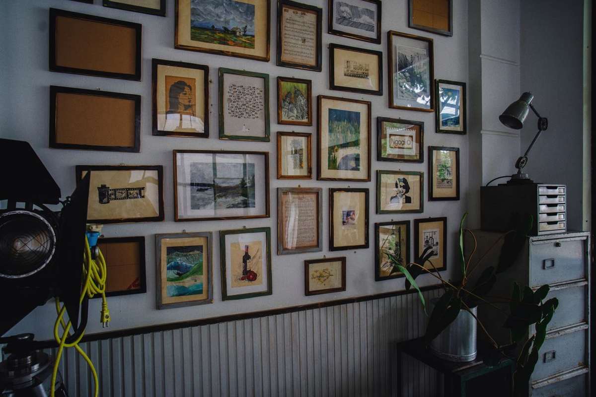
The salon hang — the floor-to-near-ceiling density of an old academy wall — is the opposite temperament: mixed sizes, mixed frames, everything hung. Its discipline is hidden but real. Start with the largest piece and place it low and off-center, never dead center at the top; it is the anchor everything else negotiates with. Build outward in rough rings, keeping gaps in the familiar 2-to-3-inch family — varied slightly is fine, wandering is not — and hold the whole cluster inside a roughly rectangular outer boundary, even when individual edges step. A salon cluster planned at 72 inches wide by 48 inches tall, centered as one unit at 58 inches, runs from 34 to 82 inches on an 8-foot (96-inch) wall: dense, grand, and still clear of floor and ceiling. Salons suit collectors and maximalists; their failure mode is not density but drift — a cluster that escapes its boundary and starts colonizing the room corner by corner.
The asymmetric layout: one shared line
Between grid and salon sits the arrangement most living rooms actually want: mixed sizes, balanced rather than mirrored. Its secret is a single shared line that the eye can find. Align pieces along a common horizontal center line and let them step above and below it; or give the group a common baseline, shelf-like, with heights rising off it; or hang to a common top line over low furniture. One line is the contract; everything else is freedom. Asymmetric layouts are also the only grammar that grows gracefully — a new piece extends the line, the balance is re-struck in an afternoon, and the wall never has to be restarted. When two candidate arrangements both work on the floor, choose the one whose shared line is easier to state in a sentence; the eye finds the same line you can describe.
The row: a layout that behaves like furniture
A single horizontal row of same-size pieces is technically a layout of its own, and the right answer more often than its simplicity suggests: above a long sofa, down a hallway, over a headboard. Centers on one line at eye level, gaps even at 2 to 3 inches, and the whole run treated to the width ratios of a single piece — a run of four 16-inch frames with three 3-inch gaps totals 73 inches, which is the two-thirds answer to a sofa of about 108 inches and slightly grand for anything smaller. Rows are where restraint reads as confidence.
Balance: weight, not just geometry
However the geometry is chosen, the arrangement must balance in visual weight, which is size multiplied by darkness and contrast. A small, dense, black-framed piece can outweigh a large pale one. The working rules: the heaviest pieces sit low and toward the middle; pale, quiet pieces can ride high and wide; and no quadrant of the bounding rectangle should hold all the darkness. Odd counts — five, seven, nine — arrange more forgivingly than even ones outside the grid, because they have no mirror line to fail. Step back and squint: the squint test strips detail and shows you the weight map, which is the layout’s true skeleton.
Sizing the mix: how much large, how much small
Mixed layouts have a proportion problem grids never face: how big should the big pieces be, relative to the whole? A serviceable pattern for salons and asymmetric walls is a rough thirds split — the largest piece spans about a third of the footprint’s width, two or three mid-size pieces carry the next share of presence, and small pieces fill the remaining gaps as punctuation. Against the salon footprint above (72 inches wide), that means an anchor around 24 to 30 inches wide, mid-size pieces in the 14-to-20 range, and small work under 12 inches used sparingly — two or three, not nine. Small pieces are the layout’s salt: a wall of nothing but 8 by 10s reads as a corkboard, and a wall with no small pieces at all reads as a showroom. The same pattern explains a common rescue: a layout that feels scattered usually lacks an anchor, and adding one piece a full size up calms it more than rearranging the pieces already there.
Spacing as a design variable
Within the consistent-gap discipline, the choice of gap is a mood. The tight end, around 2 inches, knits pieces into a single mass — salon energy, right for dense collections and dark walls. The loose end, around 3 inches, gives each piece its own air — calmer, more modern, and kinder to strong individual images that compete at close range. What no mood licenses is drift: a gap that wanders from 2 inches at one end of a row to 3.5 at the other reads as an accident even to viewers who never consciously measure. Pick the gap from the footprint arithmetic, not from vibes: if the pieces plus 2-inch gaps total less than the target footprint, widen the gaps deliberately toward 3 and let the wall breathe, rather than spreading pieces to fill space the plan never gave them.
Two walls, planned
A family photo wall in a hallway wants the asymmetric grammar on a center line: photographs unify themselves (same people, same era of prints), frames in one finish supply the thread, and the center line at eye level suits a wall seen in passing, a few feet at a time, for years. A collection of vintage botanical plates over a sideboard wants either the grid — plates are a series by birth, made to be compared — or a salon dense enough to feel like a collector’s wall rather than a sample. Notice what decided both: the art’s nature first, the wall’s job second, the furniture’s width as the footprint’s budget. Taste enters in the choice among grammars that fit; it is rarely needed to rescue one that does not.
Gallery wall layout ideas: plan on the floor, inside a boundary
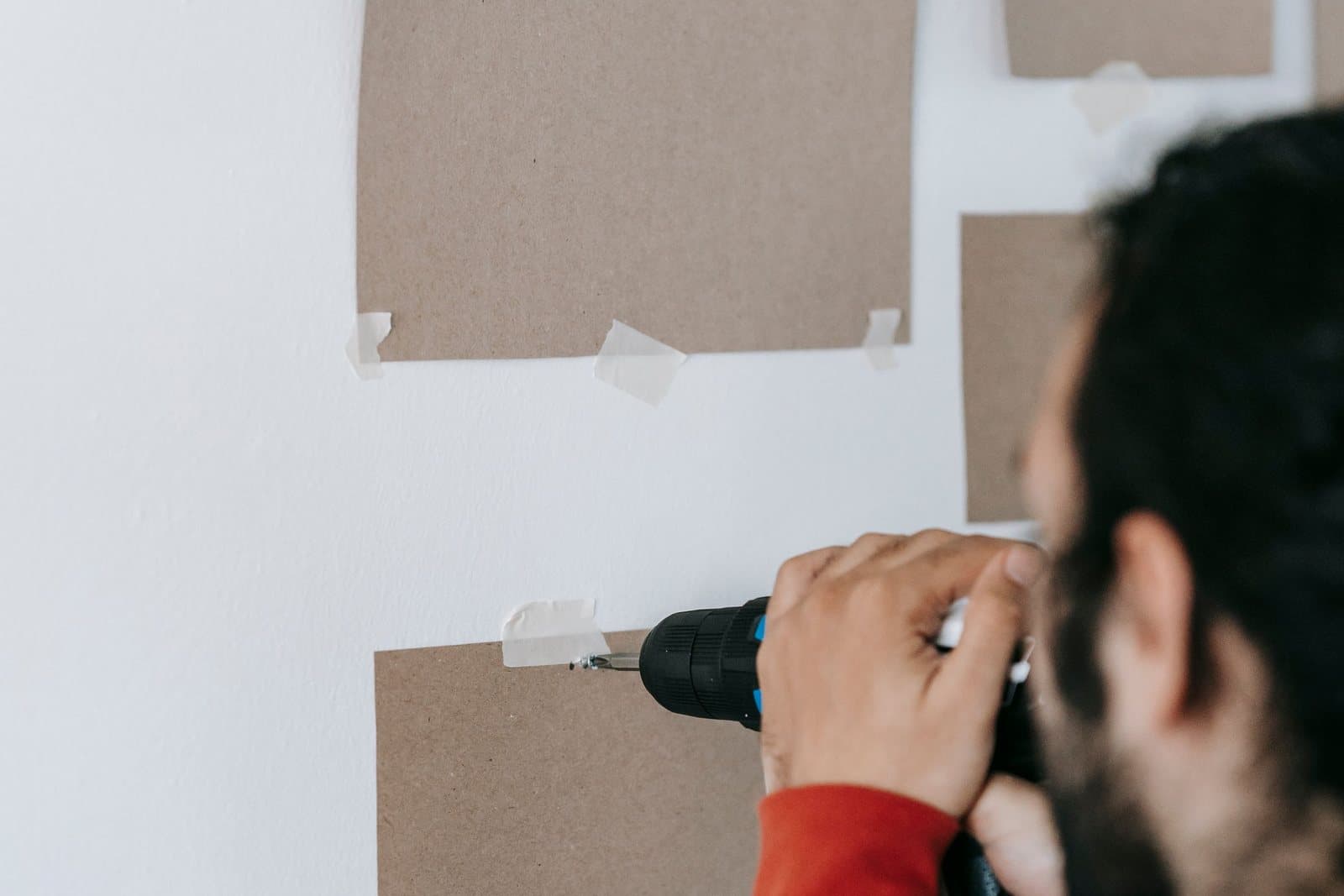
Every grammar is decided the same way: on the floor, inside a painter’s-tape rectangle of the target footprint, with all the pieces loose. Arrange, photograph, rearrange, photograph again. Two or three photographed candidates, compared on a screen at thumbnail size, settle arguments the naked eye keeps reopening — thumbnails show weight and geometry, which are the layout; the room will supply the charm. Only when a photographed arrangement wins does anything approach the wall. If your living room wall is the candidate, remember it is also the wall you will see from the sofa: photograph the floor layout, then judge it seated. These gallery wall layout ideas are grammars, not commandments — but a wall that follows one of them, with one honest thread running through it, can be built from art you already own plus a few considered additions from the catalog, and it will still look intentional in ten years.
More in How-To: Sizing, Hanging & Arranging

Continue exploring: How-To: Sizing, Hanging & Arranging guides · All guides