

Open Plan Wall Art: Zoning a Space With Art
Without walls to end one room and start the next, each zone needs its own anchor — different subjects, one shared thread, and nothing drifting across the line.
Key Takeaways
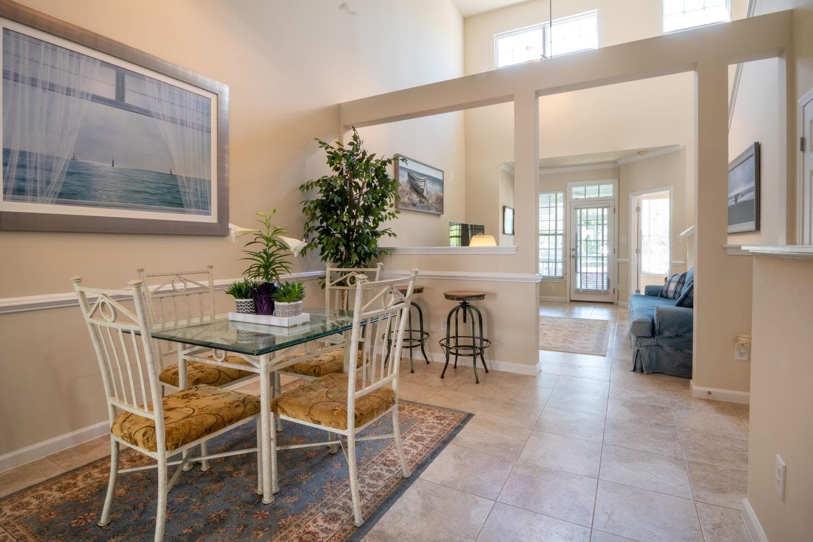
- Anchor the seating zone first with art roughly two-thirds of the sofa's width, kept within the sofa's span and the rug's edges, and spend your boldest subject there.
- Give dining its own centre of gravity, hung a touch lower for seated viewers, and differ from the living piece in subject while agreeing in tone — a still life beside a landscape reads as two rooms.
- Hold the zones together with exactly one thread — a shared hue, frame finish or mood — and judge both anchors together from the entry and kitchen, never one wall at a time.
- Scale up rather than down: long walls and sight lines swallow small art, so measure a pair or grid as one total footprint and give tall walls enough vertical presence.
- Tape both anchor outlines at full size and live with them through a full day of cooking, eating and arriving home before ordering anything.
An open-plan space is one room doing the work of three, and its central decorating problem is that nothing tells your eye where one room ends and the next begins. Builders solve that with rugs, lighting, and furniture placement. Art solves it too — from the walls, where it defines each zone’s territory without closing anything in. Hung with zoning in mind, open plan wall art becomes the soft architecture this kind of space is missing.
The method is simple to state: give each zone its own anchor piece, scaled to that zone’s furniture, and let the zones share a thread — a palette, a frame finish, a mood — that keeps the whole space reading as one home.
Open plan wall art starts at the seating zone
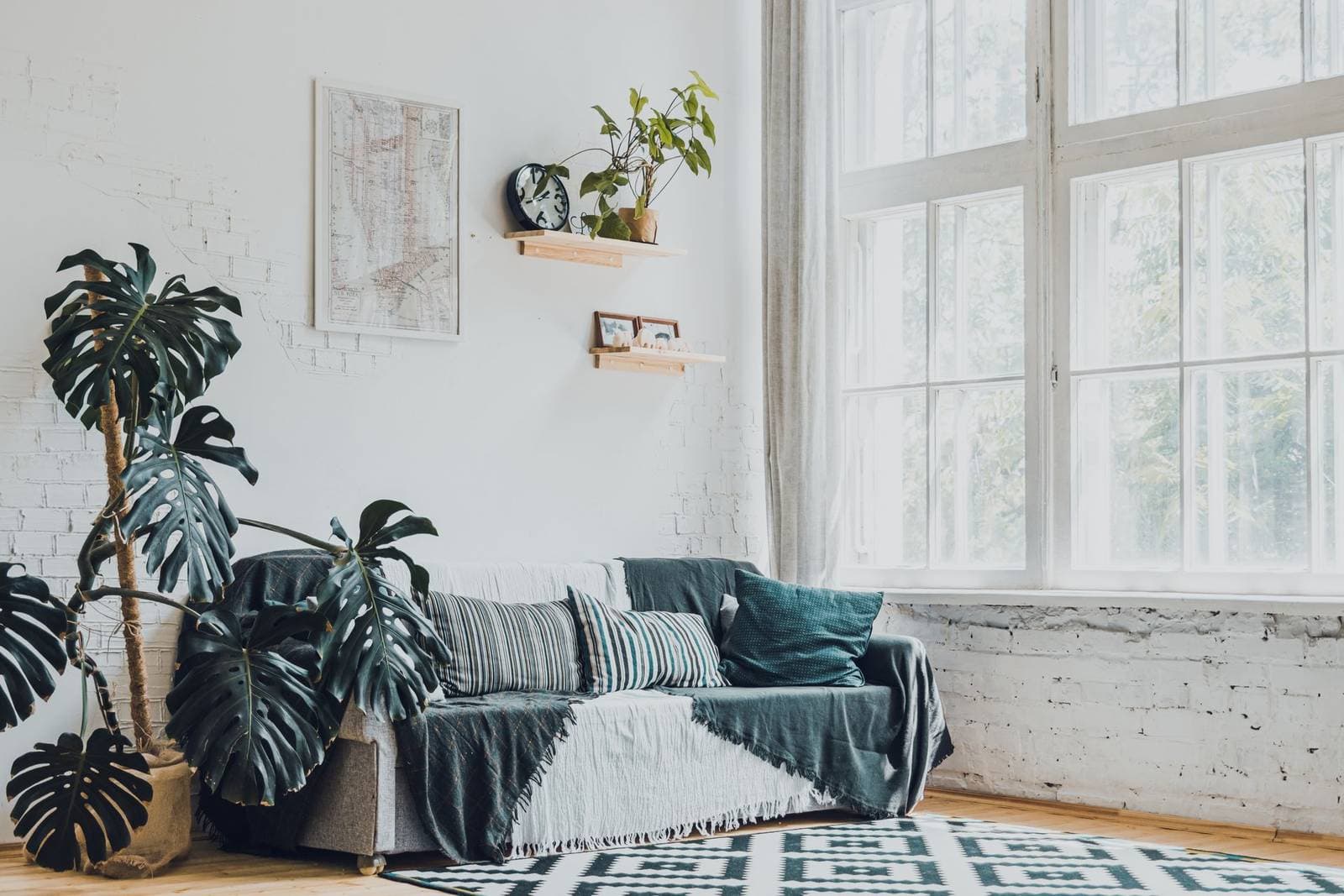
The living area is the zone to settle first, because it has the clearest furniture anchor: the sofa. The art above it follows the same rule as any living room wall art: roughly two-thirds of the sofa’s width, hung low enough to belong to the seating rather than the ceiling. In an open plan that piece does double duty — it is also the focal point for everyone entering the space, usually the first artwork the eye finds. Spend the scale and the boldest subject here.
Once the seating anchor is set, its edges define the zone. Art for the living area stays within the sofa’s span and the rug’s edges; nothing from the dining zone should drift into that span, or the boundary the art is building dissolves — the seating wall itself is planned in living room wall art: the complete sizing and hanging guide.
Give dining its own center of gravity
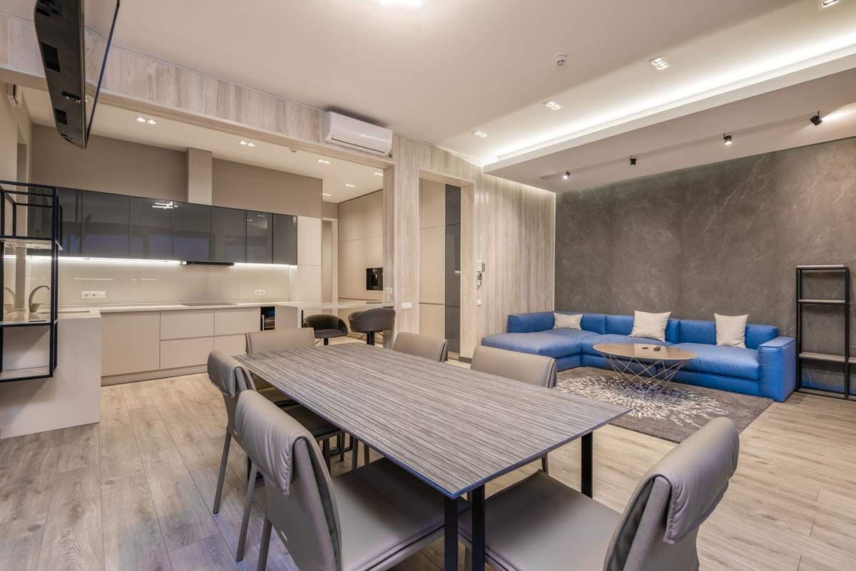
The dining zone anchors differently. Its viewers are seated, its hours are evening, and its furniture anchor is usually a sideboard or the long wall beside the table. Art there should hang a touch lower than standing eye level suggests — the audience is sitting — and it can afford to be moodier: still life, landscape, and photography with warm depth all suit long meals. The dining room wall art hub covers the seated-view logic in full.
Crucially, the dining piece should differ from the living piece in subject while agreeing with it in register. A landscape over the sofa and a still life by the table say “two rooms”; two similar landscapes side by side say “one long wall.” Contrast of subject, harmony of tone — that is the zoning formula.
Scale up: open plan wall art for long sight lines
Open-plan walls are long, sight lines are long, and small pieces that would charm a hallway vanish here, a problem our guide to decorating a large wall tackles with scale, anchors, and breathing room. This is the one home layout where oversizing is the safer error. Large and oversized pieces hold a zone together from across the whole space, which is exactly what an anchor has to do. Where one big piece is not the answer, a disciplined arrangement — a pair, or a grid treated as a single rectangle — can cover the same ground, provided the total footprint is what gets measured — the choice itself is weighed in the statement-piece-or-gallery-wall decision.
Ceiling height sharpens the point. Open plans often pair their long walls with high ceilings, and art hung at ordinary height on a tall wall needs the vertical presence to match: taller pieces, or arrangements stacked to give the zone’s wall a clear middle register between furniture and ceiling.
One thread through every zone
Zoning fails if the zones stop speaking to each other. The connective thread can be color — one hue that appears in each zone’s art, quietly — or a shared frame finish across the whole space, or a consistent mood even across different subjects. Pick one thread and hold it. Two threads is busy; none is a showroom of separate vignettes sharing a floor.
Walk the sight lines before you finalize anything. From the kitchen, both anchors are usually visible at once: do they read as two calm centers, or are they competing? From the entry, is the first zone’s art the welcome you intended? Open plans are always seen in combination, so judge the art in combination — never one wall at a time.
The kitchen end of the space
The kitchen zone usually gets no anchor of its own — it is all cabinets and appliances — and that is fine, but the wall or peninsula end that faces the kitchen still participates in the scheme. A single modest piece there, in the shared thread, tells the eye the kitchen belongs to the same home as the two anchored zones. Kitchen-suitable subjects and surfaces — simple food studies, botanicals, wipeable formats — suit the steam and the splashes; keep anything precious further down the room.
Sight lines from the kitchen run the length of the space, so the kitchen wall’s real job is often to be the frame through which the two anchors are seen. Judge it from the stove, not from in front of it.
Alignment does quiet work here as well. Hang the kitchen piece on the same centerline the dining anchor uses, or line its lower edge up with the dining rug’s edge, and the two zones read as one deliberate scheme rather than neighbors that happen to share a floor. Keep it modest, though: down the longest sight line in the home — from the stove to the far seating wall — the kitchen piece is the nearest thing in view.
Let rugs and light confirm what the art claims
Art zoning works best when the rest of the room quietly agrees with it. A rug under the seating group that ends where the sofa’s art ends, and a dining pendant centered over the table beneath the dining piece, each confirm a boundary the art has drawn. When the layers disagree — a rug crossing both zones, lighting that belongs to neither — the room feels unsettled no matter how good the anchors are. You do not need to plan every layer at once, but when you place the art, check the rug edges and the light pools against it and adjust the cheap layers until they vote the same way.
Color temperature helps too. Zones lit warm in the evening — lamps by the sofa, a pendant over the table — welcome art chosen for warm light; a kitchen under cooler task lighting will show the same palette colder. Look at a candidate’s colors under the light of the zone it will anchor, not under the showroom’s.
Working the scheme out before anything is bought
Open plans punish improvisation because every purchase is visible from everywhere. Work the two anchors out on paper first: measure both walls and both pieces of furniture, note where the shared thread will run, and tape both outlines up at full size before ordering a thing. Then live with the tape through a full day — cooking, eating, sitting, arriving home — because the zoning will be experienced in all those positions, and a dining piece that reads beautifully from the table but shouts over the sofa’s shoulder at night is the wrong piece wearing the right measurements.
Photograph the taped walls from the entry and the kitchen. A phone flattens depth the way distance does, and the photographs will show you plainly whether the two centers hold their own territories or have merged into one long decorated wall with furniture in front of it.
Order of work matters as much as order of decisions: hang the living anchor first, live with it a few days, then set the dining piece against the reality rather than the plan. Zoning is a relationship between two walls, and it is far easier to tune the second piece to the first than to adjust both against an imagined version of each other.
The leftover walls
Kitchens, entries, and the wall behind you get what is left: smaller, quieter pieces in the same thread, or deliberate emptiness. With open plan wall art, an unhung stretch is not a missed opportunity — it is the pause that lets the zones read as zones. Finish with the two anchor walls right, and the big space stops feeling like one echoing room and starts behaving like the several calm rooms it was always meant to be.
More in Room Guides
Continue exploring: Room Guides guides · All guides