

Fine Art Paper Prints: The Gallery Standard
Paper asks for a frame and careful handling, and in return gives the closest, finest look at a picture of any surface in the house.

Key Takeaways
- Fine art means the paper itself: 100 percent cotton rag or alpha-cellulose fiber, acid-free and lignin-free chemistry, and a matte inkjet coating — at roughly 230 to over 340 grams per square meter, closer to watercolor stock than poster paper.
- Paper inserts nothing between ink and eye, so gradients step without banding and fine lines survive at full fineness — the closer people will stand to look, the more paper wins.
- Match texture to image: smooth matte cotton rag for precision, textured papers for atmosphere and painterly work, and baryta for the deep blacks and tonal glide black-and-white photographers recognize.
- A mat does three jobs — it holds the print off the glazing, gives the image breathing room, and separates it with its bevel — but the board must be acid-free, or it will burn a yellow tide line into the print's edges over the years.
- Frame it as equipment: archival hinging at the top edge only, an acid-free backing board, and no dry mounting, which glues a print flat and is the one framing decision that cannot be undone.
Every other format in wall art is, in a sense, an attempt to escape paper — to be more durable, more modern, less fussy. Paper never needed rescuing. Fine art paper prints remain the gallery standard against which the others are measured: the sharpest detail, the subtlest tonal steps, the deepest matte blacks, on a substrate artists have refined for centuries. The fine art paper format asks more of its owner than a slab of metal does — a frame, a mat, some care in handling — and repays it with the most exact rendering a wall can hold. This guide is the full case: what these papers are, how they differ, and how matting and framing complete them.
What makes a paper “fine art”
The phrase is earned in the paper mill, not the marketing department, and it rests on three properties. The first is fiber. Fine art papers are made from 100 percent cotton rag — textile fiber, long and strong — or from alpha-cellulose, the purified wood fiber with the unstable compounds removed. Ordinary poster and photo papers, by contrast, are built on cheap wood-pulp bases that carry their own slow chemistry of decay. The second property is chemistry: a fine art paper is acid-free and lignin-free, usually buffered to stay that way, so the sheet will not yellow and embrittle from within. The third is surface: a matte inkjet coating engineered to hold pigment at the very top of the sheet in precise dots, which is where the format’s famous resolution comes from.
One mill ingredient deserves an honest footnote: optical brighteners, additives that fluoresce under ultraviolet light to make a sheet look brilliantly white. They work — briefly. The brightener exhausts itself over years, and a paper that leaned on it drifts toward its natural, warmer tone. Papers made without brighteners start slightly warm and stay exactly as they started, which is why the most archival-minded makers advertise their absence. Weight is the quality you can feel: fine art papers typically run from about 230 to over 340 grams per square meter, with a stiffness and heft closer to watercolor stock than to anything that has ever come out of an office printer.
A short field guide to the papers
Smooth matte cotton rag is the reference paper: a hot-pressed, nearly textureless surface that renders the finest detail the printer can produce — hairline illustration, small type, the pores in a portrait. If a paper has a claim to being the detail champion of all wall art, this is it. Textured papers carry a visible tooth modeled on traditional watercolor sheets; the texture scatters a little resolution and returns atmosphere, suiting painterly images and anything that wants to feel handmade. Many show a deckled edge — the feathered, torn-looking border of a hand-finished sheet — which becomes a design feature when the print is float-mounted rather than matted. Baryta papers are the darkroom tribute act: a fiber base with a barium-sulfate layer under a gentle gloss, giving deep, rich blacks and a smooth tonal glide that black-and-white photographers in particular recognize as home. A small family of gloss and metallic papers serves saturated color work, at some cost to the matte subtlety the category is known for.
Choosing among them is matching texture to image, the same judgment as canvas versus metal everywhere else in this series: smooth for precision, textured for atmosphere, baryta for tonal depth, and bright gloss only when the picture asks to shine; our survey of wall art formats makes that same judgment across all seven surfaces at once.
One more paper practice surprises buyers from other formats: the sheet is usually larger than the image. Prints are commonly made with a border of bare paper around the picture — sometimes a modest margin, sometimes a generous one — rather than printed edge to edge the way a canvas wraps or a metal panel is cut. That border is not wasted material. It gives the framer something to hinge, gives the mat window something to overlap or reveal, and gives the paper’s own color and texture a speaking part in the finished object. When you order a paper print, the stated size may describe the sheet or the image, and the difference decides your frame size — the single most practical question to settle before anything is cut.
Why detail lovers choose fine art paper prints
Every rival surface inserts something between the ink and the eye: canvas its weave, acrylic its reflective sheet, metal its sheen. Paper inserts nothing. The pigment sits on a matte surface engineered to show it, so gradients step without banding, fine lines survive at full fineness, and subtle dark tones stay separable instead of pooling into black. That is why the fine art tradition — detailed, considered work that rewards a viewer who steps closer — has always lived on paper: the closer the looking, the more paper wins. A print you intend people to approach, in a study or a hallway where faces pass within arm’s reach, is a print arguing for this format.
Matting: the white space is doing work
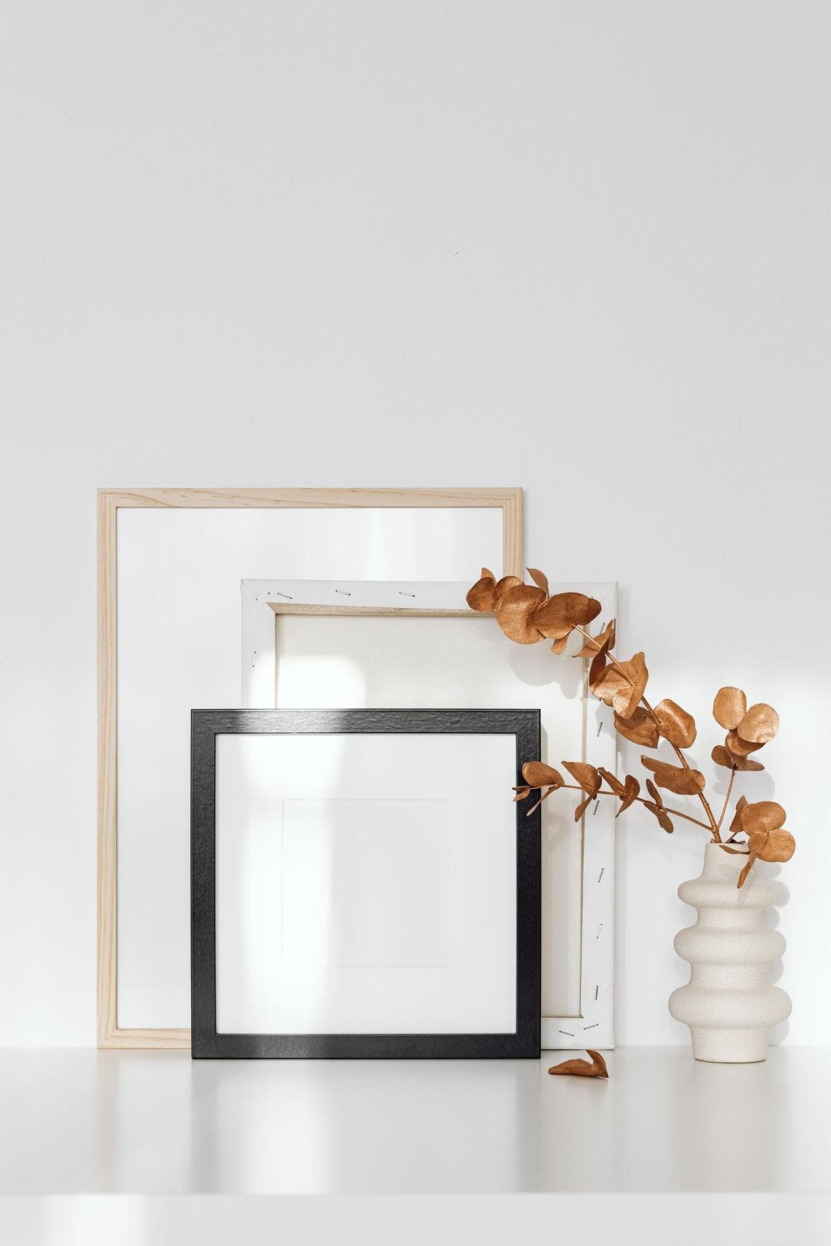
A mat is not packaging. The window mat — mat board with a beveled opening cut slightly smaller than the image — does three jobs at once. It holds the print off the glazing, because paper pressed against glass can stick, wrinkle, and grow mold in humid rooms; the air gap is conservation, not decoration. It gives the image breathing room, a field of quiet that lets a small, detailed print command a large frame. And its bevel catches a line of light that separates the artwork from its surroundings more elegantly than any frame profile.
Two rules govern matting well. First, the board must be acid-free — ideally cotton museum board — because an ordinary mat in contact with the print will burn a yellow tide line into the paper’s edges over the years, the infamous mat burn that framers undo at great expense. Second, proportion: mat borders of roughly two to three inches suit most pieces, growing wider as the frame grows, and tradition weights the bottom border slightly heavier than the top so the image sits optically centered rather than mechanically. The alternative presentation, float mounting, raises the whole sheet on a hidden support so its edges — deckled ones especially — show inside the frame; it is the right answer when the paper itself is beautiful enough to exhibit.
Framing basics that protect the print
Paper is the one major format that cannot hang unprotected, so its frame is equipment, not ornament — though its color is pure presentation, and choosing between black, white, wood, and metal frames is a decision with its own companion guide. The glazing — glass or acrylic — is the shield: acrylic glazing is lighter and will not shatter, glass resists scratching better, and either can be had with ultraviolet-filtering coatings that slow fading where daylight is unavoidable. Behind the print, an acid-free backing board and a sealed back keep out dust and the humidity that paper drinks so readily. The print is attached with archival hinging tape at the top edge only, free to expand and contract with the seasons without buckling; gluing a valued print flat to a board (dry mounting) is the one framing decision that cannot be undone and should be declined for anything you care about. A framer who raises these subjects unprompted is a framer who understands the material.
Paper’s one demand: respect
Honesty requires the counterweight. Paper creases, and a crease is forever; prints are handled by their edges, carried flat, and never rolled face-in by amateurs. Fingerprints mark matte surfaces and especially baryta, so cotton gloves are standard practice around serious work. Humidity cockles an unframed sheet, and a steamy bathroom is no place for any of it. And yet: framed properly, behind glazing, a cotton rag print made with pigment inks is the most archival object discussed in this entire guide — the combination conservators themselves trust — because every vulnerability paper has is environmental, and the frame is a controlled environment. Paper asks for one act of care at the framing bench and then outlasts its owner in peace.
Where fine art paper prints suit best
Paper rewards proximity and quiet light, so it belongs where people linger close: the home office, where a detailed map or study sits at reading distance all day; dining rooms, where seated viewers have time to look; hallways and studies with close passing traffic. It is the wrong instinct for steamy, splashy, or sun-blasted walls, and the right one almost everywhere a frame already feels at home. If fine art paper prints are the material half of this story, the tradition half — how galleries and artists think about considered work on walls — is told in our companion guide to fine art in the gallery tradition; the two were written to be read together. Start with the image you love, give it the paper it deserves, and let the mat and frame do the quiet work they have done for two hundred years.
More in Formats & Materials


Continue exploring: Formats & Materials guides · All guides