

Kitchen Wall Art That Earns Its Place
Wall space is scarce and the air carries grease, so the best spot is rarely near the stove — it's where people sit down long enough to look.
Key Takeaways
- Keep art entirely out of the range's grease plume, a kettle's steam and sink-splash range; no frame is worth a permanent film of cooking oil.
- Choose surfaces that tolerate a damp cloth — paper behind glazing, or sealed metal and acrylic — and keep raw canvas well clear of the cooking zone.
- Spend the art budget on the eating area, not the work zone, and hang it for seated viewers at a centre nearer 48 to 52 inches, checking it from the chairs.
- Let subjects rhyme with the room — ingredient studies, market scenes, herb botanicals or one vintage cafe poster — but limit witty typography to one piece so the wall doesn't become a gift shop.
The kitchen is the room where wall art has to justify itself. Wall space is scarce, surfaces are contested by cabinets and appliances, and the air carries heat, steam, and a fine film of cooking grease that settles on everything. Art that earns its place in a kitchen is chosen the way a good tool is chosen: right spot, right surface, up to the job. For the browse view, see kitchen wall art; this guide covers the placements that work, the formats that can be wiped clean, and the subjects that belong in a room built around food.
Placement first: heat, grease, and splash zones
Before choosing anything, map the kitchen’s hazards. The wall above and beside the range lives in the grease plume: every sauté sends up an aerosol of oil that lands on nearby surfaces and builds, over months, into a tacky film that dulls unprotected art and is nearly impossible to clean from textured ones. Keep art out of that plume entirely — no frame is worth a permanent glaze of old cooking oil. The same logic, milder, applies above a kettle’s steam column and within sink-splash range.
The prime kitchen wall is the one the cooking does not touch: the breakfast nook or eating area, where people sit long enough to actually look at art; the wall beside a window, lit well and safely downstream of the stove; or the short run of wall by the door, which greets everyone entering. Also walk the room with cabinet doors in mind — a piece hung where an opening door or a tall person’s head passes daily will be knocked straight eventually, and art that is always crooked makes a tidy kitchen look untidy.
Kitchen wall art formats that can be wiped clean
In a kitchen, the winning surface quality is simple: it must tolerate a damp cloth. The classic solution is fine art paper prints behind glazing — the paper carries the detail and the color, the glass or acrylic sheet takes the splashes and the wiping, and the whole piece can be cleaned like a window. It is the arrangement kitchens have used for a century of framed cafe posters and herb studies, and it still works. Sealed hard formats — metal and acrylic faces — wipe just as easily and suit modern kitchens.
The formats to place carefully are the porous ones. Raw canvas near a cooking zone drinks the grease film into its weave, where no cloth can reach it; if you love a canvas for the kitchen, hang it in the eating area, well clear of the range, and accept a gentle dust as its only cleaning. Unframed paper with no glazing belongs in another room entirely. The principle generalizes beyond kitchens: art lasts where its surface matches its air, and fine art paper prints, the gallery standard covers the paper at the heart of the glazed option.
Kitchen wall art subjects with appetite
Kitchen subjects have a head start most rooms envy: the room already has a theme, and art that rhymes with it looks inevitable. Food and drink art runs from market scenes and ingredient studies — a bowl of lemons, a tangle of herbs, coffee paraphernalia drawn with care — to vintage cafe and grocery posters whose typography is half their charm. Botanical studies of herbs and vegetables are the quiet classic: beautiful, accurate, and permanently at home next to the real thing — the full range is surveyed in food and drink wall art, with taste.
Two restraints keep kitchen art tasteful rather than themed. First, one joke is enough: a single witty piece delights, a wall of puns in aprons becomes a gift shop. Kitchen typography follows the same rule — one well-lettered piece can anchor a nook; three slogans compete with the cook. Second, match the art’s appetite to the room’s reality. Grand banquet scenes suit grand kitchens; a small working kitchen is flattered by studies of the ingredients it actually uses, at a scale its walls can hold.
The eating area deserves the best piece
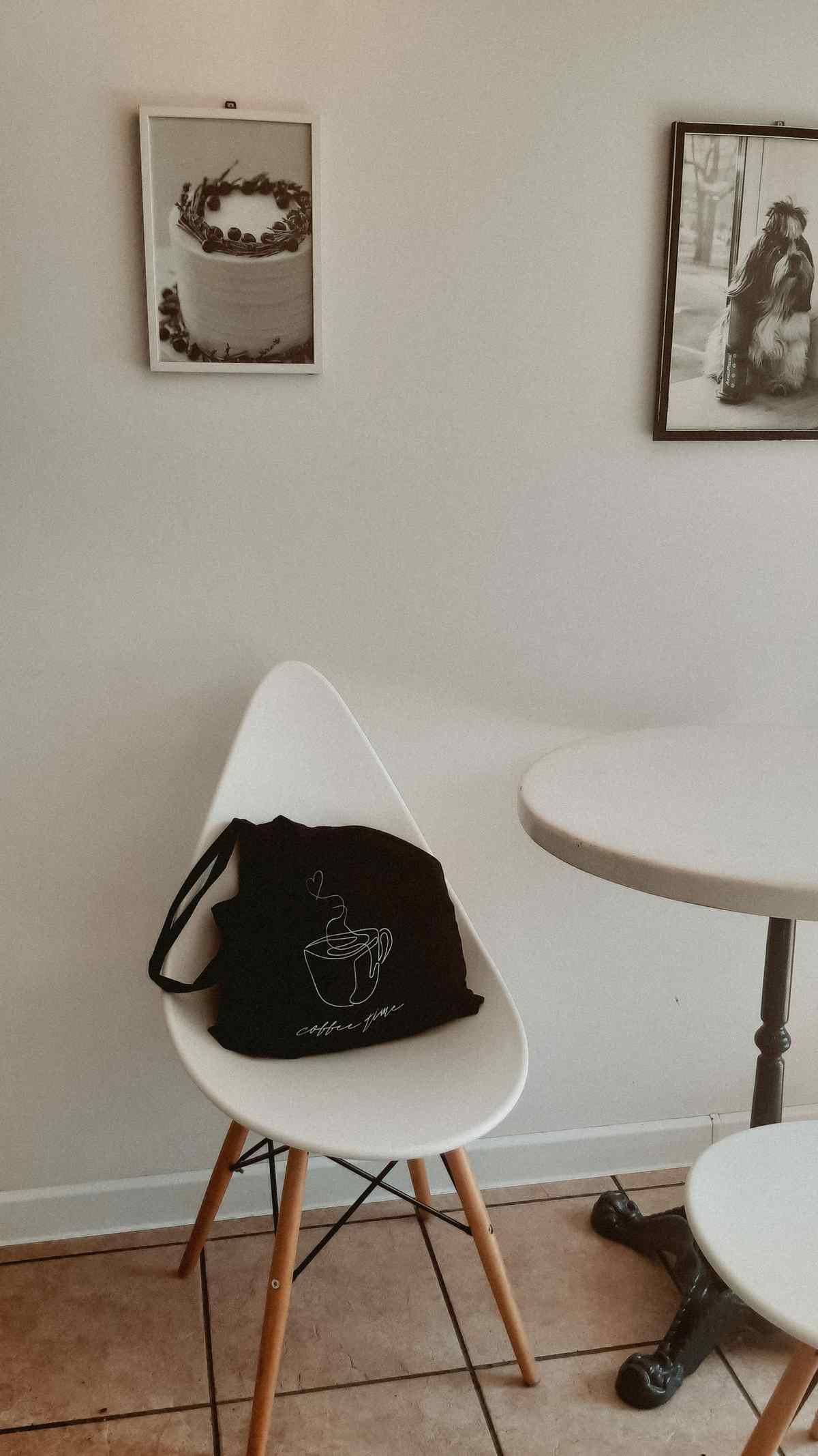
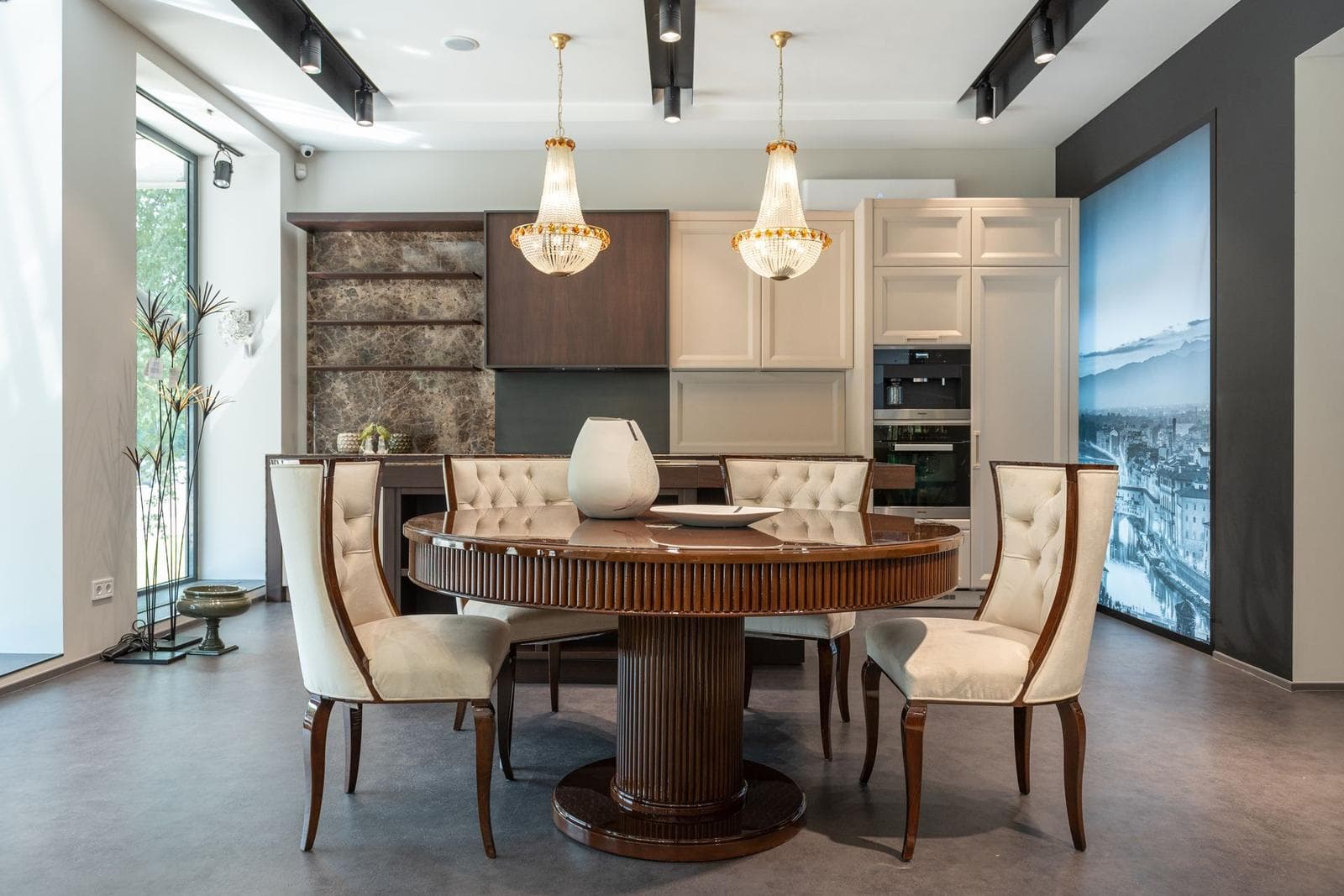
Most kitchens contain two rooms wearing one name: the workshop, around the range and sink, and the dining room in miniature, wherever people actually sit — a nook, a breakfast bar, a small table by the window. The workshop gets no art; its walls are hazards and its audience is a cook with a knife. The eating area is where the kitchen’s art budget belongs, because it is where people sit still, face a wall, and have time to look. Give it the best piece, not the leftover: a market scene at lingering scale, a pair of botanical studies at eye level from the chairs, something that makes a ten-minute breakfast feel like a place rather than a pause.
Hang eating-area art for seated viewers: center it nearer 48 to 52 inches than the standing standard, and check it from the chairs. A pendant light over the table can glare on glazing exactly the way a chandelier does in a dining room — matte faces and paper under low-reflection glazing behave best under a hanging fixture. If the eating area is a bar along a counter, the viewers are closer and higher; smaller pieces, hung a touch higher, suit the perch.
Small walls and in-between spaces
Kitchens specialize in the awkward leftover wall: the strip between countertop and cabinets, the narrow panel beside the fridge, the wall above the cabinets that only tall people see. Treat these as a small-format opportunity rather than a problem. A pair of small studies hung in the eating area beats one large piece squeezed into a gap. A picture ledge along the nook wall lets small pieces rotate with the seasons and the menu. The strip above the cabinets, if you use it at all, wants pieces with big, simple shapes — detail at that height and distance is simply lost, and dusty tops are guaranteed, so keep whatever goes up there wipeable and unfussy.
Scale to the viewer’s distance. Kitchen art is seen from two or three feet away — while chopping, waiting for a kettle, eating toast standing up. Fine detail that would vanish across a living room rewards that closeness here, which is another reason the ingredient study and the botanical plate are kitchen naturals: they are built to be looked at near.
One more kitchen-specific mercy: the room redecorates itself constantly — fruit bowls fill and empty, herbs grow and are harvested, a new kettle arrives — so its art can stay settled while everything around it churns. Choose pieces with a long patience, subjects that were true a century ago and will be true in a decade, and the kitchen gains the one thing a busy room rarely has: a wall that never needs your attention except to be enjoyed.
Open-plan kitchens: art as a border
In an open-plan space, kitchen art does a second job: it helps mark where the kitchen ends. A run of related pieces along the kitchen’s walls — same frames, same family of subjects — reads as a border the eye respects, separating the working zone from the living zone without a wall or a rug. Keep the kitchen side of the border wipeable and hazard-aware as this guide insists, and let the living side answer it in kind: an echoing color, a shared subject at a larger scale. The two zones then belong to each other without blurring, which is the whole art of open-plan decorating in one move, and the living side’s own rules are set out in our complete living room wall art guide.
Color in a room of steel and stone
Most kitchens are palettes of white, gray, stainless steel, and stone — competent, cool, and a little clinical. Kitchen wall art is where the warmth comes back in. Borrow the room’s warmest existing note — the wood of a chopping board, brass hardware, a terracotta pot — and let the art amplify it, or introduce the appetizing end of the spectrum deliberately: tomato, saffron, leaf green, cream. In an all-white kitchen, one well-chosen piece over the eating area does the work of a renovation’s worth of accessories, and it can be swapped in an afternoon when tastes change.
Place with the hazards in mind, choose surfaces that wipe, let the subjects rhyme with the room’s purpose, and a kitchen stops being the one room with nothing on its walls — it becomes the room where the art is working as honestly as everything else in it.
More in Room Guides
Continue exploring: Room Guides guides · All guides