

Wall Art for Retail Stores That Sells
A shop is read in motion, at arm's length from the stock, under lights chosen to sell. This wall art for retail stores guide plans retail wall decor as a trade specification, not decoration.
Key Takeaways
- Start at the window: the first ten feet set the shop's line before a rail is read - the pictures there are art, not price cards, and carry no logos or third-party branding.
- Lead with local subjects - the town, the coast, the shop's own trade - carried as one family from the window to the fitting rooms, so the shop reads as somewhere specific.
- Specify sealed, wipe-clean formats - metal and acrylic first - with no glazed frames where stock, trolleys, and hands meet the wall, and secure fixings throughout.
- Hang for the standing, moving eye: browsing height, one strong piece per sightline, glare checked from the shop floor under the shop's own lights, not from the ladder.
- Standardise sizes across the shop and keep a written record - shop, subject, size, supplier, date - so seasonal change and a second shop are reprints, not refits.
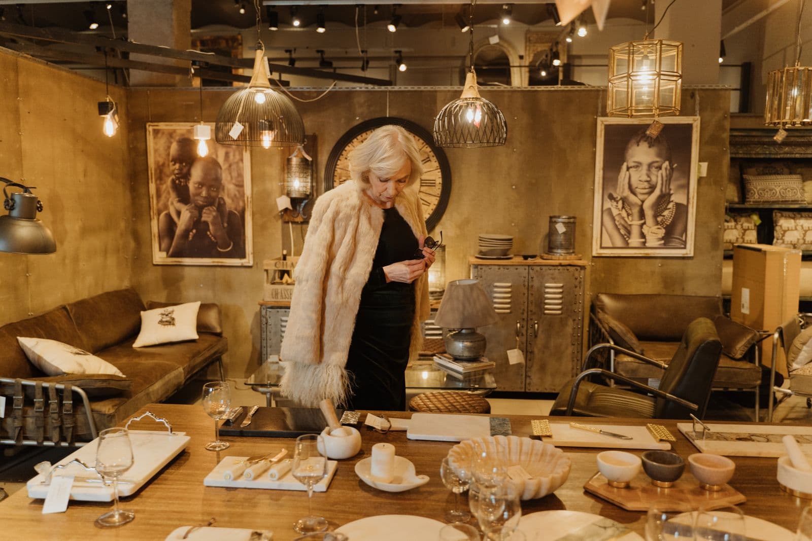
A shop is read in motion, by people already holding the stock, under lights chosen to sell. Wall art for retail stores has a harder job than home art: it has to hold one brand line across a window, a shop floor, and a till point, survive handling, deliveries, and window sunlight, and still read as intention in the photograph a customer posts of the shop. The rules are few, and mostly about treating the walls as part of the fit-out rather than as decoration added after it.
Wall art for retail stores starts with the window, not the wall
The first picture a shop owns is the one seen from the pavement. The window and the first ten feet behind it set the shop’s line before a single rail is read, and the art there has to work at walking speed, through glass, against reflections. Choose for that distance: one strong subject, readable in a glance, in the shop’s own colours — not a row of small pieces that resolve into clutter from across the street.
That also settles what the art is not. It is not signage. Prices, offers, and opening hours already have their cards and their window vinyl; the moment the pictures join in — a framed poster shouting a discount — the wall stops being decor and becomes one more instruction. Keep the jobs in separate frames. No logo walls, and no third-party branding in the pictures: the art carries the shop’s own subjects, or it carries somebody else’s.
Subjects shoppers walk toward: local first, brand-true second
Lead with local. The town, the coast, the street the shop stands on — local landscapes tell a passer-by this is a shop rooted in its place, not a unit that could be anywhere. After local, go brand-true: subjects that belong to the shop’s own trade — the harbour for the chandlery, the hills for the outdoor shop, the crop for the farm shop — chosen from the stock’s world rather than from a catalogue’s. What wall art is best for a retail store is, in the end, the art only that store could hang.
Carry one subject family through the whole shop at different scales: the signature view large where the window sightline lands, its details and seasons along the floor and at the till. Retail wall art earns its keep as a system, not as single pictures — the same thread, followed from the door to the fitting rooms, is what makes a small shop read as deliberate.
Formats that survive the shop floor: handling, sunlight, and stockroom doors
A shop floor is a working surface. Rails are dragged, stock is carried through at shoulder height, deliveries come in the front door, and the walls are wiped down with whatever is already in the cleaner’s hand. Specify surfaces that take that without ceremony. Metal prints earn their place here honestly: hard, sealed, and cleanable, with no frame lip to hold dust. Acrylic prints belong in the same family — a sealed, wipe-clean face that holds its finish under the bright, even light shops are lit with.
Mind the glass — both kinds. Window sunlight is the hardest light any picture on the site will face: hang the most fade-resistant formats where the sun lands, and keep glazed frames out of the traffic lines altogether, where trolleys, buggies, and stockroom doors meet the wall at picture height. Secure fixings are the other half of the same specification — pieces flush and firm, removable by staff with a tool, not by anyone passing. Canvas prints for retail stores have their place on the quieter walls — the fitting-room corridor, the wall behind the till — where hands and stock do not pass.

Wall art for retail stores at browsing height: scale, sightlines, and glare
Hang for the standing, moving eye. A shopper’s eye level is a walker’s, not a sitter’s, and it is travelling — along a rail, across a table, toward the till. Centers sit at browsing height, one strong piece per sightline beats a scatter of small ones, and the end of every aisle and run of wall is a picture position whether it is planned as one or not. Plan it.
Check glare from the floor, not from the ladder. Track lights and window light cross a shop at angles no home room produces, and a glossy surface can white out from exactly where the customer stands. Then take the photograph test. A shop lives in the photographs its customers take and post, and the wall behind the stock is in most of them — display-for-sale discipline, of exactly the kind our guide to home staging wall art works through for homes, where the camera is the first viewer and a stranger decides in seconds.
One shop, one scheme: window, shop floor, till point, and fitting rooms
Few shops are one room. There is the window, the floor itself, the till point where the queue stands still longest, and the fitting rooms, where a customer is alone with the stock and the walls. Plan one scheme across all of them: a single subject family and a short list of sizes, largest where the sightlines are longest, most detailed where people stand closest — the till, the fitting rooms. Planning one scheme across unlike rooms is the same problem, in a smaller building, as planning across floors, which our guide to wall art for offices works through for workplaces.
The scheme stretches without changing its grammar. Boutique wall art can run smaller and closer, because a boutique is read at arm’s length; clothing store wall art has to hold its own against rails of pattern and colour, so it goes simpler and larger; gift shop wall art works at the till and the card rack, in the pauses. One family, three tempos — the shop still reads as one shop. Store wall decor chosen room by room, rail by rail, never adds up to that.
Seasonal change without a refit
Retail runs on a calendar homes never keep: the window turns with the season and the stock turns with it. Artwork for retail stores should be planned to turn the same way. Standardise the sizes across the shop and stick to them, and a seasonal change becomes a reprint at a known size on the same fixings — an hour’s work on changeover day, not a refit with a decorator’s bill attached.
Plan the swaps with the stock calendar, not against it: the subjects that will carry the spring window are chosen when the spring stock is, printed on the same lead time, and stored flat in the stockroom in the meantime. Shop wall art that cannot change becomes the thing the regulars stop seeing; art on standard sizes stays part of the shop’s rhythm.
A second shop is a specification test: rollout and replacements
The first shop is decorated; the second is specified. Opening another unit — or refitting this one — is where undocumented choices send their bill: the size that was eyeballed, the supplier nobody wrote down, the subject chosen from a screen nobody kept. The answer is a written scheme tight enough to repeat and loose enough to localise: standardised sizes and formats across units, the signature subject re-chosen for each town, so the second shop is recognisably the same business and just as recognisably on its own street.
Pieces on a shop floor will eventually be scuffed, faded, or knocked — that is not a risk to eliminate but a cost to make small. Keep a written record — shop, subject, size, supplier, date — and keep the source files, so any unit’s replacement is a reprint at a known size, not a fresh design decision. Multi-property venues run the same discipline at a larger scale, and its fullest statement is our guide to hospitality wall art, written for hotels and rentals standardising the same promise across properties.
Working with a supplier
Choosing the pictures is the visible half of the job. The other half is specifying them like a trade buyer — finished sizes in writing, a proof judged under the shop’s own lights, lead times set against an opening or refit date the shop cannot move, the same scheme repeatable at the next unit — and that discipline is exactly how designers specify wall art for any commercial scheme, shops included. If you are fitting out more than one unit, ask the trade questions up front as well — how the trade program handles multi-unit orders, reprints, and replacements — because you are not buying pictures. You are buying the ability to keep every shop looking identical to its photographs, season after season.
Start at the window, lead with local, seal the formats, and write the scheme down: that is the entire discipline of wall art for retail stores. Do those four things and the walls stop being the space between the stock — they become part of how the shop is recognised. The same standard applies to the rest of the fit-out — retail wall decor for the till, the fitting rooms, and the stockroom wall, specified to the same written sizes as the window scheme.
More in Trade & Designer B2B

Continue exploring: Trade & Designer B2B guides · All guides